
Barrage Component
This document provides a detailed introduction to the barrage component, including the barrage message component (BarrageList) and the message sending component (BarrageInput). You can refer to the sample code in this document for seamless integration of our pre-developed components into your existing project, or customize the style and layout according to your needs by following the component customization section in the document.
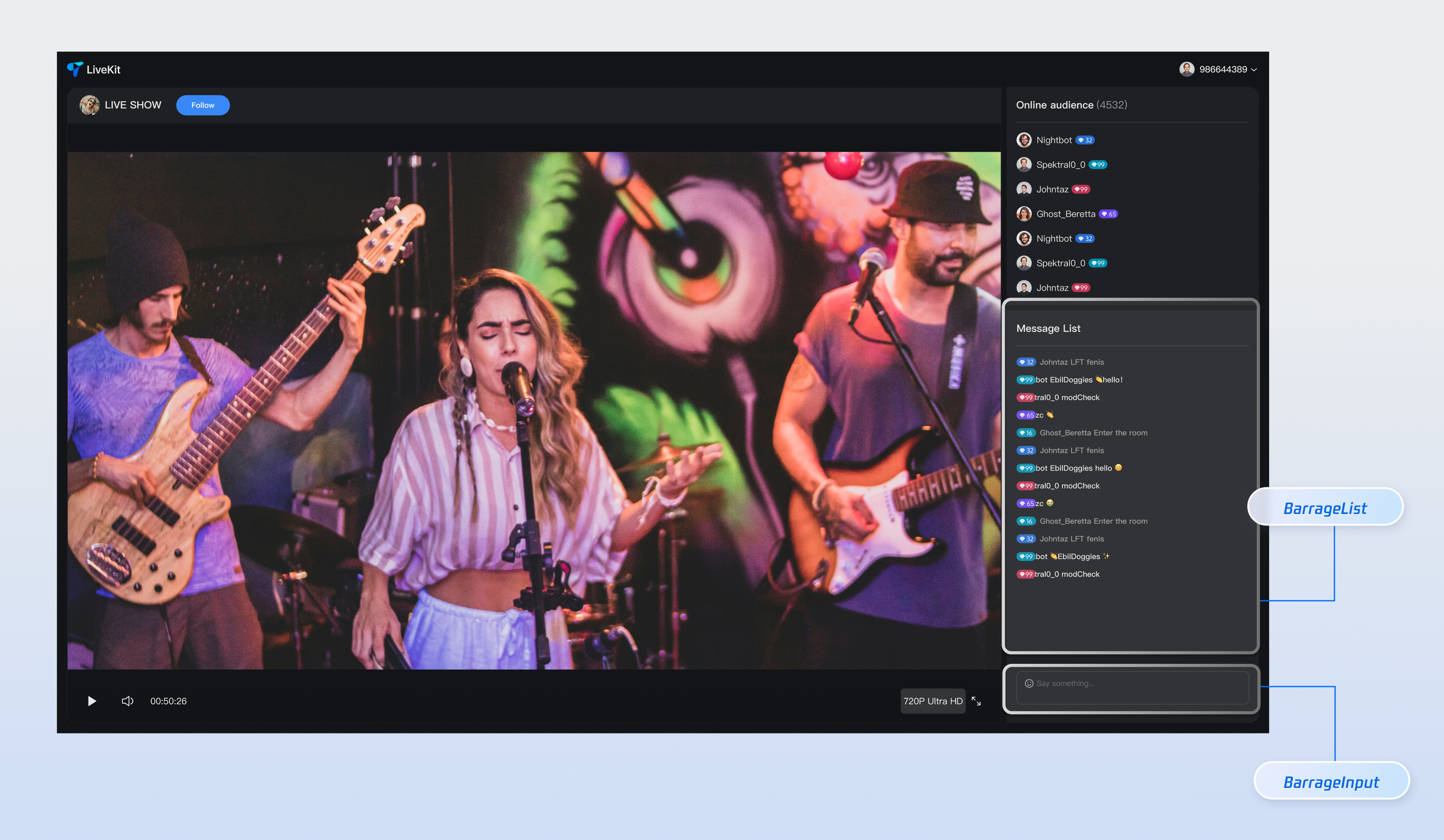
Component Composition
Component Name | Detailed Description |
Barrage Message Component (BarrageList) | A component responsible for real-time display and management of barrage message streams, providing a complete message display solution including message list rendering, time aggregation, user interaction, and responsive adaptation. |
Message Sending Component (BarrageInput) | An input component that provides rich text editing and message sending features, with seamless integration of emoji selector, character limit, status management, and cross-platform adaptation, offering users a smooth input experience. |
Component Integration
Step 1: Configuring the Environment and Activating the Service
Before performing quick integration, you need to refer to preparations, meet the related environment configuration and activate the corresponding service.
Step 2: Installing Dependencies
npm install tuikit-atomicx-vue3 @tencentcloud/uikit-base-component-vue3 --save
pnpm add tuikit-atomicx-vue3 @tencentcloud/uikit-base-component-vue3
yarn add tuikit-atomicx-vue3 @tencentcloud/uikit-base-component-vue3
Step 3: Integrating the Barrage Component
Introduce and use the barrage component in your project. You can copy the following example directly to show a complete live streaming room barrage message component and message send component in your project.
<template><UIKitProvider theme="dark" language="en-US"><div class="app"><div class="chat-container"><div class="chat-content"><BarrageList class="barrage-list" /></div><div class="chat-input"><BarrageInput class="barrage-input" /></div></div></div></UIKitProvider></template><script setup lang="ts">import { onMounted, ref } from 'vue';import { UIKitProvider } from '@tencentcloud/uikit-base-component-vue3';import { BarrageList, BarrageInput, useLoginState, useLiveState } from 'tuikit-atomicx-vue3';const { login, loginUserInfo } = useLoginState();const { joinLive } = useLiveState();async function initLogin() {try {await login({sdkAppId: 0, // SDKAppID, see Step 1 to getuserId: '', // UserID, see Step 1 to getuserSig: '', // userSig, see Step 1 to get});} catch (error) {console.error('login error:', error);}}onMounted(async () => {await initLogin();await joinLive({liveId: 'input corresponding live streaming room LiveId', // enter live room by inputting corresponding liveId});});</script><style scoped>.app{width:100vw;height:100vh;display:flex;justify-content:center;align-items:center;padding:20px;box-sizing:border-box}.chat-container{width:100%;max-width:500px;height:600px;border-radius:16px;display:flex;flex-direction:column;overflow:hidden}.chat-content{flex:1;overflow:hidden}.barrage-list{width:100%;height:100%}.chat-input{background-color:var(--bg-color-dialog);padding:16px}.barrage-input{width:100%}</style>
Customize Component
Barrage Message Component provides users with various and dimensional
Props APIs for custom requirements, allowing users to customize features or UI. Parameter content is as shown in the table below.Note:
Note: To directly learn about the custom details of the Barrage Message Component (BarrageList), quickly jump to the following link: Barrage Message Component Customization;
Note: To directly learn about the custom details of the Message Sending Component (BarrageInput), quickly jump to the following link: Message Sending Component Customization;
Barrage Message Component (BarrageList) Customization
Props
Parameter Name | Parameter Type | Default Value | Description |
messageAggregationTime | Number | 300 | Maximum time interval for message grouping (seconds). |
filter | (message: IMessageModel) => boolean | - | Functions for filtering messages. |
Message | Component | Message | Custom Message Component |
MessageTimeDivider | Component | MessageTimeDivider | Custom Message Time Segmentation Component. |
LocalNoticeMessage | Component | LocalNoticeMessage | Custom Local Notification Component. |
containerStyle | CSSProperties | - | Custom message list container style. |
itemStyle | CSSProperties | - | Custom single message item style. |
height | String | - | Component height, supports CSS units. |
style | CSSProperties | - | Specify the root element's custom style. |
As indicated in the table above, the Props custom part of the Barrage Message Component consists of three sections: component properties, replaceable subcomponents, and custom styles. Specific content is as shown in the table below.
Content | Parameter |
Component Property | filter,messageAggregationTime |
Replaceable subcomponent | Message,MessageTimeDivider,LocalNoticeMessage |
Custom style | ContainerStyle,ItemStyle,height,style |
Filter Message
By setting the
filter parameter, you can flexibly control the message content displayed in the barrage message component.<BarrageList :filter="(message) => message.type === 'TIMTextElem'" />
Message Aggregation Time
By setting the
messageAggregationTime parameter, you can control the grouping time interval.<BarrageList :messageAggregationTime="300" />
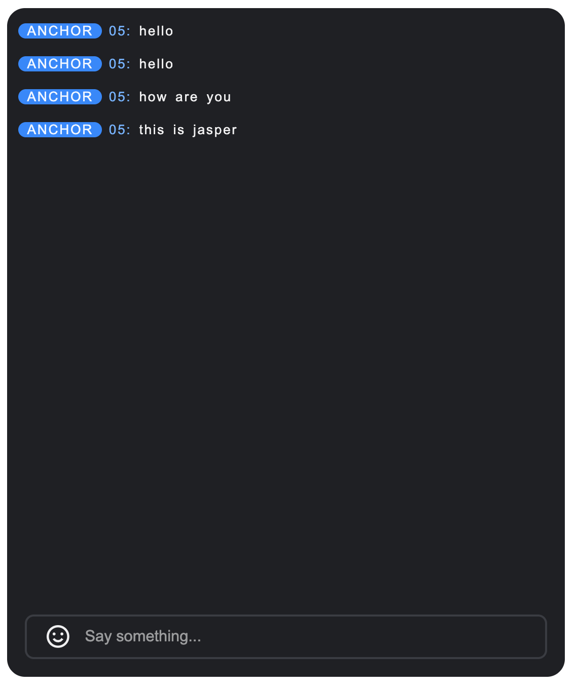
Custom Style
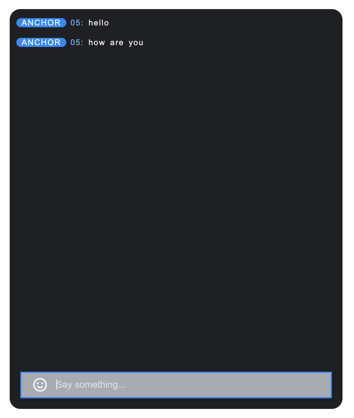
Barrage Message Component provides
containerStyle, itemStyle, custom child component, etc., for customizing component styles.1. To customize the message list container style, you can pass a style object to the
containerStyle attribute.Example: Custom container padding
<BarrageList :containerStyle="{ padding: '0px' }" />
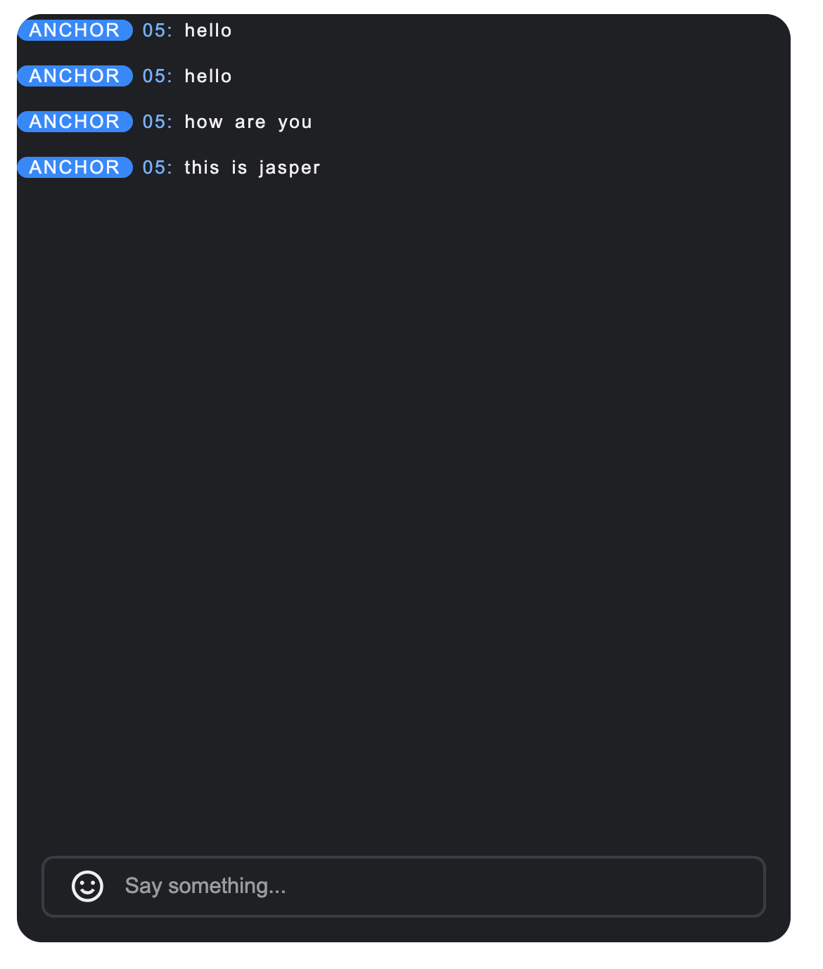
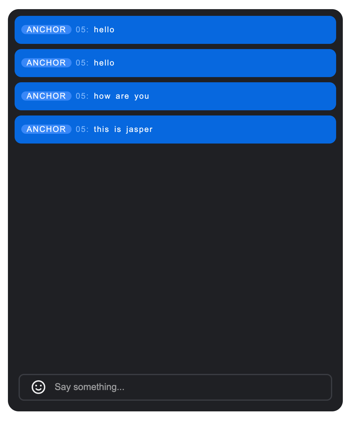
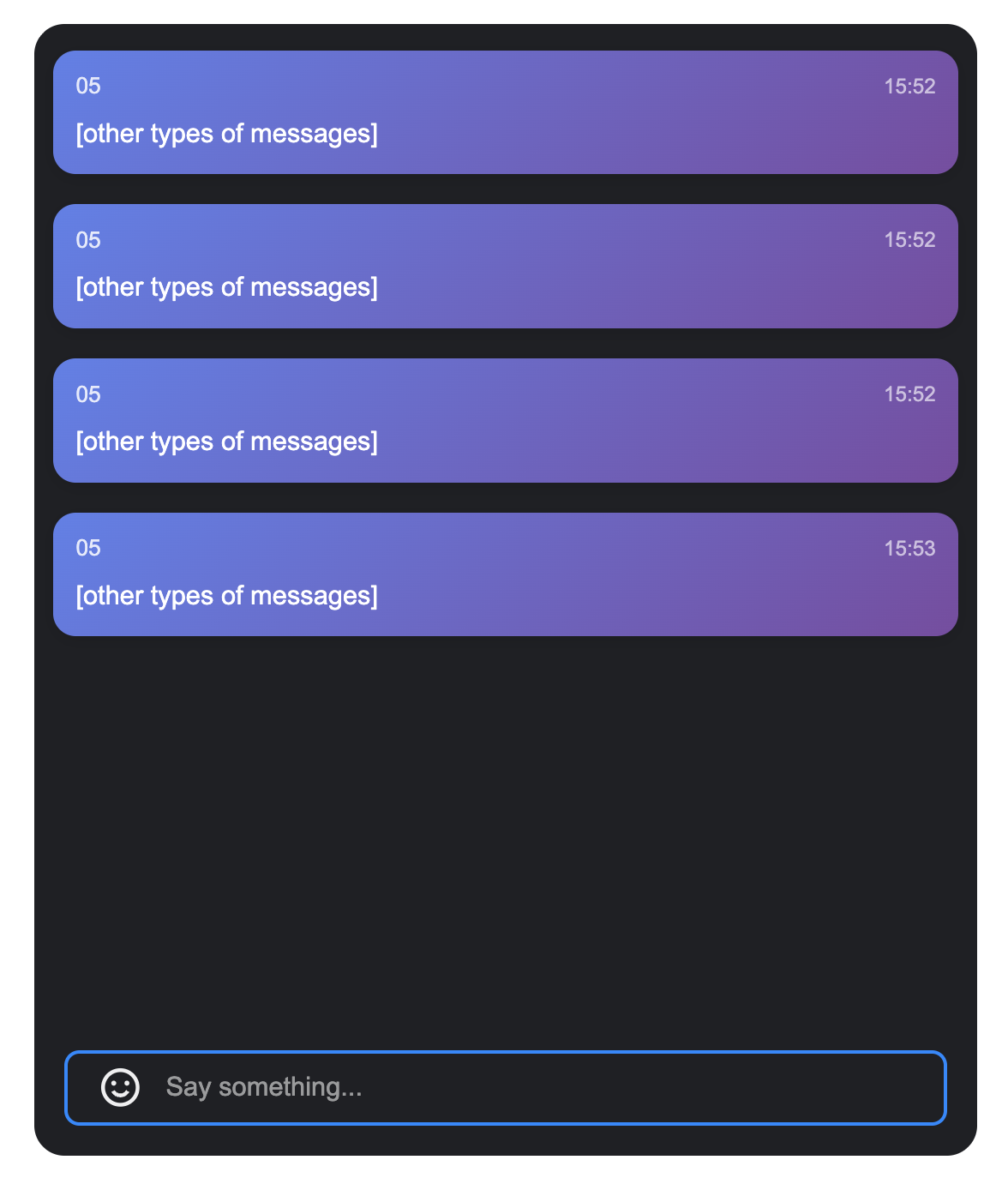
2. To customize a single message style, you can pass a style object to the
itemStyle attribute.Example: Custom message item spacing, border, and message bubble color
<BarrageList :itemStyle="{ borderRadius: '10px', background: '#1C66e5', padding: '10px', boxSizing: 'border-box'}" />
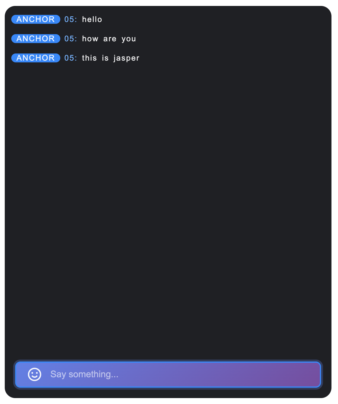
3. The barrage message component supports custom message display components, and you can fully control the rendering method.
Example: Custom Message Component
//MyCustomMessage.vue<template><div class="custom-message"><div class="message-header"><span class="user-name">{{ getUserName(message) }}</span><span class="message-time">{{ formatTime(message.time) }}</span></div><div class="message-content">{{ getMessageText(message) }}</div></div></template><script setup lang="ts">interface SimpleMessage {id: string;from: string;nick?: string;nameCard?: string;time: number;type: string;content: string;avatar?: string;}interface Props {message: SimpleMessage;isLastInChunk?: boolean;}const props = defineProps<Props>();const formatTime = (timestamp: number) => {return new Date(timestamp * 1000).toLocaleTimeString('zh-CN', {hour: '2-digit',minute: '2-digit'});};const getUserName = (message: SimpleMessage) => {return message.nameCard || message.nick || message.from || 'anonymous user';};const getMessageText = (message: SimpleMessage) => {if (message.type === 'text') {return message.content || '';} else if (message.type === 'image') {return '[image message]';} else if (message.type === 'emoji') {return '[emoji message]';}return '[other types of messages]';};</script><style scoped>.custom-message{background:linear-gradient(135deg,#667eea 0%,#764ba2 100%);color:white;padding:12px;border-radius:12px;margin:4px 0;box-shadow:0 2px 8px rgba(0,0,0,0.1);transition:transform 0.2s ease}.custom-message:hover{transform:translateY(-2px)}.message-header{display:flex;justify-content:space-between;align-items:center;margin-bottom:8px;font-size:12px;opacity:0.9}.user-name{font-weight:500;max-width:120px;overflow:hidden;text-overflow:ellipsis;white-space:nowrap}.message-time{font-size:11px;opacity:0.7}.message-content{font-size:14px;line-height:1.4;word-break:break-word}</style>// Use the barrage message component for use in<template><BarrageList :Message="MyCustomMessage" /></template><script setup lang="ts">import MyCustomMessage from "./MyCustomMessage.vue";</script>
Before modification | After modification | | |
| Custom container padding | Custom message item spacing and border | Custom Message Component |
 |  |  |  |
Message Sending Component (BarrageInput) Customization
Props
Parameter Name | Type | Default Value | Description |
containerClass | String | '' | Custom container CSS class name. |
containerStyle | Record | {} | Inline style of custom container. |
width | String | - | Component width, supports CSS units. |
height | String | - | Component height, supports CSS units. |
minHeight | String | '40px' | Minimum component height, supports CSS units. |
maxHeight | String | '140px' | Max component height, supports CSS units. |
placeholder | String | - | Placeholder text in the input box. |
disabled | Boolean | false | Whether to disable the input box. |
autoFocus | Boolean | true | Whether to auto-focus into the input box. |
maxLength | Number | 80 | Maximum character limit for input content. |
Events
Event Name | Parameter | Description |
focus | - | Trigger when the input box gets focus. |
blur | - | Trigger when the input box loses focus. |
As indicated in the table above, the Props custom part of the Message Sending Component consists of three sections: size control, input restriction, and custom styles. Specific content is as shown in the table below.
Content | Parameter |
Size control | width,height,minHeight,minWidth |
Input restriction | maxLength |
Custom style | ContainerStyle,ContainerClass |
Size Control
By setting
width, height, minHeight, maxHeight parameters, you can flexibly control the size of BarrageInput.<BarrageInput width="400px" height="60px" minHeight="40px" maxHeight="120px" />
Input Restriction
By setting the
maxLength parameter, you can control the maximum number of characters for input content.<BarrageInput :maxLength="100" />
Custom Style
The message send component provides
containerStyle and containerClass attributes for customizing component style.1. To customize the input box container style, you can pass a style object to the
containerStyle attribute.Example: Custom container background and border rounded corners
<BarrageInput :containerStyle="{ backgroundColor: '#a8abb2', borderRadius: '0 0', boxShadow: '0 2px 8px rgba(0,0,0,0.1)'}" />
2. To customize the input box container class name, you can pass a class name string to the
containerClass attribute.Example: Custom container class name
<template><BarrageInput containerClass="my-custom-input-container" /></template><style>.my-custom-input-container {background: linear-gradient(135deg, #667eea 0%, #764ba2 100%);border: none;border-radius: 20px;padding: 8px 20px;}.my-custom-input-container:focus-within {box-shadow: 0 0 0 3px rgba(102, 126, 234, 0.3);}</style>
Before modification | After modification | |
| Custom container background and border rounded corners | Custom message item spacing and border |
 |  |  |

