
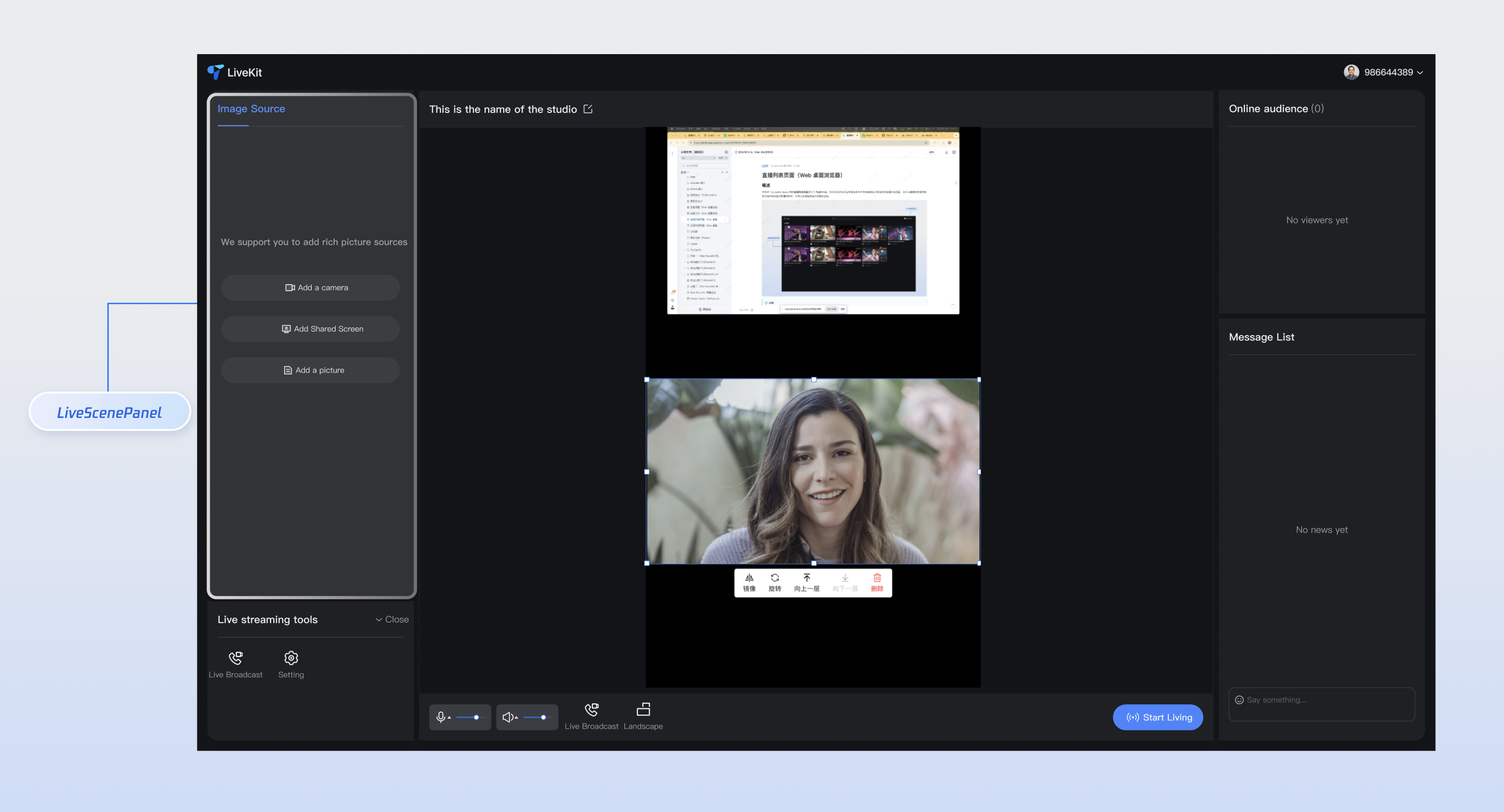
Media Source Configuration Panel
This document provides a detailed introduction to the Media Source Configuration Panel (LiveScenePanel). You can refer to the sample code in this document for seamless integration of our pre-developed components in your existing project, or customize the style and layout according to your needs by following the component customization section in the document.
Core Features
Feature Category | Specific Capability |
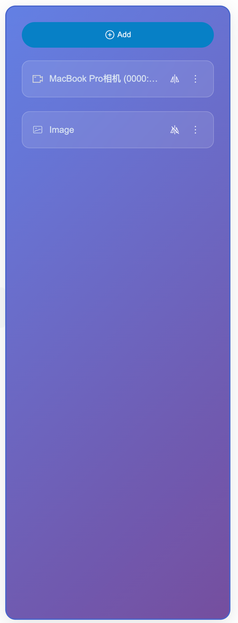
Multi-material type support | Camera, screen sharing, image, video, text and multiple material types, support device selection and parameter configuration. |
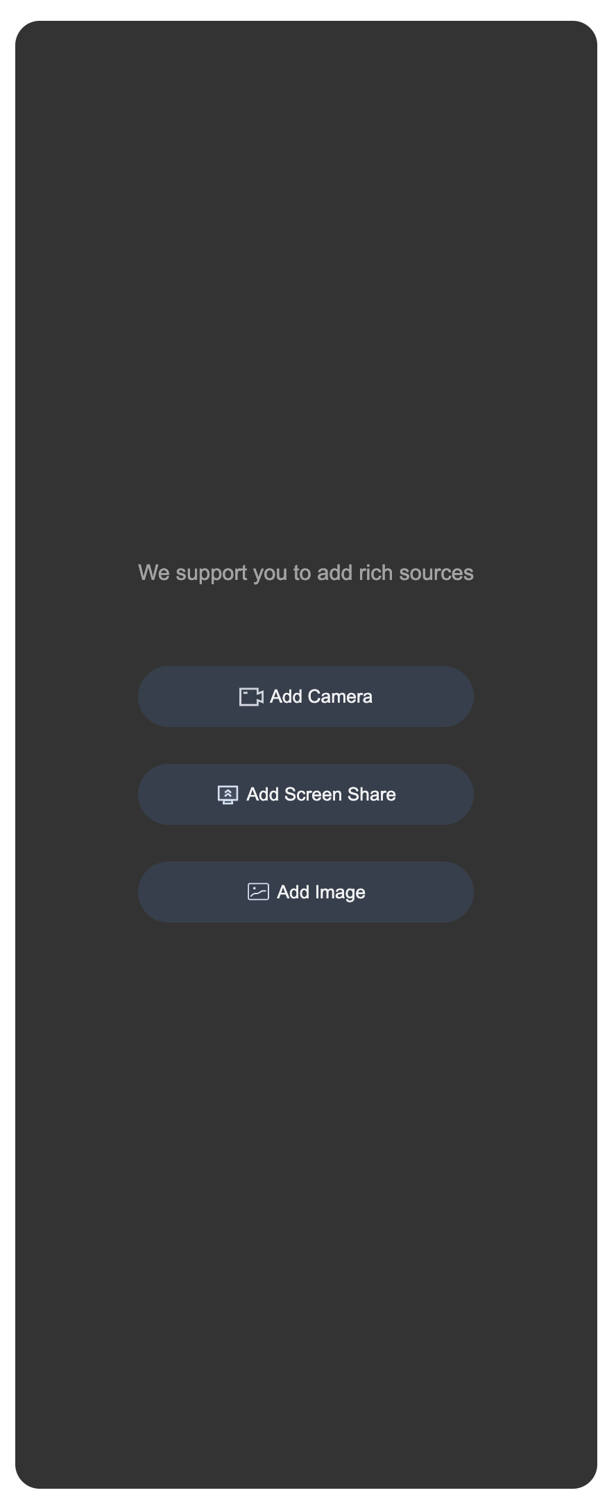
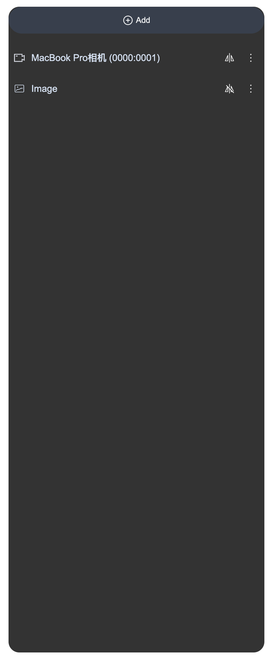
Intelligent display mode | Display the full panel when no material is present, and automatically switch to compact button mode when material is available, with responsive layout adaptation. |
Material management operations | Complete material management features including addition, editing, rename, deletion, and sorting, with support for batch operations. |
Real-time preview configuration | Camera configuration pop-up provides real-time preview, supports parameter adjustment and device testing. |
Permission and Error Handling | Automated permission check, Friendly error prompt and retry mechanism to guarantee user experience. |
Component Integration
Step 1: Configuring the Environment and Activating the Service
Before performing quick integration, you need to refer to preparations to meet the related environment configuration and activate the corresponding service.
Step 2: Dependency Installation
npm install tuikit-atomicx-vue3 @tencentcloud/uikit-base-component-vue3 --save
pnpm add tuikit-atomicx-vue3 @tencentcloud/uikit-base-component-vue3
yarn add tuikit-atomicx-vue3 @tencentcloud/uikit-base-component-vue3
Step 3: Integrating the Media Source Configuration Panel
Add Media Source Configuration Panel to your project and use it. Copy the following example code directly into your project to show the media source configuration panel.
<template><UIKitProvider theme="dark" language="en-US"><div class="app-container"><LiveScenePanel class="live-scene-panel" /></div></UIKitProvider></template><script setup lang="ts">import { onMounted } from 'vue';import { UIKitProvider } from '@tencentcloud/uikit-base-component-vue3';import { LiveScenePanel, useLoginState } from 'tuikit-atomicx-vue3';const { login } = useLoginState();async function initLogin() {try {await login({sdkAppId: 0, // SDKAppID, see Step 1 to get ituserId: '', // UserID, see Step 1 to get ituserSig: '', // userSig, see Step 1 to get it});} catch (error) {console.error('login error:', error);}}onMounted(async () => {await initLogin();});</script><style scoped>.app-container{width:100vw;height:100vh;display:flex;justify-content:center;align-items:center;padding:20px;box-sizing:border-box}.live-scene-panel{width:20%;height:80vh;background:rgba(0,0,0,0.8);border-radius:16px}</style>
Customize Component
The media source configuration panel provides users with various and dimensional feature APIs for user customization, allowing users to customize material types, operation behavior, style themes, etc. After completing Step 3 above, see the following example to adjust the UI of the media source configuration panel, or directly copy the sample code incrementally into the component to generate the effect example.
Style Customization
Customize component appearance via CSS class names and variables, supporting comprehensive customization of theme colors, layout styles, animation effects, and more.
<template><LiveScenePanel class="custom-live-scene-panel" /></template><style>.app-container{width:100vw;height:100vh;display:flex;justify-content:center;align-items:center;padding:20px;box-sizing:border-box}.custom-live-scene-panel{width:100%;max-width:300px;height:80vh;background:linear-gradient(135deg,#667eea 0%,#764ba2 100%);border:2px solid #4c63d2;border-radius:16px;padding:24px;box-shadow:0 8px 32px rgba(0,0,0,0.1);color:white}.custom-live-scene-panel .add-material-item{background-color:#147fcb!important;color:white;border:none;border-radius:0!important;padding:12px 24px;font-weight:600;transition:all 0.3s ease}.custom-live-scene-panel .materials-list{margin-top:20px;gap:16px;display:grid;grid-template-columns:repeat(auto-fill,minmax(200px,1fr))}.custom-live-scene-panel .material-item{background:rgba(255,255,255,0.1);border:1px solid rgba(255,255,255,0.2);border-radius:12px;padding:16px;backdrop-filter:blur(10px);transition:all 0.3s ease}.custom-live-scene-panel .material-item:hover{background:rgba(255,255,255,0.2);transform:scale(1.02)}</style>
Before modification | | After modification | |
Add Media Source Interface | Media Source Setting Interface | Add Media Source Interface | Media Source Setting Interface |
 |  | 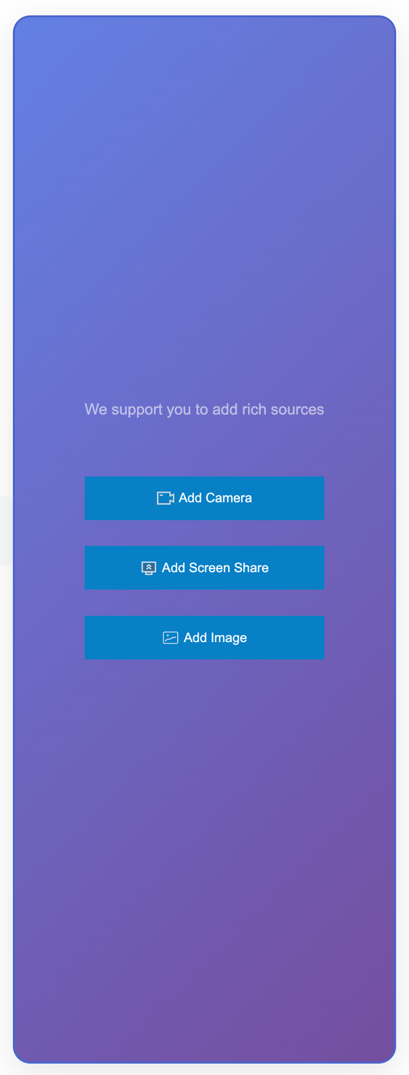 |  |
Listening for Status and Scaling
Using status management Hooks, you can listen to internal state changes in the media source configuration panel and implement responsive processing for external business logic. This approach allows you to monitor and respond to operations like adding, deleting, and updating materials without modifying the component's internal code, thereby achieving data synchronization, service statistics, user prompts, and other extended features.
<template><!-- status display --><div class="status-info"><span>Number of materials: {{ materialCount }}</span><span>Last operation: {{ lastOperation }}</span></div><LiveScenePanel /><LiveScenePanel /><StreamMixer /></template><script setup lang="ts">import { ref, computed, watch } from 'vue';import { LiveScenePanel, useVideoMixerState, StreamMixer } from 'tuikit-atomicx-vue3';

