
MessageList
Component Overview
MessageList is a powerful chat message list component that provides complete message display, interaction, and custom functions. It supports core chat features such as message aggregation, read receipts, message operations, and scroll control, while also offering various custom options to satisfy different business needs.
Props Properties
Field | Type | Default Value | Description |
'left' | 'right' | 'two-sided' | 'two-sided' | Message alignment mode. Left: Align all messages left. Right: Align all messages right. two-sided: Send messages align right, receive messages align left. | |
boolean | false | Whether to enable the read receipt feature. | |
IMessageAction[] | undefined | Custom message actions list, such as copy, revoke, delete. | |
number | 300 | Message aggregation interval (seconds). Consecutive messages from the same sender within this period will be aggregated and displayed. | |
(message: IMessageModel) => boolean | undefined | Message filtering function used to control which messages to display. | |
string | undefined | Custom CSS class name. | |
React.CSSProperties | undefined | Custom inline style. | |
React.ComponentType | Message | Custom message component. | |
React.ComponentType | MessageTimeDivider | Custom time dividing line component. |
Property Explanation
alignment
Parameter type:
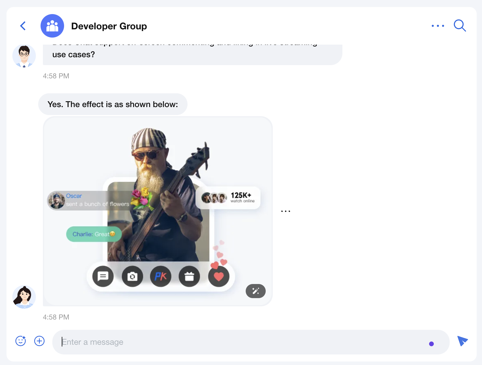
'left' | 'right' | 'two-sided'alignment is used to set the message alignment mode, supporting
left, right, and two-sided three modes. The default value is 'two-sided'.two-sided: Messages from others align left, your messages align right.left: All messages align left.right: All messages align right.enableReadReceipt
Parameter type:
booleanenableReadReceipt is used to set whether the message read receipt feature is enabled. Default value:
false.messageActionList
Parameter type:
IMessageAction[]messageActionList are used to set the operation list of messages, such as copy, recall, delete. Default value is the complete message operation list
['copy', 'recall', 'quote', 'forward', 'delete'].interface IMessageAction {key: 'copy' | 'recall' | 'quote' | 'forward' | 'delete' | string;label?: string;icon?: React.ReactNode;onClick?: (message: IMessageModel) => void;visible?: ((message: IMessageModel) => boolean) | boolean;component?: React.ComponentType<{ message: IMessageModel }>;style?: React.CSSProperties;}
useMessageAction can obtain the complete message operation list, then customize as needed.Example1: Change Message Operation List Order
Assume the message action list is displayed in the order of
forward, copy, recall, quote, delete.import { Chat, MessageList, useMessageActions } from '@tencentcloud/chat-uikit-react';const App = () => {const actions = useMessageActions(['forward', 'copy', 'recall', 'quote', 'delete']);return (<Chat><MessageList messageActionList={actions} /></Chat>);}
Example 2: Only Show Some Message Actions
Suppose only show
forward, copy, and recall operations.import { Chat, MessageList, useMessageActions } from '@tencentcloud/chat-uikit-react';const App = () => {const actions = useMessageActions(['forward', 'copy', 'recall']);return (<Chat><MessageList messageActionList={actions} /></Chat>);}
Example 3: Modifying Existing Message Actions
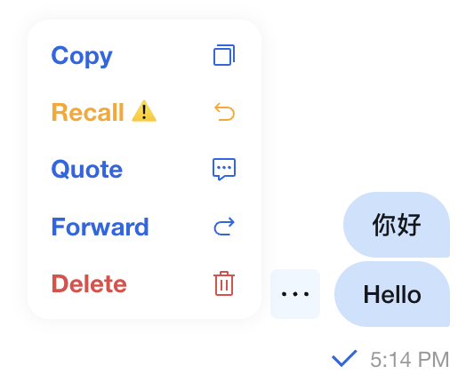
Here is an example of a custom recall operation:
1. Change the tag to 'Recall ⚠️'
2. Change the color to orange
3. Only text messages can be withdrawn
4. key should be consistent with the original operation, use
recallimport TUIChatEngine from '@tencentcloud/chat-uikit-engine';import { Chat, MessageList, useMessageActions } from '@tencentcloud/chat-uikit-react';const ChatApp = () => {const actions = useMessageActions(['copy', {key: 'recall',label: 'Recall ⚠️',style: {color: 'orange'},visible: (message) => message.type === TUIChatEngine.TYPES.MSG_TEXT,}, 'quote', 'forward', 'delete']);return (<Chat><MessageList messageActionList={actions} /></Chat>);}
The following figure shows the effect.
Example 4: Adding New Custom Message Actions
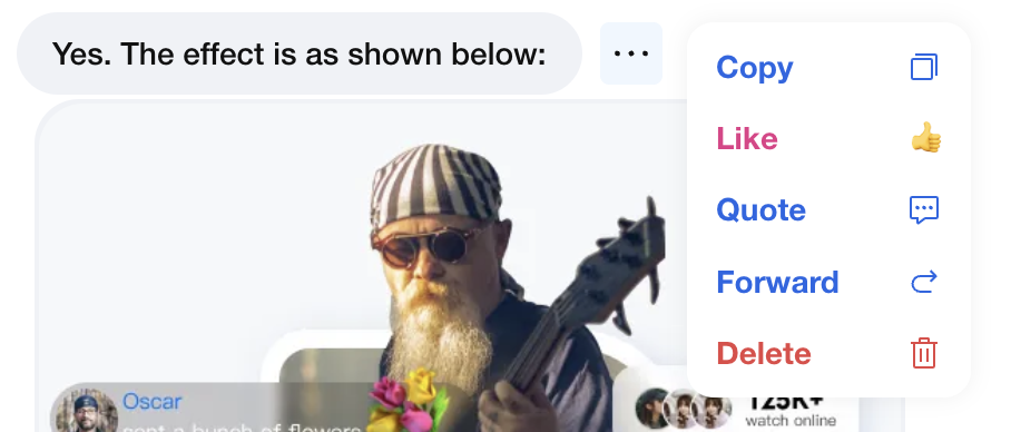
If custom message actions are needed, for example, only messages sent by others can be tagged as 'like' and inserted after the 'recall' operation.
import { useMessageAction } from '@tencentcloud/chat-uikit-react';import { yourApi } from '@/api/yourApi';const customActions = {key: 'like',label: 'Like',icon: <span>👍</span>,style: {color: '#E53888',},visible: (message) => message.flow === 'in',onClick: (message) => {yourApi.likeMessage(message.ID);}}function ChatApp() {const actions = useMessageAction(['forward', 'copy', 'recall', customActions, 'quote', 'delete']);return <MessageList messageActionList={actions} />;}
The following figure shows the effect.
messageAggregationTime
Parameter type:
numbermessageAggregationTime is used to set the message aggregation interval, aggregating consecutive messages from the same sender for display. Default value:
300 (seconds).filter
Parameter type:
(message: IMessageModel) => booleanfilter is used to set the message filtering function to control which messages to display. Default value:
undefined.Example: Filtering Error Messages Sent by Robots
import { MessageList } from '@/components/MessageList';import TUIChatEngine from '@tencentcloud/chat-uikit-engine';const messageFilter = (message) => {// Filter out text messages where sender nickname contains '_robot' and content includes 'operation-failed'if (message.nick?.includes('_robot')&& message.type === TUIChatEngine.TYPES.MSG_TEXT&& message.payload?.text?.includes('operation-failed')) {return false;}return true;};function ChatApp() {return <MessageList filter={messageFilter} />;}
className
Parameter type:
stringclassName is used to set the root container's custom CSS class name, default value
undefined.style
Parameter type:
React.CSSPropertiesstyle is used to set the root container's custom inline style, default value
undefined.Message
Parameter type:
React.ComponentTypeMessage is used to set the custom message component, replace the default message rendering component, default value built-in
Message component.Example: Custom CUSTOM Message Click Redirection Message Component
import TUIChatEngine from '@tencentcloud/chat-uikit-engine';import { Chat, MessageList, Message } from '@tencentcloud/chat-uikit-react';function CustomMessage(props) {const { message } = props;if (message.type === TUIChatEngine.TYPES.MSG_CUSTOM) {const { businessID, ...restData } = JSON.parse(message.payload.data);if (businessID === 'text_link') {return (<div><div>{restData.text}</div><a href={restData.link}>redirect to public website address {restData.link}</a></div>);}} else {// Use the default message component for other message typesreturn <Message {...props} />;}}function ChatApp() {return (<Chat><MessageList Message={CustomMessage} /></Chat>);}
MessageTimeDivider
Parameter type:
React.ComponentTypeMessageTimeDivider is used to set a custom time dividing line component, default value is the built-in
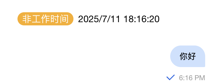
MessageTimeDivider component.Example: Time Dividing Line for Working Hour
import { Chat, MessageList, MessageTimeDivider } from '@tencentcloud/chat-uikit-react';const BusinessTimeDivider = (props: React.ComponentProps<typeof MessageTimeDivider>) => {const { prevMessage, currentMessage } = props;if (!prevMessage || !currentMessage) return null;// For each message to be rendered, get the time of the current message and the previous message, convert them to date objects, and determine whether they span a day or exceed a 4-hour intervalconst currentTime = new Date(currentMessage.time * 1000);const prevTime = new Date(prevMessage.time * 1000);// Display only when crossing days or exceeding 4-hour intervalconst shouldShow = currentTime.toDateString() !== prevTime.toDateString() ||(currentTime.getTime() - prevTime.getTime()) > 4 * 60 * 60 * 1000;if (!shouldShow) return null;// Check working hours (9:00-18:00, Monday through Friday)const isWorkingTime = () => {const hour = currentTime.getHours();const day = currentTime.getDay();return day >= 1 && day <= 5 && hour >= 9 && hour <= 18;};const timeLabel = isWorkingTime() ? 'working hour' : 'off hours';const timeColor = isWorkingTime() ? '#52c41a' : '#faad14';return (<div style={{ textAlign: 'center', margin: '16px 0' }}><span style={{backgroundColor: timeColor,color: 'white',padding: '2px 8px',borderRadius: '12px',marginRight: '8px'}}>{timeLabel}</span>{currentTime.toLocaleString()}</div>);};function ChatApp() {return (<Chat><MessageList MessageTimeDivider={BusinessTimeDivider} /></Chat>);}
The effect is shown below:
Summary
The MessageList component provides complete message list functionality and various custom options. By reasonably configuring Props and customizing components, you can create a chat interface that meets business requirements. It is advisable to select appropriate configuration based on specific scenarios in actual use.

