
Audience List Component
This document provides a detailed introduction to the Audience List Component (LiveAudienceList). You can refer to the sample code in this document for seamless integration into your existing project, or customize the style and layout according to your needs by following the component customization section in the document.
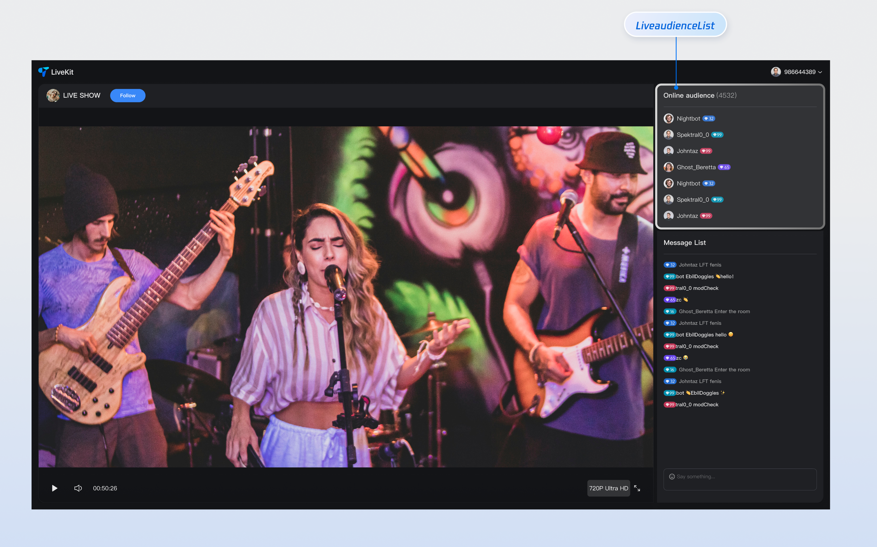
Core Features
Feature Category | Specific capabilities |
Real-time audience show | Display the online audience list in the live streaming room in real time, support avatar and nickname display, and provide a clear audience information view, enabling hosts to intuitively understand audience composition. |
Responsive design | Component support includes UI solutions for desktop and mobile terminals, automatically adapting to different device screen dimensions to provide consistent user experience and meet multi-platform live streaming needs. |
Customizable UI | Provide flexible slot mechanism, support customization of audience tags, profile photo style and other elements, enabling you to customize the display effect of the audience list based on business needs, creating a unique visual experience. |
Component Integration
Step 1: Configuring the Environment and Activating the Service
Before performing quick integration, you need to refer to preparations, meet the required environment configuration and activate the corresponding service.
Step 2: Dependency Installation
npm install tuikit-atomicx-vue3 @tencentcloud/uikit-base-component-vue3 --save
pnpm add tuikit-atomicx-vue3 @tencentcloud/uikit-base-component-vue3
yarn add tuikit-atomicx-vue3 @tencentcloud/uikit-base-component-vue3
Step 3: Integrating the Audience List Component
Introduce and use the audience list component in your project. You can copy the following example code directly to display the live broadcast audience list in your project.
<template><UIKitProvider theme="dark"><div class="app"><div class="live-audience-container"><LiveAudienceList class="live-audience-list"/></div></div></UIKitProvider></template><script setup lang="ts">import { onMounted } from 'vue';import { UIKitProvider } from '@tencentcloud/uikit-base-component-vue3';import { LiveAudienceList, useLoginState, useLiveListState } from 'tuikit-atomicx-vue3';const { login } = useLoginState();const { joinLive } = useLiveListState();async function initLogin() {try {await login({sdkAppId: 0, // SDKAppID, see Step 1 to getuserId: '', // UserID, see Step 1 to getuserSig: '', // userSig, see Step 1 to get});} catch (error) {console.error('login error:', error);}}onMounted(async () => {await initLogin();await joinLive({liveId: 'input the corresponding live streaming room LiveId', // enter live room});});</script><style>.live-audience-container{display:flex;height:100%;width:300px;padding:20px}.live-audience-list{width:100%;height:100%}</style>
Component Customization
Audience List Component provides flexible custom slots, supporting adjustment of audience tags, unique identifiers and other elements' style and layout based on your needs. Below are slot usage examples.
Component Slot
Name | Parameter | Description |
customAudienceInfo | audience: AudienceInfo | Customize audience information display UI |
// Example of using the customAudienceInfo slot<LiveAudienceList><CustomAudienceInfo #customAudienceInfo /></LiveAudienceList>
AudienceInfo defines the basic info and status of each audience in a live streaming room:Parameter | Type | Description |
userId | string | The audience's unique identifier must be unique across the entire system. |
userName | string | The name displayed for the audience in the live stream supports Chinese and English characters. If empty, the userId is displayed. |
avatarUrl | string | The complete URL of the audience avatar supports HTTPS protocol. |
isMessageDisabled | boolean | Whether the audience is muted. true indicates muted, false indicates normal speaking. |
joinTime | number | Timestamp of audience entering the live room, for sorting and statistics |
interface AudienceInfo {userId: string; // Audience unique IDuserName?: string; // Audience display name (optional)avatarUrl?: string; // Audience avatar URL (optional)isMessageDisabled?: boolean; // Whether muted (optional)joinTime?: number; // Entry timestamp (optional)}
Component Properties
Attribute name | Type | Default Value | Description |
height | string | '500px' | Component height, supports CSS units (px, %, vh) |
style | CSSProperties | {} | Custom style object used to override component default style |
Custom Slot Example
To help you better experience and understand the audience list component's customAudienceInfo slot customization capability, we provide a custom personal info example scenario for your reference. You can refer to the above step 3 and incrementally copy the following code into your project to achieve a similar effect.
<template><LiveAudienceList><template #customAudienceInfo="{ audience }"><div class="custom-audience-info">avatar<img:src="audience.avatarUrl || defaultAvatar":alt="audience.userName || audience.userId"class="audience-avatar"/>audience information<div class="audience-details"><span class="audience-name">{{ audience.userName || audience.userId }}</span><span class="join-time">{{ formatJoinTime(audience.joinTime) }}</span></div>status indicator<div v-if="audience.isMessageDisabled" class="muted-indicator">🔇</div></div></template></LiveAudienceList></template><script setup lang="ts">import { LiveAudienceList } from 'tuikit-atomicx-vue3';const defaultAvatar = 'xxx'; // Input default avatar Urlconst formatJoinTime = (timestamp?: number) => { // Format join timeif (!timestamp) return 'just now join';const now = Date.now();const diff = now - timestamp;const minutes = Math.floor(diff / (1000 * 60));const hours = Math.floor(diff / (1000 * 60 * 60));const days = Math.floor(diff / (1000 * 60 * 60 * 24));if (days > 0) return `${days} days ago join`;if (hours > 0) return `${hours} hours ago join`;if (minutes > 0) return `${minutes} minutes ago join`;return 'just now join';};</script><style scoped>.custom-audience-info{display:flex;align-items:center;gap:12px;padding:8px;border-radius:8px;transition:background-color .2s ease}.custom-audience-info:hover{background-color:var(--uikit-color-gray-1)}.audience-avatar{width:40px;height:40px;border-radius:50%;object-fit:cover;border:2px solid var(--uikit-color-gray-3)}.audience-details{flex:1;display:flex;flex-direction:column;gap:4px}.audience-name{font-size:14px;font-weight:500;color:var(--text-color-primary);white-space:nowrap;overflow:hidden;text-overflow:ellipsis}.join-time{font-size:12px;color:var(--text-color-secondary)}.muted-indicator{font-size:16px;opacity:.6}</style>

