
Link Management Panel
This document provides a detailed introduction to Link Management Panel (CoGuestPanel). You can refer to the sample code in this document for seamless integration of our pre-developed components in your existing project, or customize the style and layout according to your needs by following the customization section of components in the document.
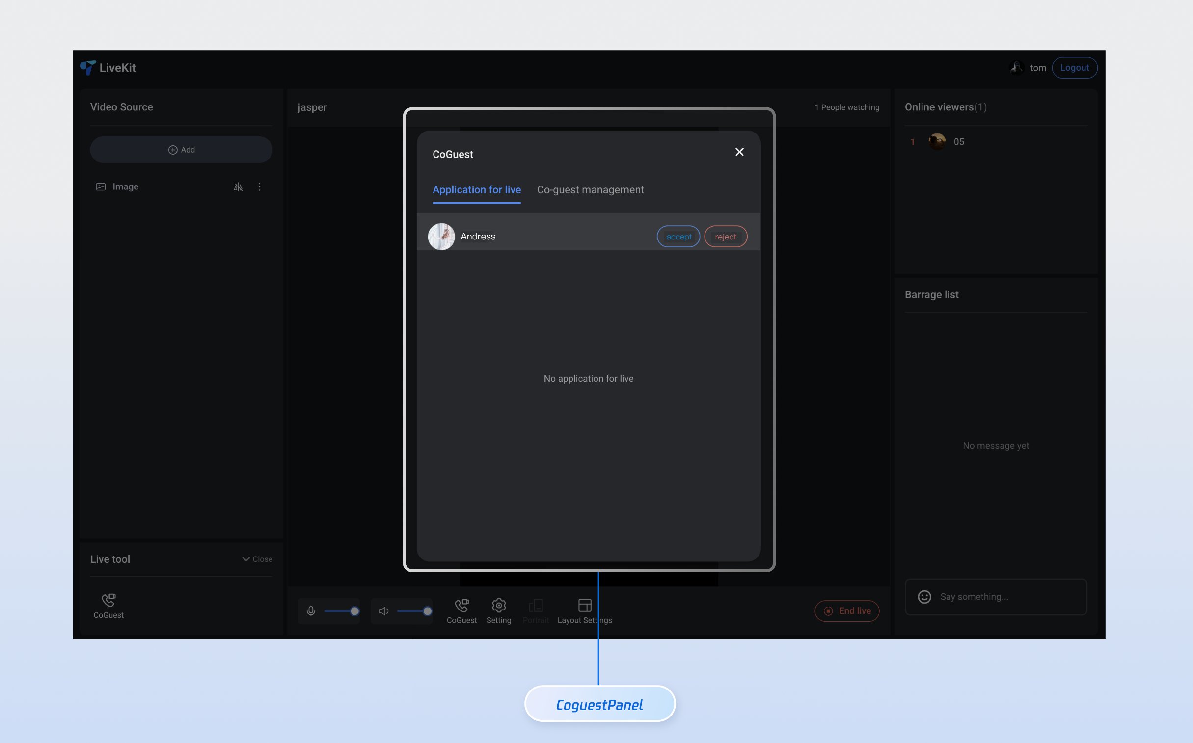
Core Features
Feature Name | Detailed Description |
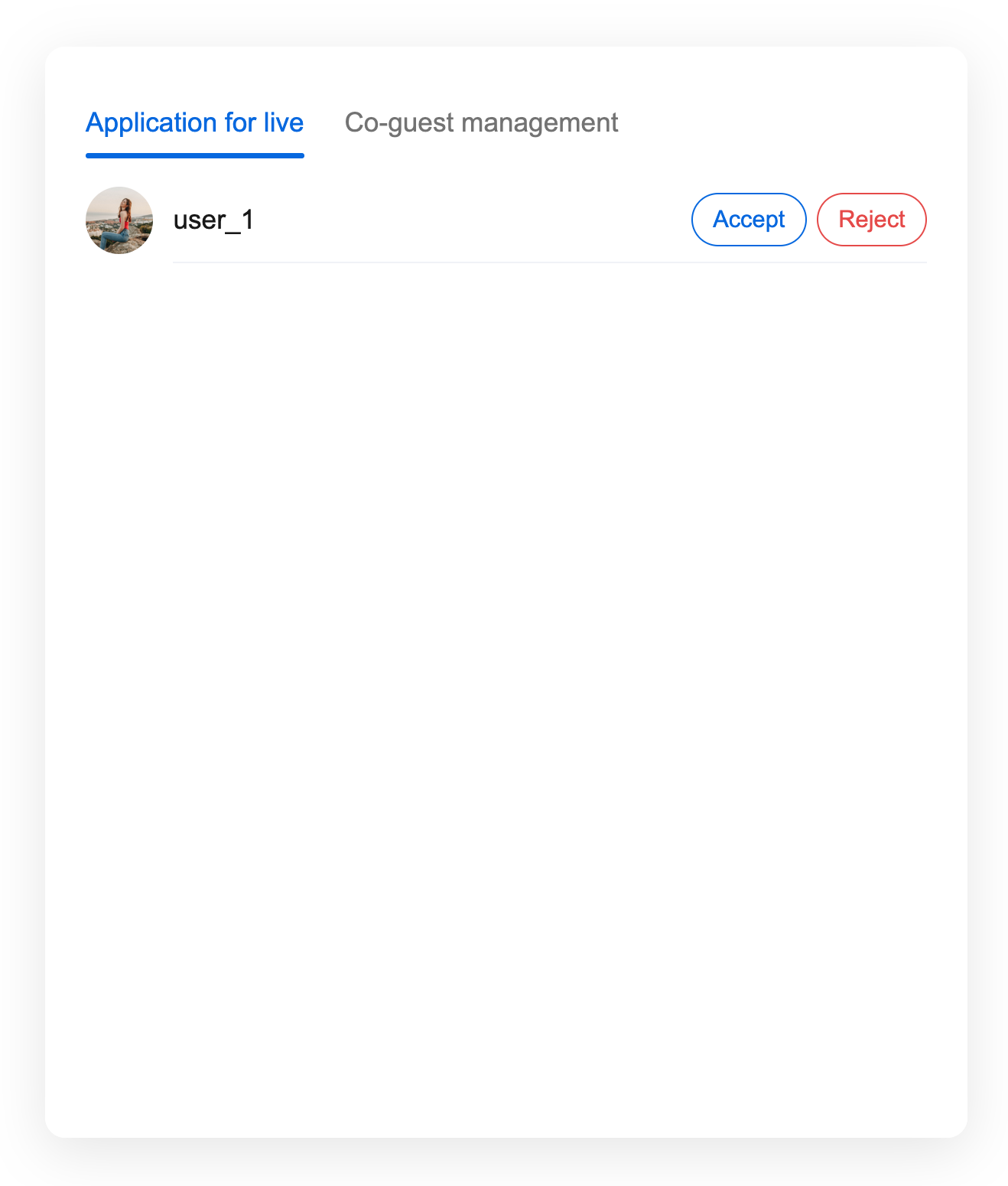
Tab switchover | The UI offers dual tabs, allowing users to quickly switch between the Mic Connection Request and Mic Connection Management feature modules. It supports status memory and message prompts. |
Application List | Display all pending Mic Connection Requests in real time, showing user avatars, Nicknames, and status. Supports sorting by time and the filter function. |
Anchor Operations | Provide abundant one-click operation buttons, support accept application, reject application, disconnect and other features, with real-time feedback on operation results. |
Component Integration
Step 1: Configuring the Environment and Activating the Service
Before performing quick integration, you need to refer to preparations to meet the related environment configuration and activate the corresponding service.
Step 2: Dependency Installation
npm install tuikit-atomicx-vue3 @tencentcloud/uikit-base-component-vue3 --save
pnpm add tuikit-atomicx-vue3 @tencentcloud/uikit-base-component-vue3
yarn add tuikit-atomicx-vue3 @tencentcloud/uikit-base-component-vue3
Step 3: Integrating the Link Management Panel
Introduce Link Management Panel in your project and use it. You can copy the following example code directly to your project to show the Link Management Panel.
<template><UIKitProvider theme="light" language="en-US"><div class="app"><CoGuestPanel class="co-guest-panel" /></div></UIKitProvider></template><script setup lang="ts">import { onMounted, ref } from 'vue';import { UIKitProvider } from '@tencentcloud/uikit-base-component-vue3';import { CoGuestPanel, useLoginState, useLiveState } from 'tuikit-atomicx-vue3';const { login, loginUserInfo } = useLoginState();const { joinLive } = useLiveState();async function initLogin() {try {await login({sdkAppId: 0, // SDKAppID, see Step 1 to getuserId: '', // UserID, see Step 1 to getuserSig: '', // userSig, see Step 1 to get});} catch (error) {console.error('login error:', error);}}onMounted(async () => {await initLogin();// enter live room by inputting corresponding liveIdawait joinLive({liveId: 'input corresponding live streaming room LiveId',});});</script><style scoped>.app{width:100vw;height:100vh;display:flex;justify-content:center;align-items:center;padding:20px;box-sizing:border-box}.co-guest-panel{width:100%;max-width:500px;padding: 24px;height:600px;background:rgba(255,255,255,0.9);border-radius:12px;box-shadow:0 8px 32px rgba(0,0,0,0.1);overflow:hidden}</style>
Custom Style Customization
The Link Management Panel supports style customization via CSS variables. You can override the following variables to adjust the component appearance. After completing Step 3, see the following example to adjust the UI of the Link Management Panel, or directly perform incremental copying of the sample code into your component to generate the effect example.
<template><CoGuestPanel class="co-guest-panel" /></template><style>.co-guest-panel{--text-color-primary:#2d3748;--text-color-secondary:#93a3bb;--text-color-link:#20c9e7;--bg-color-primary:#ffffff;--bg-color-hover:#d6e7f3;--stroke-color-primary:#8bb6ef;--stroke-color-secondary:#90c0f4;--shadow-light:0 2px 8px rgba(69,67,67,0.08);--shadow-medium:0 4px 16px rgba(93,87,87,0.12);--transition:all 0.3s ease;}.co-guest-panel .panel-content{background:var(--bg-color-primary);border-radius:16px;border:1px solid var(--stroke-color-primary);box-shadow:var(--shadow-medium);transition:var(--transition);overflow:hidden;}.co-guest-panel .panel-content:hover{box-shadow:0 8px 24px rgba(0,0,0,0.15);transform:translateY(-2px);border-color:var(--stroke-color-secondary);}.co-guest-panel .user-item{padding:16px;margin:8px 0;background:var(--bg-color-primary);border:1px solid var(--stroke-color-primary);border-radius:12px;transition:var(--transition);cursor:pointer;}.co-guest-panel .user-item:hover{background:var(--bg-color-hover);border-color:var(--text-color-link);box-shadow:var(--shadow-light);transform:translateY(-1px);}.co-guest-panel .user-item:active{transform:translateY(0);transition:all 0.15s ease;}.co-guest-panel .user-item.selected{background:rgba(102,126,234,0.08);border-color:var(--text-color-link);box-shadow:var(--shadow-light);}</style>
Before modification | After modification |
 |  |

