
iOS(SwiftUI)
Component Overview
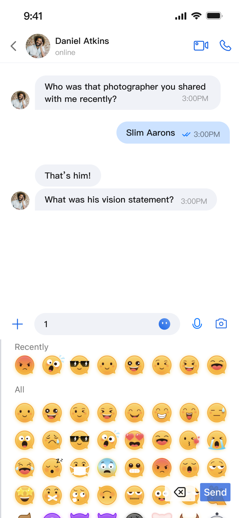
MessageInput is a SwiftUI-based message input component that enables users to compose and send a variety of message types, including text, images, videos, files, and voice messages. It features an integrated emoji picker, supports multiple style configurations, and offers extensive customization options.
Message Input Interface | Emoji Picker |
 |  |
Component Integration
MessageInput is included in TUIKit SwiftUI. To use MessageInput, integrate TUIKit SwiftUI into your project. For detailed integration steps, see the TUIKit SwiftUI documentation.
Component Structure
MessageInput consists of the main input component and a style configuration protocol, providing message input capabilities and supporting customization.
Initialization Parameters
Parameter | Type | Description |
conversationID | String | Conversation ID used to identify the current chat session |
config | MessageInputConfigProtocol | Input style configuration that controls which function buttons are displayed |
Public API
Method | Parameters | Description |
init | conversationID: String, config: MessageInputConfigProtocol | Initializes the message input component |
Basic Usage
To get started, initialize the MessageInput component with a conversation ID:
import AtomicXimport SwiftUIstruct ChatView: View {var body: some View {VStack {Spacer()MessageInput(conversationID: "conversation_123")}}}
Customization
You can control which feature buttons appear on the input bar:
// Customize the displayed function buttonsMessageInput(text: $inputText,conversationID: conversationID,config: ChatMessageInputConfig(isShowAudioRecorder: false, // Hide audio recordingisShowPhotoTaker: true, // Show photo captureisShowMore: true, // Show "More" optionsisShowSendButton: true // Show send button))
The following images show different customization effects:
Default Input Box | Input Box with Audio Recording Hidden | Input Box with All Features Hidden |
 |  |  |

