
Flutter
Component Overview
MessageInput is a message input component that enables users to create and send messages with a full range of editing options. It supports various message types, including text, images, videos, files, and voice messages. The component also includes features such as emoji selection and offers flexible styling and customization options.
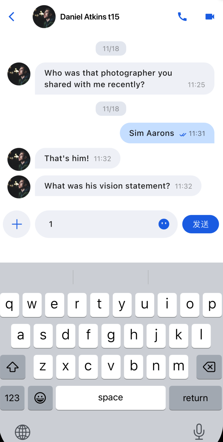
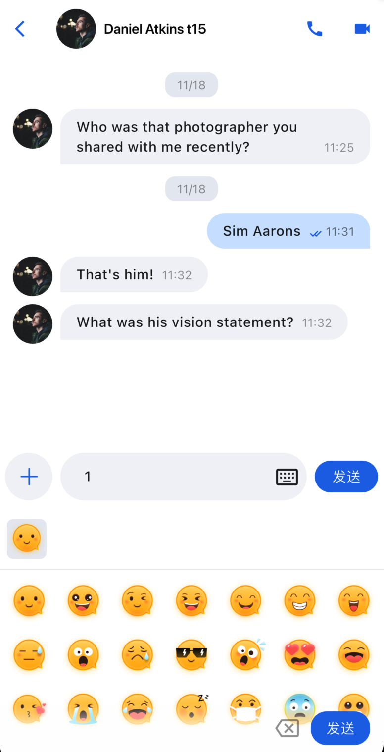
Message Input Interface | Emoji Picker |
 |  |
Component Integration
MessageInput is part of TUIKit Flutter. To use MessageInput, integrate TUIKit Flutter into your project. For setup instructions, see TUIKit Flutter documentation.
Component Descriptions
MessageInput is composed of a core input module and a style configuration protocol, allowing you to customize the input experience.
Initialization Parameters
Parameter Name | Type | Description |
conversationID | String | Conversation ID that identifies the current chat session. |
config | MessageInputConfigProtocol | Style configuration that controls which function buttons appear. |
Basic Usage
Initialize the MessageInput component with a conversation ID:
Column(children: [MessageInput(conversationID: 'conversation_123',),],);
Customization
You can configure which feature buttons appear in the input bar:
// Customize which feature buttons to showMessageInput(conversationID: widget.conversation.conversationID,config: ChatMessageInputConfig(isShowAudioRecorder: false, // Hide audio recordingisShowPhotoTaker: true, // Show photo captureisShowMore: true, // Show more features),),
Examples of different configurations:
Default Input Box | Input Box with Audio Recording Hidden | Input Box with All Features Hidden |
 |  |  |

