
Android(Compose)
TUIKit Compose offers flexible appearance customization with support for Light, Dark, and System theme modes, along with customizable primary colors. A simple configuration enables theme switching and brand color application throughout your app.
For example, in the message list, you can see how different theme modes and primary colors affect the UI:
Light + Default Color | Light + Orange | Dark + Default Color | Dark + Green Theme |
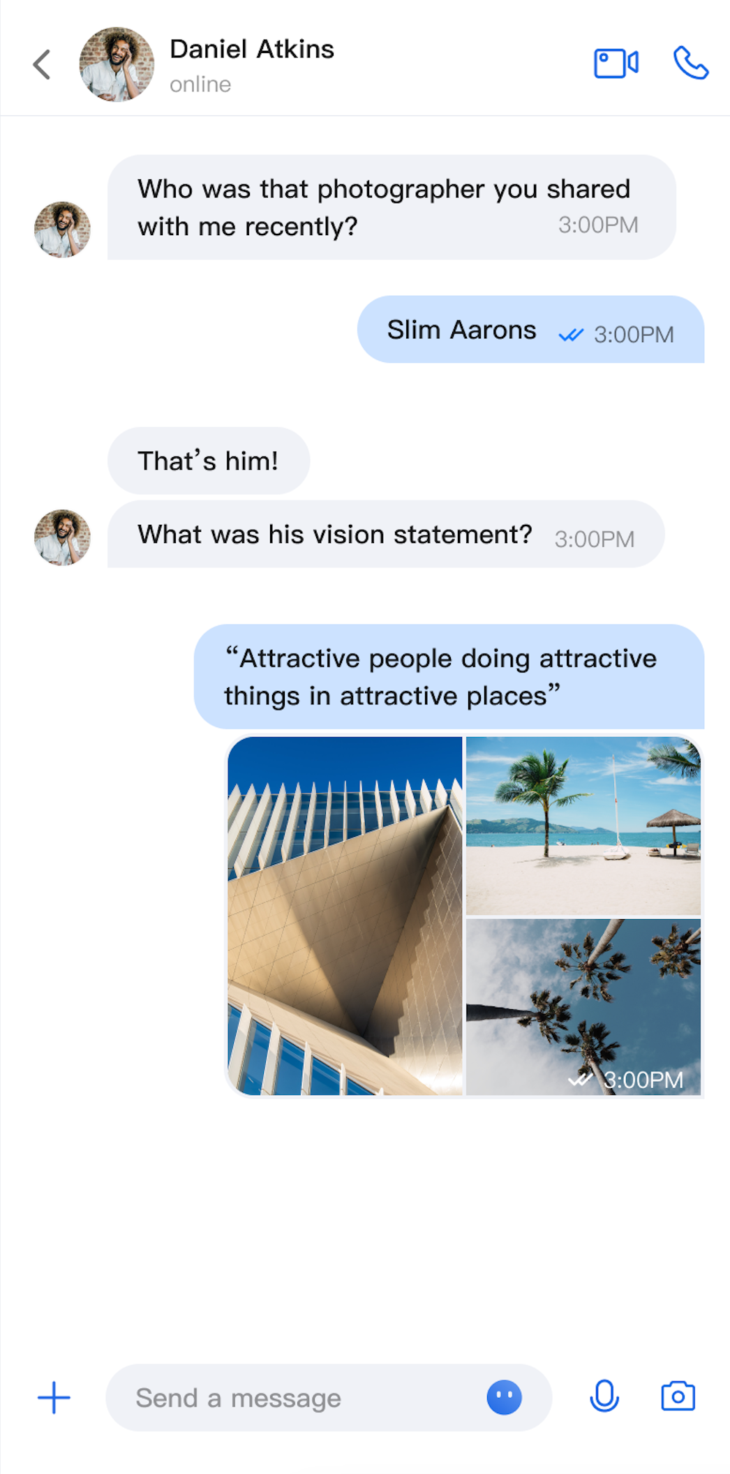 | 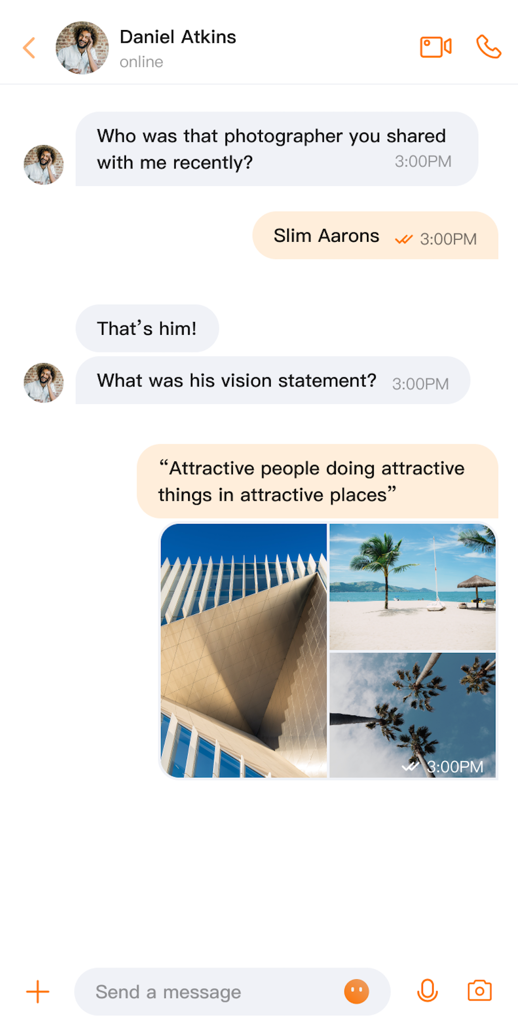 | 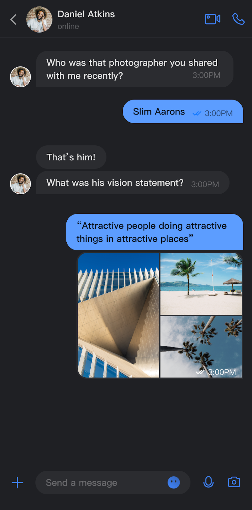 | 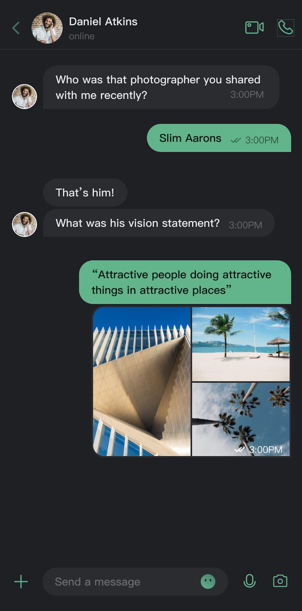 |
Key Features
Theme Mode
Light Mode: Bright interface for daytime use.
Dark Mode: Dim interface for nighttime use.
Follow System: Automatically matches the system appearance setting.
Primary Color Customization
Preset Theme Colors: Includes standard options like blue, green, red, orange, and more.
Custom Theme Color: Supports any Hex color value.
Intelligent Palette Generation: Automatically creates a palette with 10 color shades.
Quick Reset: Instantly revert to the default theme color.
API Reference
All theme configuration and queries are handled through concise APIs in
ThemeState.Set Theme Mode
Method | Parameter | Return Value | Description |
setThemeMode | ThemeMode | Unit | Sets the display mode, automatically saves and refreshes. ThemeMode.SYSTEM: Follows system appearance.ThemeMode.LIGHT: Forces light mode. ThemeMode.DARK: Forces dark mode. |
Set Primary Color
Method | Parameter | Return Value | Description |
setPrimaryColor | String | Unit | Sets the primary color using a Hex value (e.g., "#1C66E5"). |
clearPrimaryColor | None | Unit | Resets the primary color to the default blue. |
Note:
When you call setThemeMode or setPrimaryColor, your settings are automatically saved to persistent storage. No manual saving is required. The configuration will be loaded automatically the next time the app starts.
Changing theme settings automatically clears the cache to ensure real-time color updates. You do not need to manage the cache manually.
Avoid frequent theme switching in your code (for example, do not call these APIs in a loop).
Query ThemeState Information
You can check the current theme configuration using the following read-only properties:
Property | Type | Description |
currentMode | ThemeMode | Current theme mode. |
currentPrimaryColor | String? | Current primary color (Hex format). |
hasCustomPrimaryColor | Boolean | Indicates if a custom primary color is set. |
isDarkMode | Boolean | Indicates if the current mode is dark mode. |
Usage
This section explains how to integrate theme and primary color customization into your app, with three approaches ranging from basic to advanced.
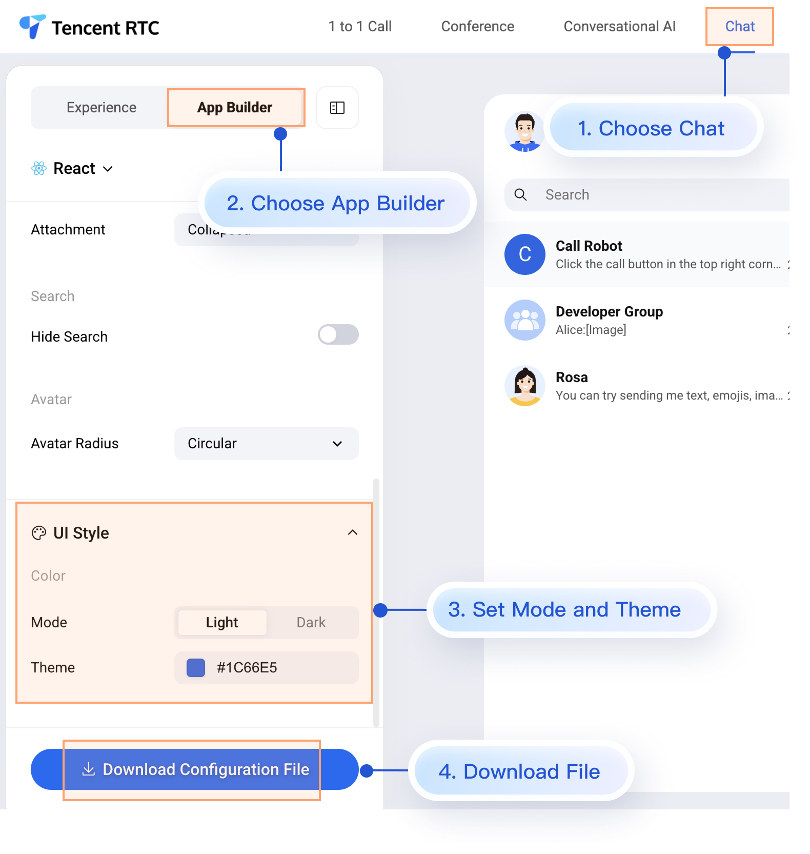
Option A: Configure with AppBuilder (Recommended)
AppBuilder is a convenient tool for customizing features and UI, managed through a unified JSON configuration file. It’s ideal for keeping Web and Native apps visually consistent.
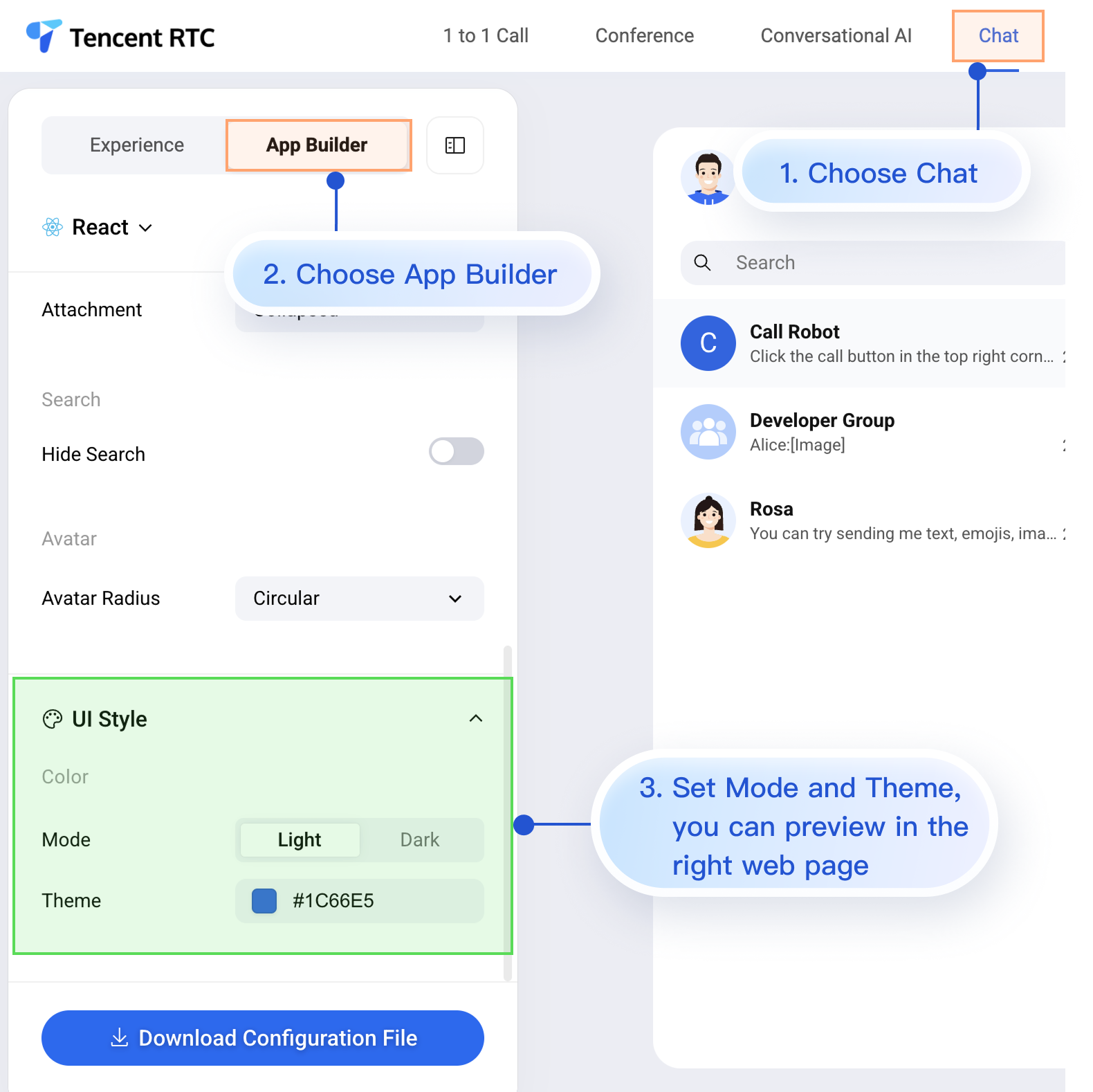
While the Chat Web Demo Center does not currently support real-time preview for mobile, mobile projects do support AppBuilder configuration.
To apply your custom configuration from the Web Demo Center to your mobile project, follow these two steps:
1. Download the configuration file.
2. Add the appConfig.json file to your Android project.
1. Download the Configuration File
The contents of
appConfig.json map directly to the configuration options in AppBuilder. Appearance settings are under the theme section:{"theme": {"mode": "light", // Theme mode: light - Light mode, dark - Dark mode, system - Follow system"primaryColor": "#E65100" // Primary color, hexadecimal color value},"messageList": {"alignment": "two-sided","enableReadReceipt": false,"messageActionList": ["copy","recall","quote","forward","delete"]},"conversationList": {"enableCreateConversation": true,"conversationActionList": ["delete","mute","pin","markUnread"]},"messageInput": {"hideSendButton": false,"attachmentPickerMode": "collapsed"},"search": {"hideSearch": false},"avatar": {"shape": "circular"}}
Configuration Option Description
Parameter | Type | Optional Values | Description |
mode | String | "system", "light", "dark" | Theme mode |
primaryColor | String | Hex color value, e.g., "#0ABF77" | Primary color |
2. Add the Configuration File to Your Project
Drag appConfig.json into your project. For example, in the open-source demo TUIKit Android Compose on GitHub, appConfig.json is located in the assets folder under demo/app:
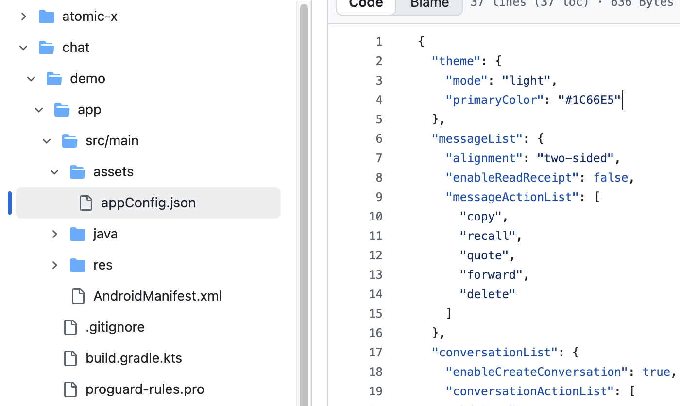
Once you’ve added the file, you don’t need to write any extra code. When you launch the app, TUIKit Compose components will automatically use the theme mode and primary color specified in appConfig.json.
Option B: Set Theme Mode in Code
You can set the theme mode directly using the
setThemeMode API. Example:val themeState = ThemeState.sharedColumn {Button(onClick = {themeState.setThemeMode(ThemeMode.SYSTEM)}) { Text(text = "Follow System") }Button(onClick = {themeState.setThemeMode(ThemeMode.LIGHT)}) { Text(text = "Light Mode") }Button(onClick = {themeState.setThemeMode(ThemeMode.DARK)}) { Text(text = "Dark Mode") }}
Approach 3: Set Primary Color in Code
Set the primary color using the
setPrimaryColor API. Just provide a Hex color value, and all TUIKit Compose components will automatically use matching colors from the same palette for UI rendering. No manual color adjustments are needed. Example:Column {var text: String by remember { mutableStateOf("#1C66E5") }fun isValidHexColor(): Boolean {return text.matches(Regex("^#[0-9A-Fa-f]{6}$"))}BasicTextField(value = text,onValueChange = { text = it },modifier = Modifier.fillMaxWidth().padding(16.dp))Button(enabled = isValidHexColor(),onClick = {themeState.setPrimaryColor(text)}) {Text("Apply Primary Color")}}
Usage Recommendations:
For most apps, using the JSON configuration file is recommended. It’s simple, reliable, and ensures cross-platform consistency.
Use colors from themeState.colors throughout your app to maintain a consistent look when switching themes.
FAQs
How do I check if the current mode is dark mode?
if themeState.isDarkMode {// Currently in dark mode} else {// Currently in light mode}
Can I set transparency?
No. Only 6-digit Hex format (RGB) is supported for the primary color. 8-digit Hex (RGBA) is not supported.
How do I reset to the default theme?
themeState.clearPrimaryColor() // Remove custom primary colorthemeState.setThemeMode(ThemeMode.SYSTEM) // Switch to system mode
Where is the theme configuration saved?
Theme settings are stored in the app’s persistent storage. If the app is uninstalled, the configuration is lost and defaults are restored on reinstallation.
How do I get the full current theme configuration?
val config = themeState.currentThemeprint("Mode: ${config.mode}")print("Primary Color: ${config.primaryColor ?: "Default"}")
Can I set both mode and primary color at the same time?
Yes. Call both methods separately; the system will automatically merge the settings:
themeState.setThemeMode(ThemeMode.DARK)themeState.setPrimaryColor("#0ABF77")

