
iOS(SwiftUI)
TUIKit offers flexible appearance customization with support for Light, Dark, and System theme modes, along with customizable primary colors. A simple configuration enables theme switching and brand color application throughout your app.
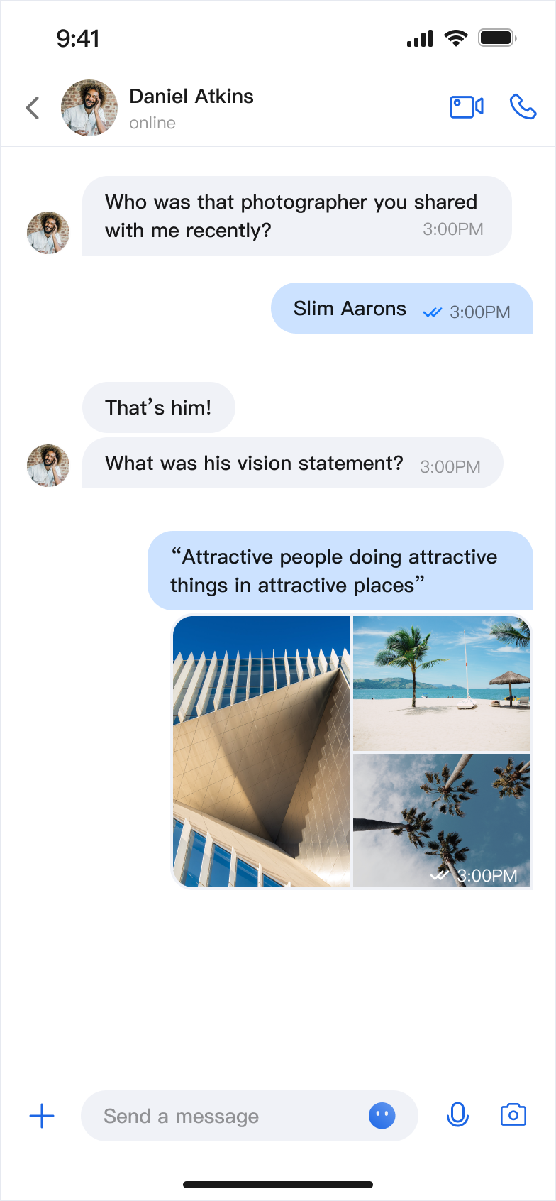
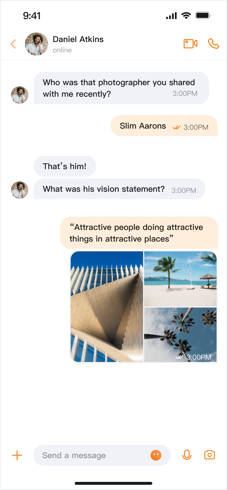
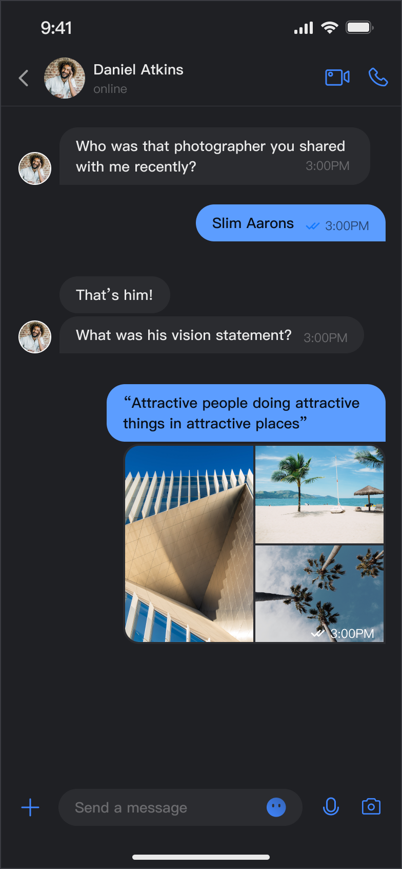
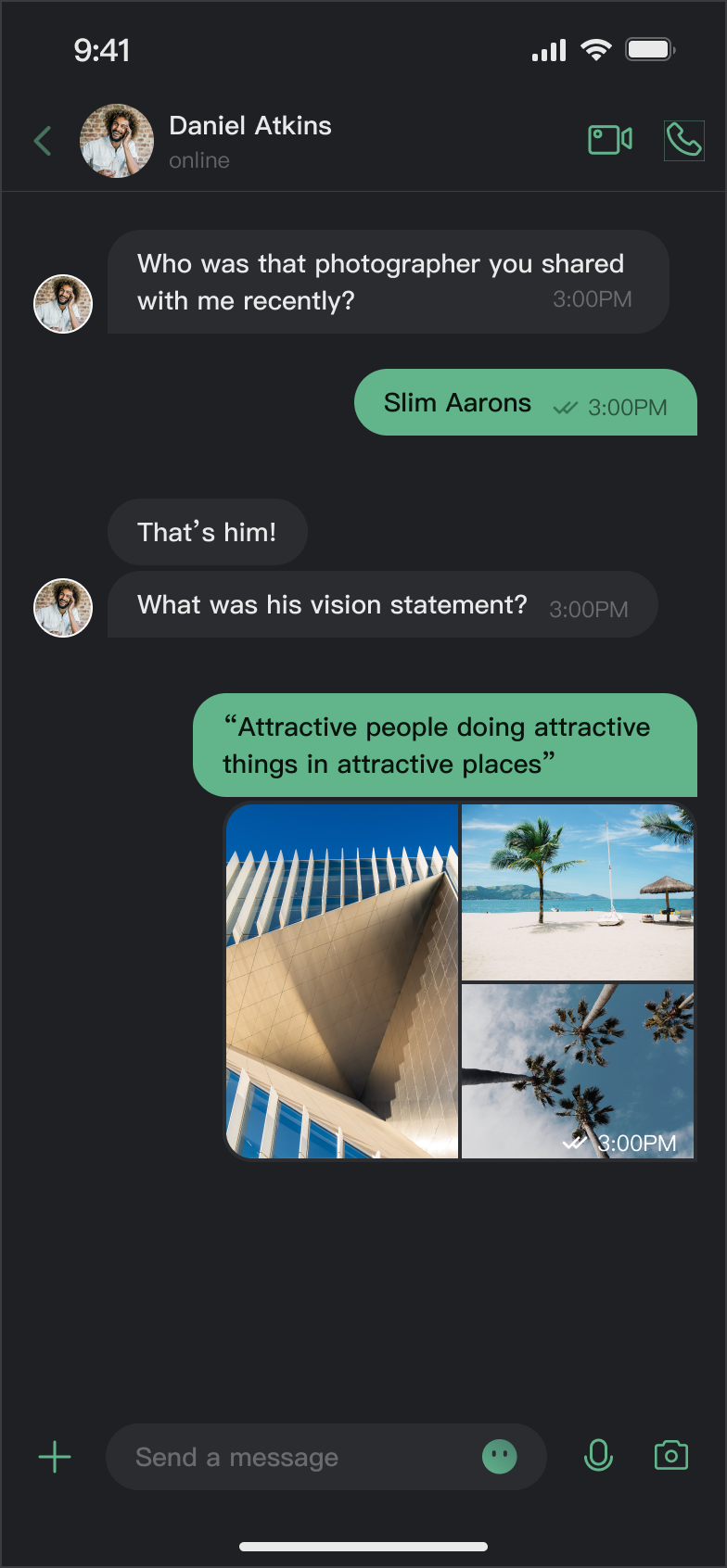
For example, in the message list, you can see how different theme modes and primary colors affect the UI:
Light + Default Color | Light + Orange | Dark + Default Color | Dark + Green Theme |
 |  |  |  |
Core Capabilities
Theme Mode
Light Mode: Bright interface for daytime use.
Dark Mode: Dim interface for nighttime use.
System Mode: Automatically matches the system appearance.
Primary Color Customization
Preset Theme Colors: Choose from standard colors like blue, green, red, orange, and more.
Custom Primary Color: Set any color using Hex format.
Smart Palette Generation: Automatically creates a full palette with 10 color variations.
Reset Customization: Instantly revert to the default theme color.
API Reference
All theme configuration and queries are handled through a simple set of APIs in
ThemeState.Set Theme Mode
Method | Parameter | Return Value | Description |
setThemeMode(_:) | ThemeMode | Void | Sets the theme mode, automatically saves and refreshes. ThemeMode.system: Follows system appearance. ThemeMode.light: Forces light mode. ThemeMode.dark: Forces dark mode. |
Set Primary Color
Method | Parameter | Return Value | Description |
setPrimaryColor(_:) | String | Void | Sets the primary color. Accepts Hex format (e.g., "#1C66E5"). |
clearPrimaryColor() | None | Void | Removes the custom primary color and restores the default blue. |
Note:
1. After calling
setThemeMode or setPrimaryColor, the configuration is automatically saved to UserDefaults. No manual saving is required. The settings will be loaded automatically when the app restarts.2. When you update the theme configuration, the cache is cleared automatically to ensure the color scheme updates in real time. No manual cache management is needed.
3. Avoid frequent theme changes when using these APIs (for example, do not call them in a loop).
Query ThemeState Information
You can check the current theme configuration and status using these read-only properties:
Property | Type | Description |
currentMode | ThemeMode | Current theme mode. |
currentPrimaryColor | String? | Current primary color (Hex format). |
hasCustomPrimaryColor | Bool | Whether a custom primary color is set. |
isDarkMode | Bool | True if the current mode is dark mode. |
Usage
This section explains how to integrate and use theme and primary color customization in your app, with three approaches from basic to advanced.
Option A: Configure with AppBuilder (Recommended)
AppBuilder is a centralized tool for feature and UI customization, managed via a JSON configuration file. It’s ideal for keeping Web and Native apps visually consistent.
While the Chat Web Demo doesn’t support real-time preview for mobile configurations, mobile apps do support AppBuilder configuration.
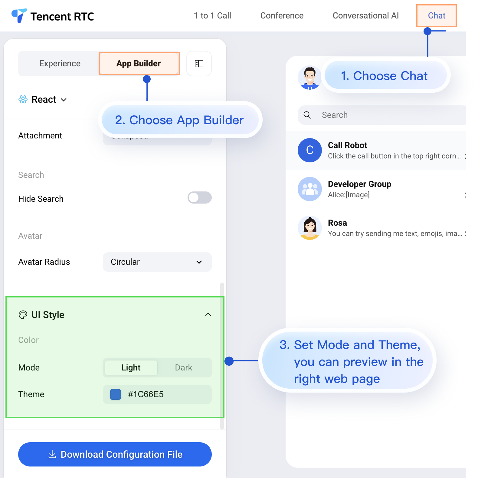
Here’s how to apply your custom configuration in a mobile project after setting up AppBuilder in the Web Demo. The process is simple and includes 3 steps:
1. Download the configuration file.
2. Add the appConfig.json file to your iOS project.
3. Load the configuration file when the app launches.
Step 1: Download the Configuration File
Go to the Chat Web Demo and download the appConfig.json configuration file. The download location is:

The
appConfig.json file looks like this. The configuration options match those on the AppBuilder page. Appearance settings are under theme:{"theme": {"mode": "light", // Theme mode: light - Light mode, dark - Dark mode, system - Follows system"primaryColor": "#E65100" // Primary color, 6-digit hex value},"messageList": {"alignment": "two-sided","enableReadReceipt": false,"messageActionList": ["copy","recall","quote","forward","delete"]},"conversationList": {"enableCreateConversation": true,"conversationActionList": ["delete","mute","pin","markUnread"]},"messageInput": {"hideSendButton": false,"attachmentPickerMode": "collapsed"},"search": {"hideSearch": false},"avatar": {"shape": "circular"}}
Configuration Option Description
Parameter | Type | Optional Values | Description |
mode | String | "system", "light", "dark" | Theme mode. |
primaryColor | String | Hex color value, e.g. "#0ABF77" | Primary color. |
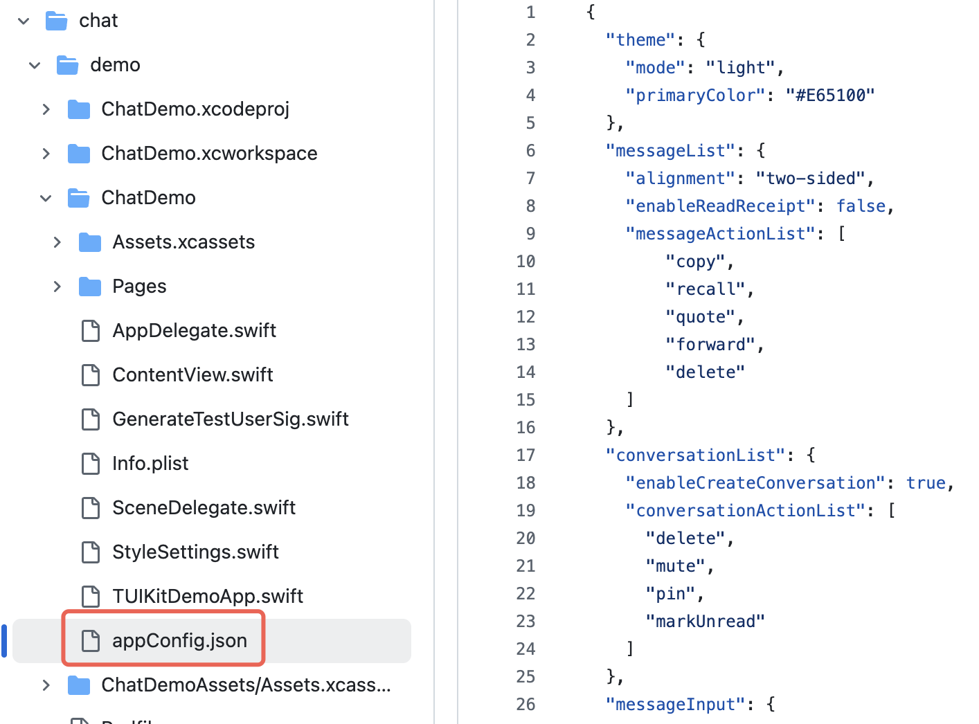
Step 2: Add the Configuration File to Your Project
Drag appConfig.json into your project, select the correct Target, and check Copy Bundle Resources.
For example, in the open-source demo TUIKit iOS SwiftUI, appConfig.json is located in the main bundle under demo/ChatDemo:
Step 3: Load the Configuration File
Set the JSON file path and load the configuration at app launch. If appConfig.json is in the main bundle, you can access it like this:
import AtomicX@mainstruct MyApp: App {init() {// Load theme configuration fileif let path = Bundle.main.path(forResource: "appConfig", ofType: "json") {AppBuilderHelper.setJsonPath(path: path)}}var body: some Scene {WindowGroup {ContentView()// Inject ThemeState.shared at the root view of the app.environmentObject(ThemeState.shared)}}}
Now, without writing any extra code, your app will automatically use the theme mode and primary color defined in appConfig.json when it launches.
Option B: Set Theme Mode in Code
You can set the theme mode directly using the
setThemeMode API. themeState is the ThemeState.shared singleton object accessed from the environment. Example:import SwiftUIimport AtomicXstruct SettingsView: View {@EnvironmentObject var themeState: ThemeStatevar body: some View {List {Section("Appearance Mode") {Button("Follow System") {themeState.setThemeMode(.system)}Button("Light Mode") {themeState.setThemeMode(.light)}Button("Dark Mode") {themeState.setThemeMode(.dark)}}}.navigationTitle("Settings")}}
Option C: Set Primary Color in Code
Set the primary color using the
setPrimaryColor API. Just provide a Hex color value, and all TUIKit SwiftUI components will automatically adapt matching colors for different UI elements—no manual adjustments needed. Example:struct CustomColorPicker: View {@EnvironmentObject var themeState: ThemeState@State private var customColor = "#1C66E5"var body: some View {VStack(spacing: 20) {TextField("Enter color value", text: $customColor).textFieldStyle(RoundedBorderTextFieldStyle()).placeholder(when: customColor.isEmpty) {Text("#1C66E5").foregroundColor(.gray)}Button("Apply Primary Color") {themeState.setPrimaryColor(customColor)}.disabled(!isValidHexColor(customColor))}.padding()}private func isValidHexColor(_ hex: String) -> Bool {let pattern = "^#[0-9A-Fa-f]{6}$"return hex.range(of: pattern, options: .regularExpression) != nil}}
Usage Recommendations:
For most apps, use the JSON configuration file method. It’s simple, reliable, and ensures cross-platform consistency.
Use colors from
themeState.colors throughout your app to keep the appearance consistent when switching themes.FAQs
How do I check if the current mode is dark mode?
if themeState.isDarkMode {// Currently in dark mode} else {// Currently in light mode}
How can I see the effect immediately after setting the primary color?
The UI updates automatically after you set the primary color, since
ThemeState is an ObservableObject. Make sure your views use @EnvironmentObject or @ObservedObject to observe changes.Can I set transparency?
Not supported. The primary color only accepts 6-digit Hex format (RGB), not 8-digit (RGBA). To add transparency, use the
.opacity() modifier with your color.How do I restore the default theme?
themeState.clearPrimaryColor() // Remove custom primary colorthemeState.setThemeMode(.system) // Switch to system mode
Where is the theme configuration stored?
It’s saved in
UserDefaults under the key "BaseComponentThemeKey". The configuration is removed when the app is uninstalled and resets to default after reinstalling.How do I get the full configuration for the current theme?
let config = themeState.currentThemeprint("Mode: \(config.mode)")print("Primary Color: \(config.primaryColor ?? "Default")")
Can I set both mode and primary color at the same time?
Yes. Call both methods separately; the system will automatically combine the settings:
themeState.setThemeMode(.dark)themeState.setPrimaryColor("#0ABF77")

