
外観を定義する
TUIKit Flutter offers flexible appearance customization with support for Light, Dark, and System theme modes, along with customizable primary colors. A simple configuration enables theme switching and brand color application throughout your app.
For example, in the message list, you can see how different theme modes and primary colors affect the UI:
Light + Default Color | Light + Orange | Dark + Default Color | Dark + Green Theme |
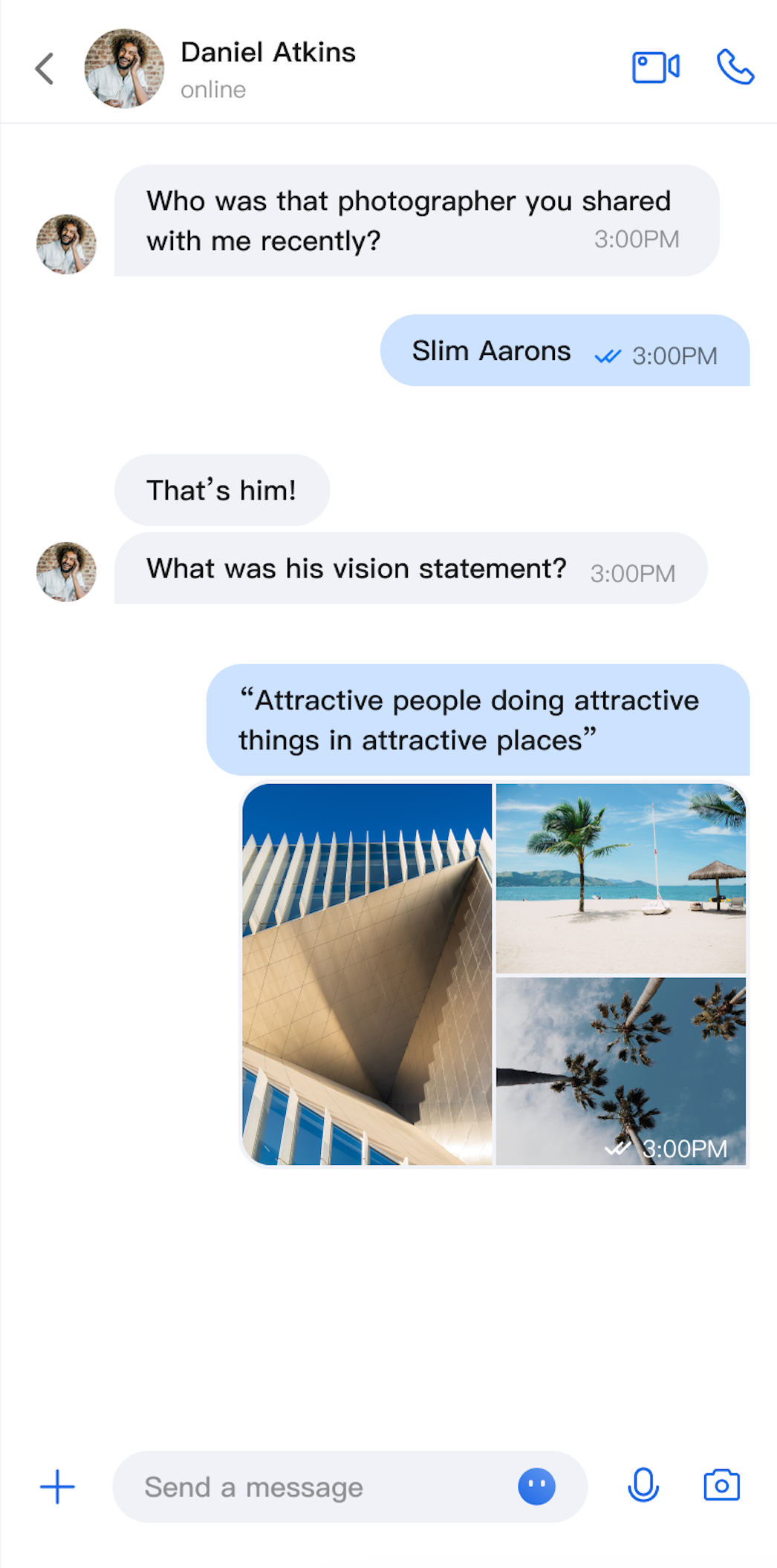 | 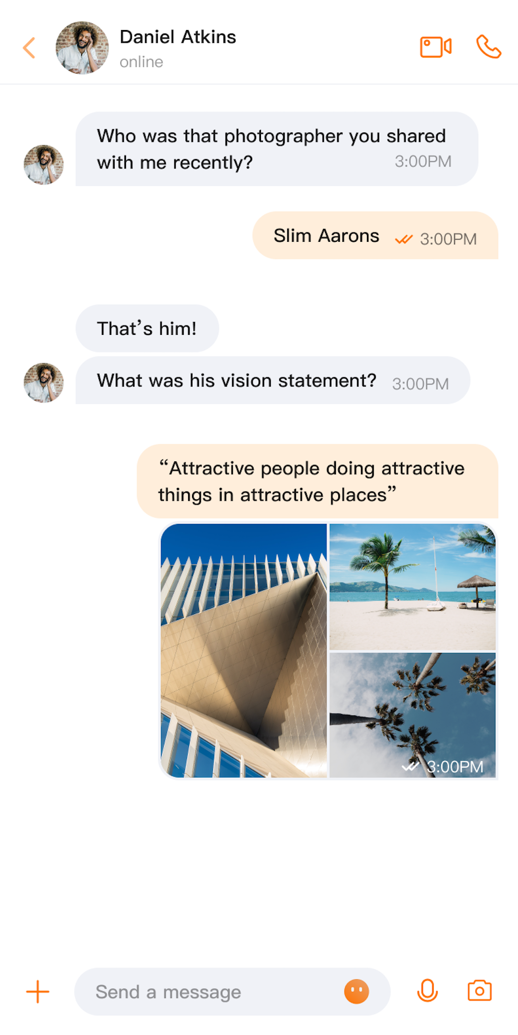 | 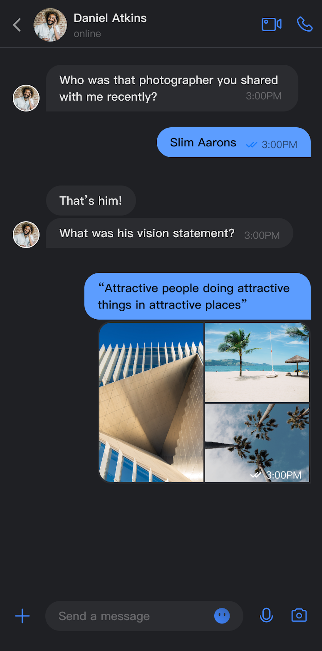 | 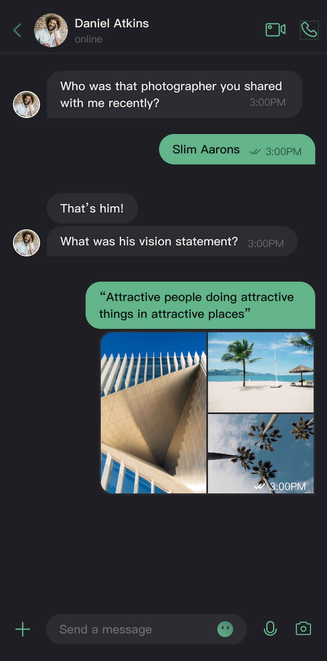 |
Core Features
Theme Mode
Light Mode: Provides a bright interface for daytime use.
Dark Mode: Displays a dim interface for low-light environments.
System Mode: Automatically matches the system's appearance setting.
Primary Theme Color Customization
Preset Theme Colors: Choose from built-in options like blue, green, red, orange, and more.
Custom Theme Colors: Set any Hex color value to match your brand.
Smart Palette Generation: Automatically creates a palette of 10 color shades based on your selected color.
Reset to Default: Easily revert to the default theme color with one click.
API Reference
All theme configuration and queries are managed through the
ThemeState API.Setting Theme Mode
Method | Parameter | Return Value | Description |
setThemeMode | ThemeType | void | Sets the theme mode, saves the setting, and refreshes the UI. ThemeType.SYSTEM: Follows system settings.ThemeType.LIGHT: Enables light mode.ThemeType.DARK: Enables dark mode. |
Setting Primary Theme Color
Method | Parameter | Return Value | Description |
setPrimaryColor | String | Unit | Sets the primary theme color using a Hex string (e.g., "#1C66E5"). |
clearPrimaryColor | None | Unit | Removes the custom theme color and resets to the default blue. |
Notes:
Both
setThemeMode and setPrimaryColor automatically persist the configuration. No manual save is required. Settings are restored on app startup.Changing theme configuration automatically clears the cache to ensure real-time updates. Manual cache management is not needed.
Avoid calling theme APIs repeatedly (such as within loops).
Querying ThemeState
Use the following read-only properties to retrieve the current theme configuration:
Property | Type | Description |
currentMode | ThemeType | The current theme mode. |
currentPrimaryColor | String? | The current primary theme color (Hex value). |
hasCustomPrimaryColor | Boolean | Indicates if a custom primary color is set. |
isDarkMode | Boolean | Indicates if dark mode is active. |
Usage
This section covers how to integrate and apply theme and color customization in your app, with three recommended approaches ranging from basic to advanced.
Project Setup
Wrap your app's entry point with
ComponentTheme and configure MaterialApp as shown below. For implementation details, see the demo:@overrideWidget build(BuildContext context) {return ComponentTheme(child: MultiProvider(providers: [ChangeNotifierProvider.value(value: LocaleProvider()),],child: Builder(builder: (context) {final themeState = BaseThemeProvider.of(context);final isDarkMode = themeState.isDarkMode;// ...... other configuration omittedreturn MaterialApp(themeMode: isDarkMode ? ThemeMode.dark : ThemeMode.light,// ...... other configuration omitted);}),),);
Option A: Configure with AppBuilder (Recommended)
AppBuilder is a flexible tool for customizing features and UI through a unified JSON configuration file. It is ideal for maintaining consistent appearance across Web and Native apps.
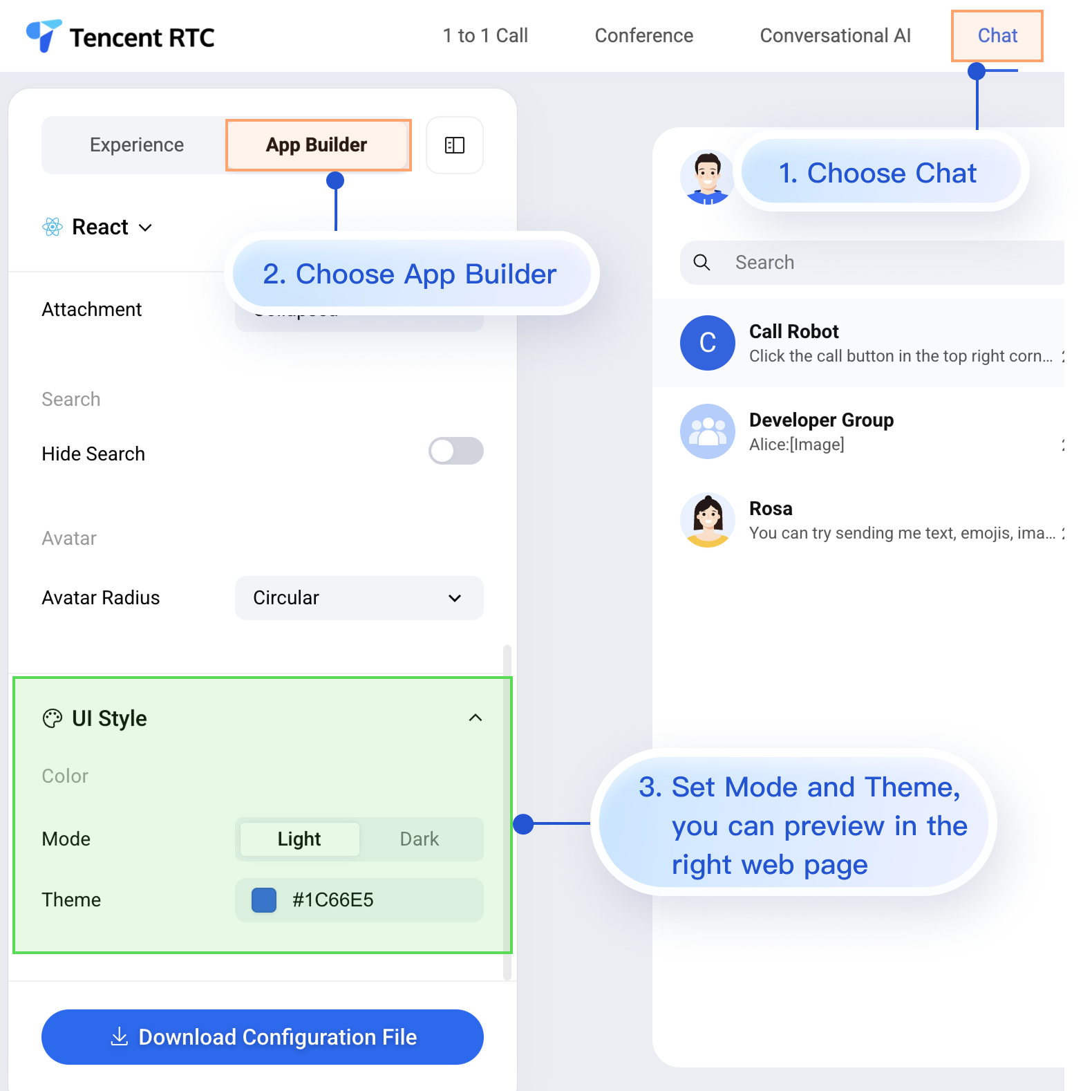
While the Chat Web Demo does not currently preview mobile configuration in real time, mobile projects fully support AppBuilder configuration.
Follow the steps below to apply your AppBuilder settings from the Web Demo to your mobile project:
1. Download the configuration file.
2. Add the appConfig.json file to your Flutter project.
3. Load the configuration file on app startup.
Step 1: Download the Configuration File

Below is an example of
appConfig.json. Configuration items map directly to fields in AppBuilder. Appearance settings are located under the theme section:{"theme": {"mode": "light", // Theme mode: "light" for Light Mode, "dark" for Dark Mode, "system" to follow device settings"primaryColor": "#E65100" // Primary color in Hex format},"messageList": {"alignment": "two-sided","enableReadReceipt": false,"messageActionList": ["copy","recall","quote","forward","delete"]},"conversationList": {"enableCreateConversation": true,"conversationActionList": ["delete","mute","pin","markUnread"]},"messageInput": {"hideSendButton": false,"attachmentPickerMode": "collapsed"},"search": {"hideSearch": false},"avatar": {"shape": "circular"}}
Configuration Options
Parameter | Type | Options | Description |
mode | String | "system", "light", "dark" | Theme mode |
primaryColor | String | Hex value, e.g., "#0ABF77" | Primary theme color |
Step 2: Add the Configuration File to Your Project
Drag appConfig.json into your project. For example, in the TUIKit Flutter demo, appConfig.json is placed in the assets folder:
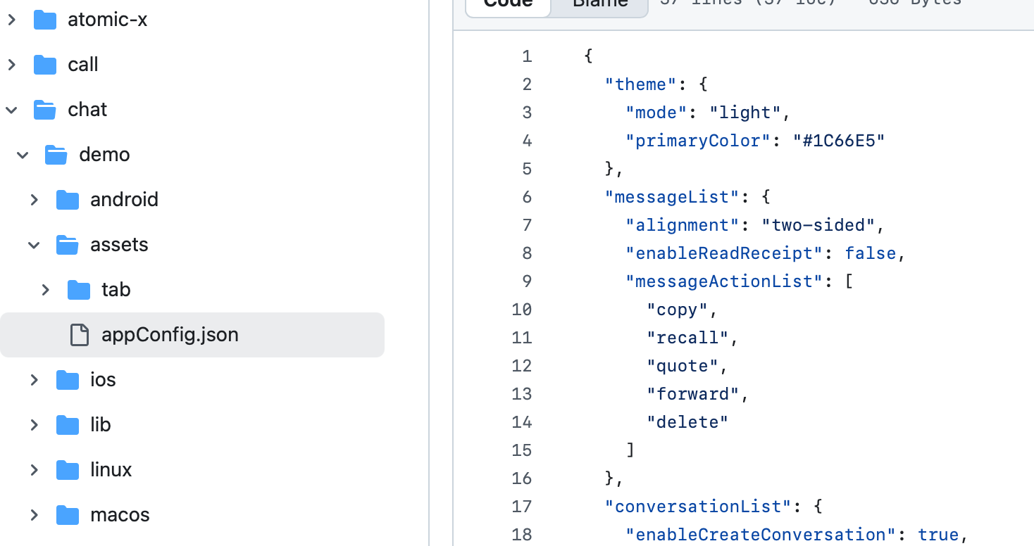
Declare the assets resource in your pubspec.yaml file:
assets:- assets/
Step 3: Load the Configuration File
Specify the JSON file path and load it during app initialization:
class _MyAppState extends State<MyApp> {bool _isInitialized = false;@overridevoid initState() {super.initState();_initializeApp();}Future<void> _initializeApp() async {await StorageUtil.init();await AppBuilder.init(configPath: 'packages/uikit_next/assets/appConfig.json');if (mounted) {setState(() {_isInitialized = true;});}}}
Once configured, TUIKit Flutter components will automatically use the theme mode and primary color defined in appConfig.json when the app starts.
Option B: Set Theme Mode in Code
Set the theme mode directly using the
setThemeMode API. Example:val themeState = ThemeState.sharedColumn {Button(onClick = {themeState.setThemeMode(ThemeMode.SYSTEM)}) { Text(text = "Follow System") }Button(onClick = {themeState.setThemeMode(ThemeMode.LIGHT)}) { Text(text = "Light Mode") }Button(onClick = {themeState.setThemeMode(ThemeMode.DARK)}) { Text(text = "Dark Mode") }}
Option C: Set Primary Color in Code
Set the primary theme color using the
setPrimaryColor API. Provide a Hex color value, and TUIKit Flutter will automatically generate a full palette for UI components. No manual color adaptation is required.final themeState = BaseThemeProvider.of(context);themeState.setPrimaryColor('#1C66E5');
Recommendations:
For most use cases, we recommend managing appearance via a JSON configuration file for simplicity, reliability, and cross-platform consistency.
Always use colors from
themeState.colors throughout your app to maintain a consistent look when switching themes.FAQs
How do I check if dark mode is active?
if (themeState.isDarkMode) {// Currently in dark mode} else {// Currently in light mode}
Can I set transparency for the theme color?
No. Only 6-digit Hex codes (RGB) are supported; 8-digit Hex (RGBA) formats are not allowed.
How do I reset to the default theme?
themeState.clearPrimaryColor() // Removes custom theme colorthemeState.setThemeMode(ThemeType.SYSTEM) // Switches to system default mode
Where is theme configuration saved?
Theme settings are stored in the app's persistent storage. If the app is uninstalled, the configuration is removed and reset to default on reinstall.
How do I retrieve the current theme configuration?
final themeState = BaseThemeProvider.of(context);final config = themeState.currentTheme;print("Mode: ${config.type}");print("Primary color: ${config.primaryColor ?? "Default"}");
Can I set both theme mode and primary color at the same time?
Yes. You can call both methods independently, and the system will merge the settings automatically:
themeState.setThemeMode(ThemeType.DARK)themeState.setPrimaryColor("#0ABF77")

