
視聴者リスト
This guide walks you through integrating the Audience List Component (LiveAudienceList) into your application. You can quickly add our pre-built component using the examples below, or fully customize its styles and layout following the customization section.
Core Features
Feature Category | Specific Capabilities |
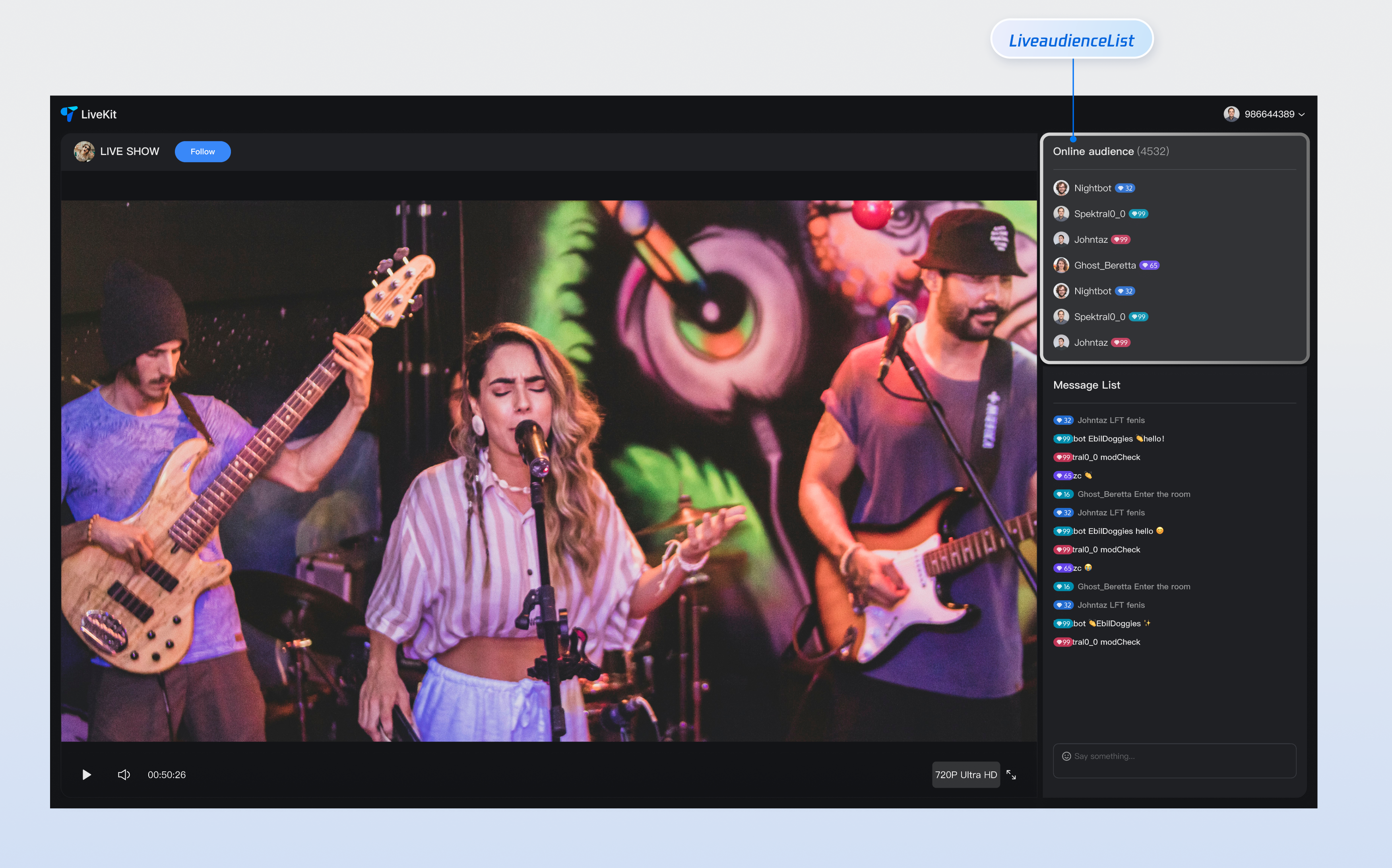
Real-time Audience Display | Displays the current list of viewers in the live room in real-time, showing avatars and nicknames. This gives hosts a clear view of who's watching and helps them understand their audience composition. |
Responsive Design | Includes separate UI layouts for desktop and mobile devices. The component automatically adapts to different screen sizes, ensuring a consistent experience across platforms. |
Customizable UI | Offers flexible slot mechanisms for customizing audience badges, avatar styles, and other UI elements. Tailor the audience list to match your brand and design requirements. |
Component Integration
Step 1: Prerequisites
Before quick integration, you need to refer to Preparation to meet the relevant environment configuration and activate the corresponding services.
Step 2: Install Dependencies
npm install tuikit-atomicx-react @tencentcloud/uikit-base-component-react --savenpm install sass --save-dev
pnpm add tuikit-atomicx-react @tencentcloud/uikit-base-component-reactpnpm add sass --dev
yarn add tuikit-atomicx-react @tencentcloud/uikit-base-component-reactyarn add sass --dev
Step 3: Integrate Audience List Component
Import and use the Audience List Component in your project. Copy the following code example to display the live room audience list.
import React from "react";import { useUIKit } from "@tencentcloud/uikit-base-component-react";import { useLiveAudienceState, LiveAudienceList } from "tuikit-atomicx-react";import styles from "./AudienceList.module.scss";const AudienceList: React.FC = () => {const { t } = useUIKit();const { audienceCount } = useLiveAudienceState();return (<div className={styles.livePlayer__audienceList}><div className={styles.livePlayer__audienceListTitle}><span>{t('live_player_view.audience_list_title')} </span><span className={styles.livePlayer__audienceCount}>({audienceCount})</span></div><div className={styles.livePlayer__audienceListContent}><LiveAudienceList height="100%" /></div></div>);};export default AudienceList;
.livePlayer__audienceList {display: flex;flex-direction: column;flex-shrink: 0;height: 30%;padding: 8px;background: var(--uikit-bg-color-operate);.livePlayer__audienceListTitle {padding: 12px 0;border-bottom: 1px solid var(--uikit-stroke-color-primary);@include text-size-16;}.livePlayer__audienceCount {font-weight: 400;color: var(--uikit-text-color-secondary);}.livePlayer__audienceListContent {flex: 1;overflow: hidden;}}
Component Customization
Component Props
LiveAudienceList Props
Props | Type | Default Value | Required | Description |
children | (params: { audience: AudienceInfo; }) => React.ReactNode | - | No | Custom audience badge renderer (e.g., role badges, identity markers). Displayed between the avatar and nickname |
className | String | - | No | Custom CSS class name |
style | CSSProperties | - | No | Custom CSS style |
height | String | - | No | Audience list height |
AudienceInfo Data Type
Property | Type | Default Value | Description |
userId | String | - | Audience ID |
userName | String | - | Audience name (nickname) |
avatarUrl | String | - | Audience avatar URL |
userRole | Number | 2 | Audience role 0: Live room owner 1: Live room administrator 2: Regular audience |
isMessageDisabled | Boolean | false | Whether sending text and emoji messages is disabled |
joinedTimestamp | Number | 0 | Time when the audience joined the live room |
customInfo | Record<String, any> | - | User custom properties |
Example: Custom Audience Badges
import { LiveAudienceList } from 'tuikit-atomicx-react';import type { AudienceInfo } from 'tuikit-atomicx-react';// Custom component props, must match LiveAudienceList component children propsinterface CustomAudienceProps {params: {audience: AudienceInfo}}// User custom component, display user roleconst CustomAudience: React.FC<CustomAudienceProps> = ({ params }) => {return (<div className="custom-audience-item">{params.audience.userRole === 2 ? "[Audience]" : (params.audience.userRole === 1 ? "[Admin]" : "[Host]")}</div>);};const LivePlayer: React.FC<LivePlayerProps> = ({ className }) => {return (<div className={`${styles.livePlayer} ${className || ''}`}><div className={styles.livePlayer__audienceListContent}>{/* Set height, className, style properties */}<LiveAudienceList height="100%" className="my-class-name" style={{backgroundColor: "transparent"}}>{(params) => <CustomAudience params={params} />} {/* Use custom component in player page audience list to display user role */}</LiveAudienceList></div></div>);};
Next Steps
After integrating the audience list component, you can add more features like live gifting and chat messages. Check out the guides below to continue building your live streaming experience.
Feature | Description | Integration Guide |
Live Gift Component | Displays a gift catalog, supports sending gifts and gift animations. | |
Chat Barrage Component | Supports sending, receiving, and displaying text messages and emojis. |

