
メッセージレンダリングコンポーネント
This guide walks you through integrating the Chat Component, which includes the Message List Component (BarrageList) and the Message Input Component (BarrageInput). You can quickly add our pre-built components using the examples below, or fully customize their styles and layout following the customization section.
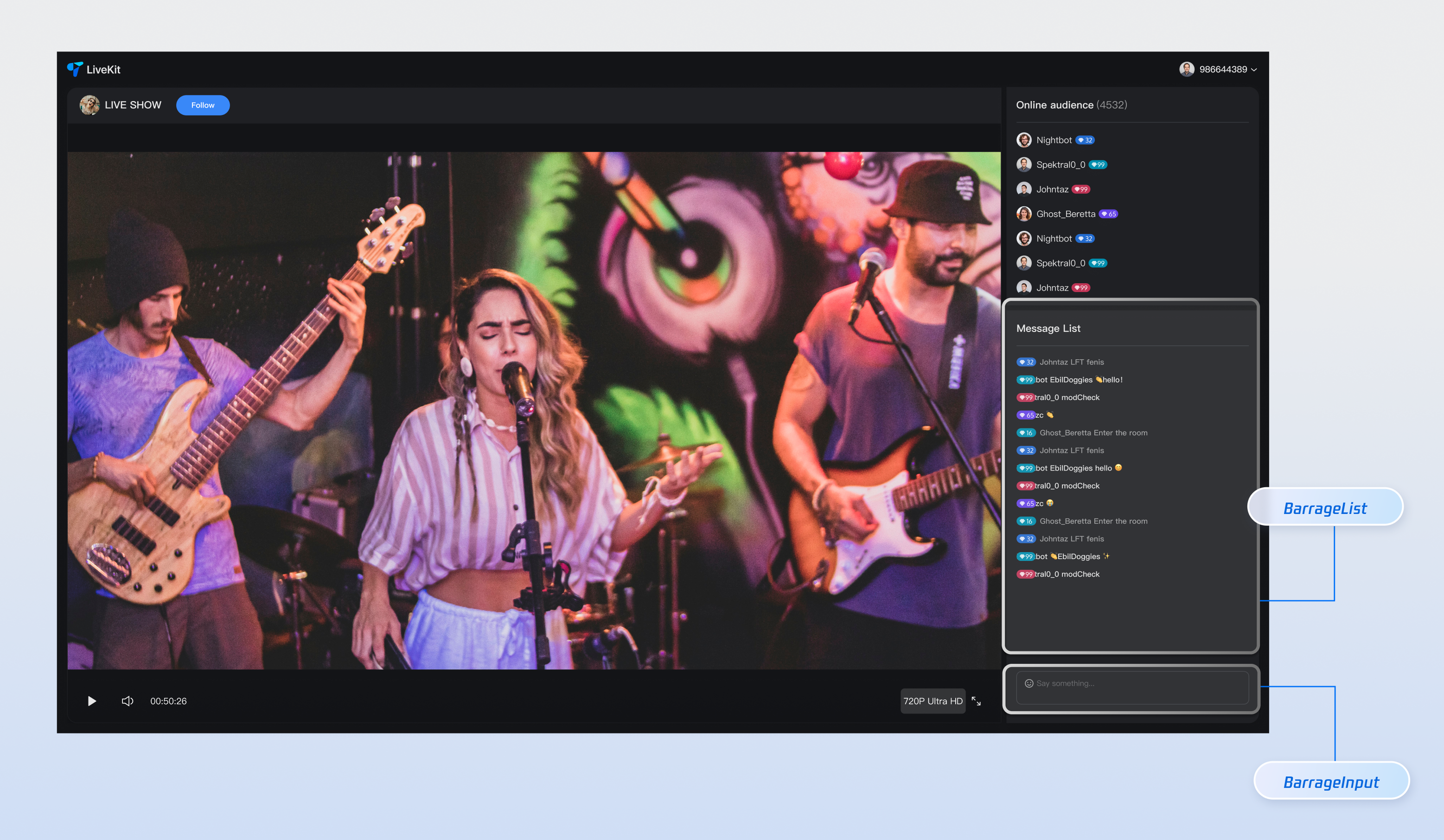
Component Structure
Component Name | Description |
Barrage Message Component (BarrageList) | Handles real-time display and management of chat messages, including message rendering, time-based grouping, user interactions, and responsive layouts. |
Message Input Component (BarrageInput) | Provides rich text editing and message sending capabilities, featuring an emoji picker, character limits, state management, and cross-platform support for a smooth messaging experience. |
Component Integration
Step 1: Prerequisites
Before integrating the component, refer to the Preparation Guide to configure your environment and activate the required services.
Step 2: Install Dependencies
npm install tuikit-atomicx-react @tencentcloud/uikit-base-component-react --savenpm install sass --save-dev
pnpm add tuikit-atomicx-react @tencentcloud/uikit-base-component-reactpnpm add sass --dev
yarn add tuikit-atomicx-react @tencentcloud/uikit-base-component-reactyarn add sass --dev
Step 3: Integrate Barrage Component
Import and use the live barrage component in your project. You can directly copy the following example code into your project to display the complete live room barrage message component and message input component.
import React from "react";import { useUIKit } from "@tencentcloud/uikit-base-component-react";import { BarrageList, BarrageInput } from "tuikit-atomicx-react";import styles from "./MessageList.module.scss";const MessageList: React.FC = () => {const { t } = useUIKit();return (<div className={styles.livePlayer__messageList}><div className={styles.livePlayer__messageListTitle}><span>{t('live_player_view.message_list_title')}</span></div><div className={styles.livePlayer__messageListContent}><BarrageList /><BarrageInput /></div></div>);};export default MessageList;
.livePlayer__messageList {display: flex;flex-direction: column;flex: 1 0 auto;margin-top: 8px;padding: 8px;background: var(--uikit-bg-color-operate);.livePlayer__messageListTitle {padding: 12px 0;border-bottom: 1px solid var(--uikit-stroke-color-primary);@include text-size-16;}.livePlayer__messageListContent {display: flex;flex: 1;flex-direction: column;}}
Customization
The barrage message component and message input component provide rich Props attributes for functionality and UI display settings.
Barrage Message Component (BarrageList)
Props | Type | Default Value | Description |
Message | Component | IBarrageMessageComponentProps | Custom message component renderer. |
containerStyle | CSSProperties | - | Custom message list container style. |
itemStyle | CSSProperties | - | Custom single message item style. |
height | String | - | Component height, supports CSS units. |
style | CSSProperties | - | Custom style for the root element. |
className | String | - | Custom CSS class name set on the component root DOM node. |
Message Input Component (BarrageInput)
Props Name | Type | Default Value | Description |
containerClass | String | '' | Custom container CSS class name. |
containerStyle | CSSProperties | {} | Custom container inline style. |
width | String | - | Component width, supports CSS units. |
height | String | - | Component height, supports CSS units. |
minHeight | String | '40px' | Component minimum height, supports CSS units. |
maxHeight | String | '140px' | Component maximum height, supports CSS units. |
placeholder | String | - | Input box placeholder text. |
disabled | Boolean | false | Whether to disable the input box. |
autoFocus | Boolean | true | Whether to auto-focus the input box. |
maxLength | Number | 80 | Maximum character limit for input content. |
onFocus | () => void | - | Input box focus event handler. |
onBlur | () => void | - | Input box blur event handler. |
Examples
Customizing Styles and Dimensions
// Message List<BarrageListclassName="custom-barrage-list-name"style={{backgroundColor: "#FFFFFF"}}containerStyle={{backgroundColor: "#999999"}}itemStyle={{backgroundColor: "#000000"}}height="200px" />// Message Input<BarrageInputclassName="custom-barrage-input-name"autoFocusdisabled={false}width="100%"height="100px"placeholder="Enter barrage message"/>
Custom Message
import React from 'react';import { BarrageList } from 'tuikit-atomicx-react';import type { Barrage } from 'tuikit-atomicx-react';interface ICustomMessageComponentProps {message: Barrage;isLastInChunk?: boolean;style?: React.CSSProperties;}const CustomMessage: React.FC<ICustomMessageComponentProps> = ({ message }) => {return (<div className="my-message-item">{message.sender.userName}: {message.textContent}</div>);};// Use custom message component in the message list<BarrageListMessage={CustomMessage}/>
Next Steps
After integrating the chat component, you can add more features like live gifting and audience lists. Check out the guides below to continue building your live streaming experience.
Feature | Description | Integration Guide |
Live Gift Component | Displays a gift catalog, supports sending gifts and gift animations. | |
Audience List Component | Displays current viewers in the live room. |

