
Conversation List
ConversationList is primarily responsible for the List function. It contains the Header part and List part, and has features such as search session, create session, session pinning, and delete conversation.This document introduces in detail the foundation usage, customization, freely combine components, and the props parameter list.
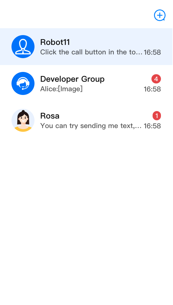
Session List | Session Operation | Conversation Search | Create Session |
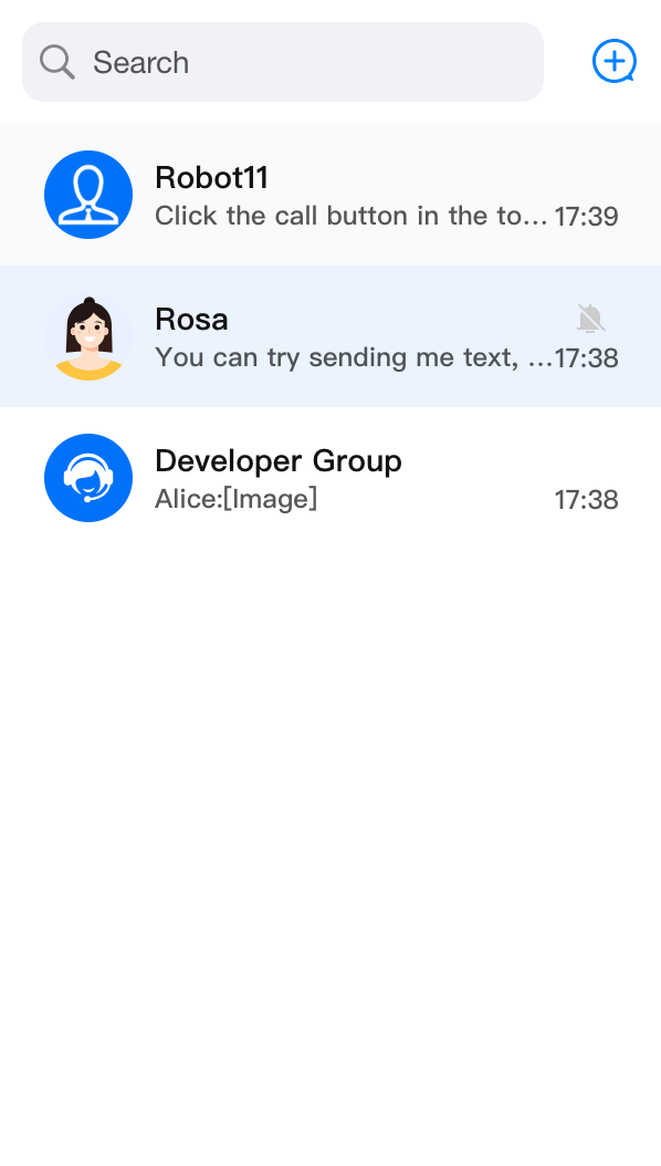 | 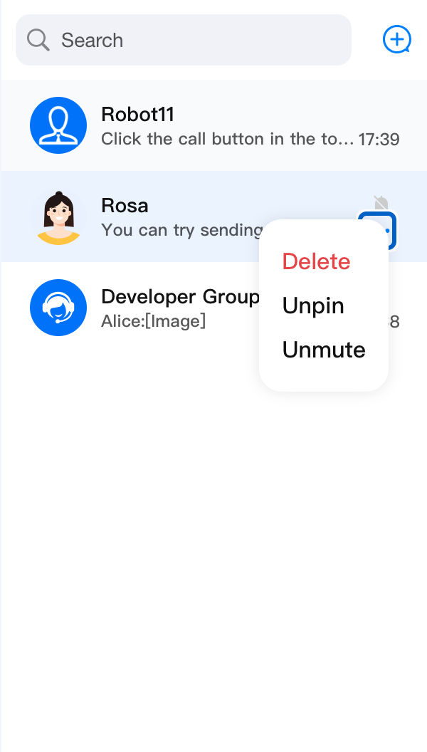 | 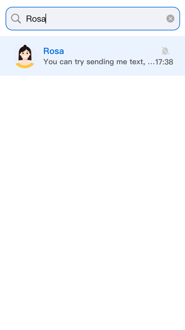 | 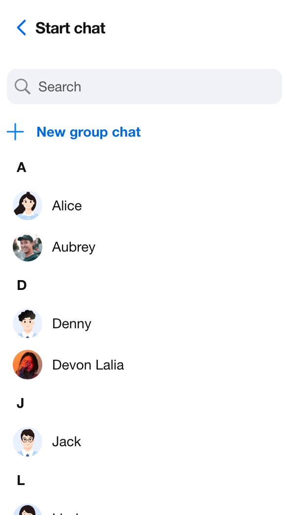 |
Basic Usage
ConversationList component has no required properties. You can use ConversationList through the following code.import { UIKitProvider, ConversationList } from '@tencentcloud/chat-uikit-react';const App = () => {return (<UIKitProvider><ConversationList /></UIKitProvider>);};
Customize Component
ConversationList provides user-customized and multidimensional Props API, allowing users to customize features, UI, modules and more.ConversationList provides multiple replaceable subcomponents, allowing users to customize Header, List, ConversationPreview, ConversationCreate, ConversationSearch, ConversationActions, Avatar, Placeholder and more. Meanwhile, users can also leverage default subcomponents to do secondary development and customization.Basic Feature Switch
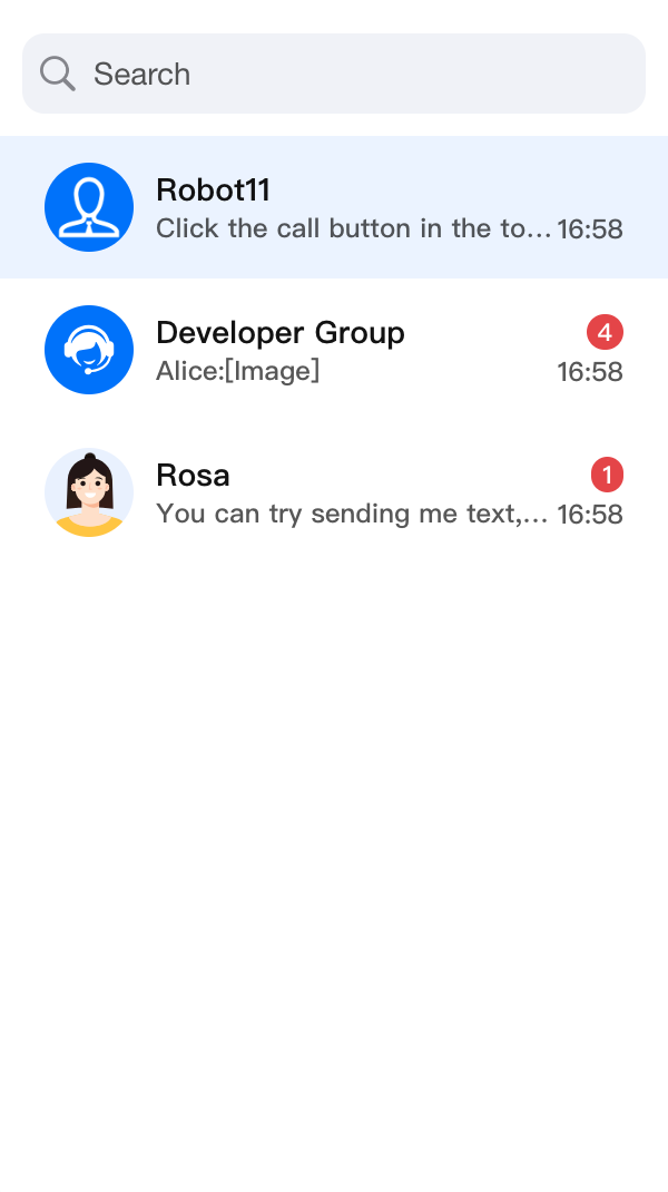
By setting
enableSearch, enableCreate and enableActions parameters, you can flexibly control the display of conversation search, session creation and conversation action features in ConversationList.<ConversationList enableSearch={false} />
<ConversationList enableCreate={false} />
<ConversationList enableActions={false} />
enableSearch={false} | enableCreate={false} | enableActions={false} |
 |  |  |
Data Filtering and Sorting
The ConversationList component provides
filterConversation and sortConversation attributes, allowing you to filter and sort conversation list data.Filter Conversations
To filter conversation list data, you can pass a filter function to the
filterConversation attribute. This function receives a ConversationModel array as parameter and should return a new array that only contains conversations meeting your criteria.Here is an example of using the
filterConversation attribute to only show conversations with "unread messages":import { ConversationList } from '@tencentcloud/chat-uikit-react';import type { ConversationModel } from '@tencentcloud/chat-uikit-react';<ConversationListfilter={(conversationList: ConversationModel[]) =>conversationList.filter(conversation => conversation.unreadCount > 0)}/>
Sorting Conversations
To sort conversation list data, you can pass a sorting function to the
sortConversation attribute. This function receives a ConversationModel array as parameter and should return a new array with conversations sorted according to your criteria.Here is an example of using the
sortConversation property to sort the conversation list in descending order by "latest message time":import { ConversationList } from '@tencentcloud/chat-uikit-react';import type { ConversationModel } from '@tencentcloud/chat-uikit-react';<ConversationListsort={(conversationList: ConversationModel[]) =>conversationList.sort((a, b) => (+(b?.lastMessage?.lastTime || 0)) - (+(a?.lastMessage?.lastTime || 0)),)}/>
By using the
filter and sort attributes, you can efficiently filter and sort conversation list data according to your needs.Custom ActionsConfig
import { ConversationList } from '@tencentcloud/chat-uikit-react';import type { ConversationModel } from '@tencentcloud/chat-uikit-react';<ConversationListactionsConfig={{enablePin: false,onConversationDelete: (conversation: ConversationModel) => { console.log('Delete conversation success'); },customConversationActions: {'custom-actions-1': {label: 'custom-actions',onClick: (conversation: ConversationModel) => { console.log(conversation); },},},}}/>
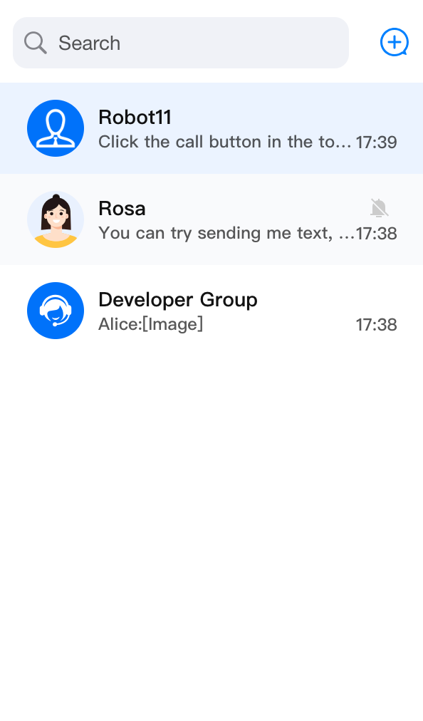
enablePin: false | enableDelete: false | enableMute: false | customConversationActions |
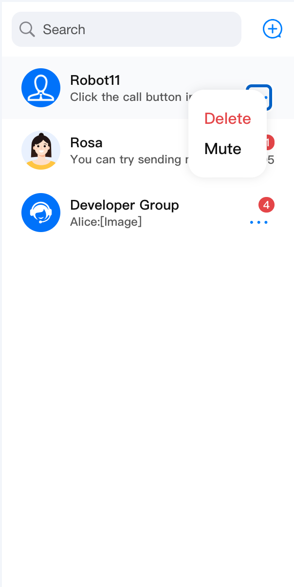 | 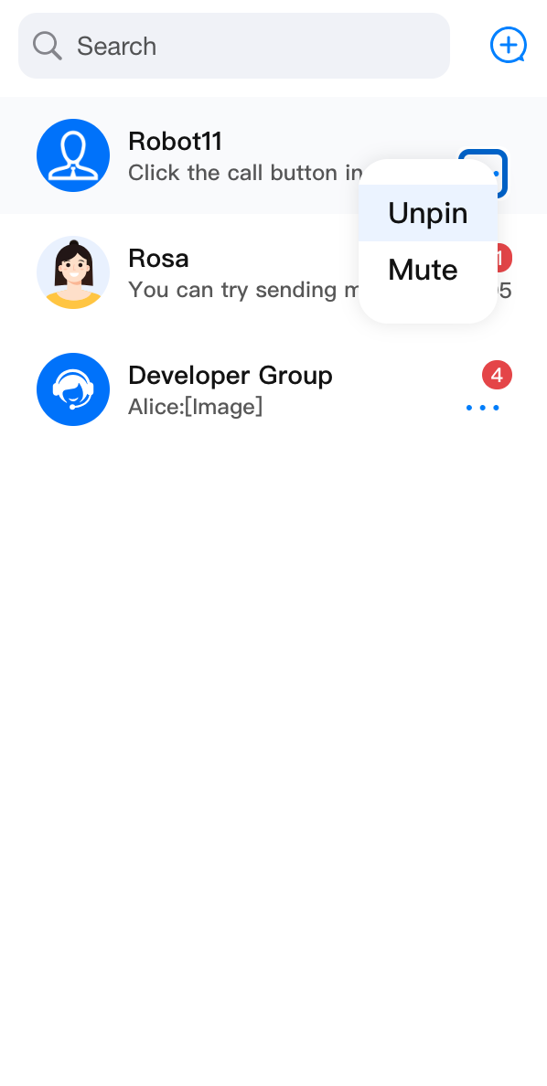 | 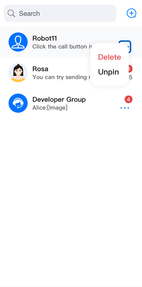 | 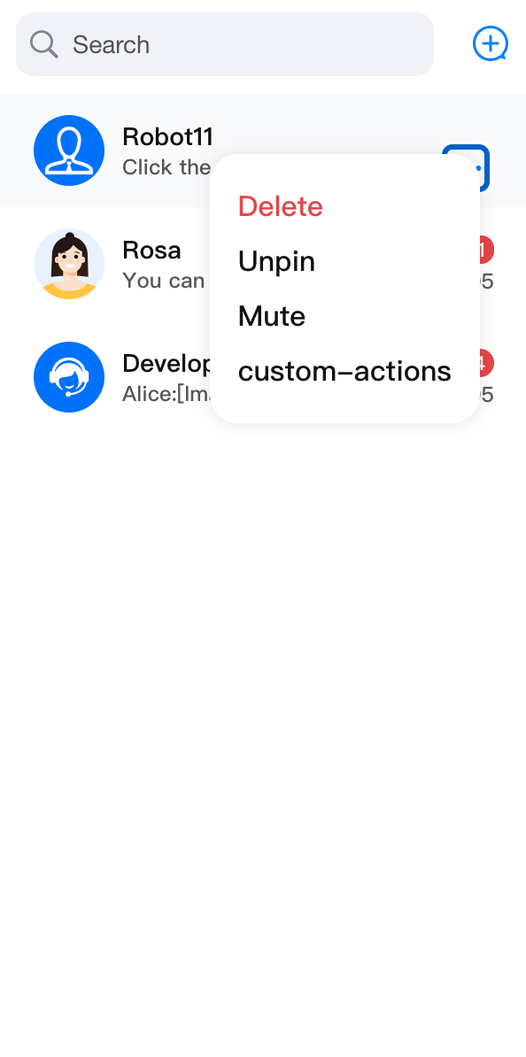 |
Custom Placeholder
You can customize the list display in different statuses by importing
PlaceholderEmptyList, PlaceholderLoading, and PlaceholderLoadError.Here is an example of customizing a new
PlaceholderLoading:<ConversationListPlaceholderEmptyList={<div>Empty List!!!</div>}/>
Custom Header
ConversationListHeader is responsible for rendering the header part of ConversationList, acting as a wrapping layer to render the default ConversationSearch and ConversationCreate. You can customize it by importing left, right such as attributes, and you can also customize the entire component.Props
Parameter Name | Type | Default Value | Description |
children | ReactNode | - | Custom session list header center component. When used in <ConversationList>, it imports <ConversationSearch> and <ConversationCreate> by default. |
left | ReactElement | - | Custom session list header left component. |
right | ReactElement | - | Custom session list header right component. |
className | String | - | Specify the custom name for the root element's CSS class. |
style | React.CSSProperties | - | Specify the custom style for the root element. |
Basic Customization
The following is an example of adding a new function button on the right side of the Header Component.
import {ConversationList,ConversationListHeader,} from '@tencentcloud/chat-uikit-react';import type { ConversationListHeaderProps } from '@tencentcloud/chat-uikit-react';const CustomConversationListHeader = (props: ConversationListHeaderProps) => {const CustomIcon = <div>Custom Icon</div>;return (<ConversationListHeader {...props} right={CustomIcon} />);};<ConversationList Header={CustomConversationListHeader} />
Advanced Customization
Here is a simplified conversation grouping feature that distinguishes by All, unread conversation, one-on-one chat session, and group chat across four key dimensions. Click different group buttons to execute different filtering rules.
Before Modification | After Modification |
 | 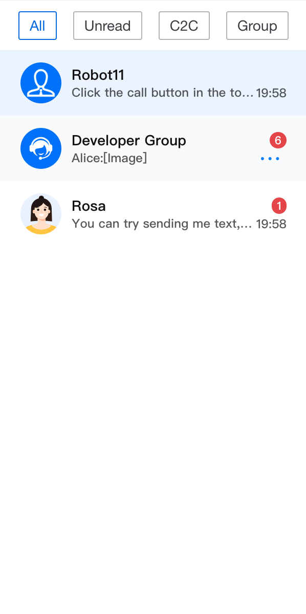 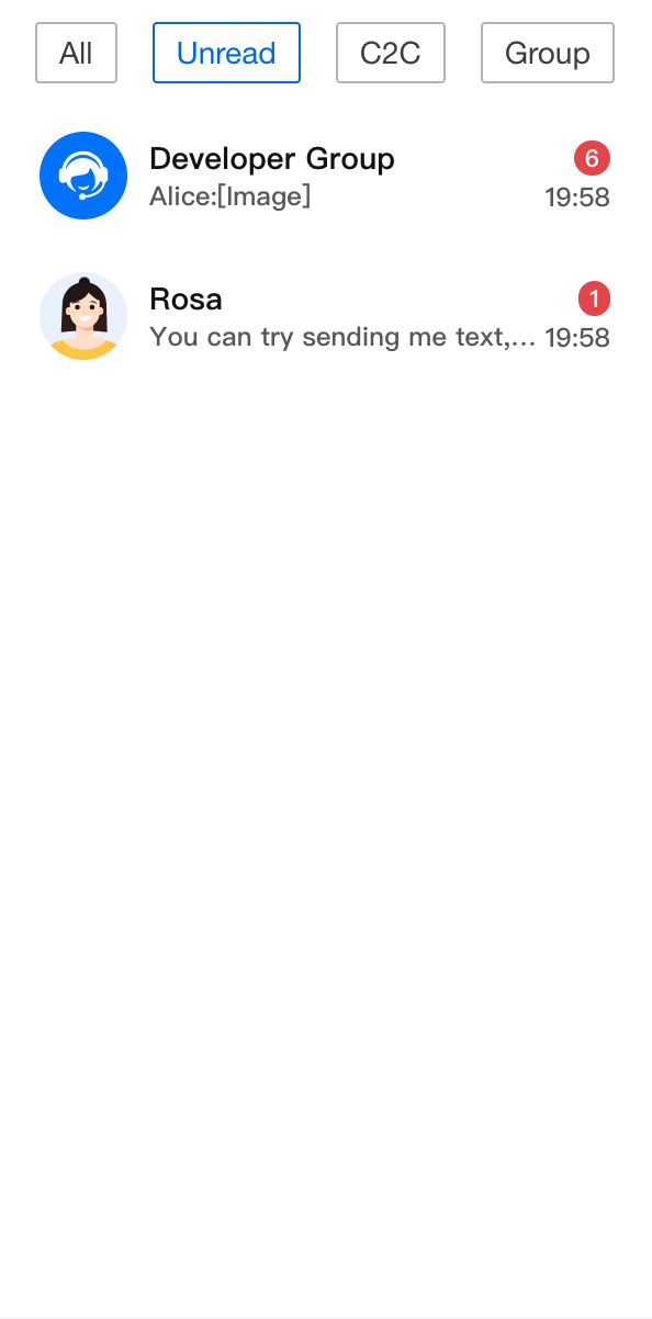 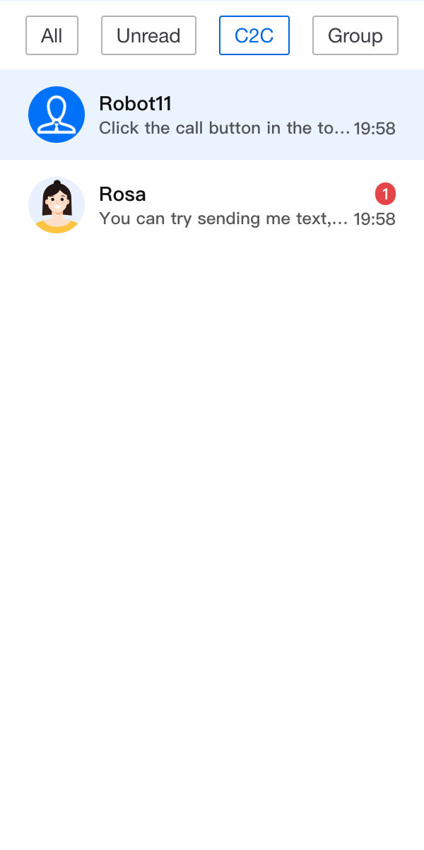 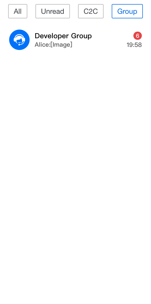 |
import { useState } from 'react';import TUIChatEngine from '@tencentcloud/chat-uikit-engine';import { ConversationList, UIKitProvider } from '@tencentcloud/chat-uikit-react';import type { ConversationListHeaderProps, ConversationModel } from '@tencentcloud/chat-uikit-react';const App = () => {const [currentFilter, setCurrentFilter] = useState<string>('all');const conversationGroupFilter: Record<string, (conversationList: ConversationModel[]) => ConversationModel[]> = {all: (conversationList: ConversationModel[]) => conversationList,unread: (conversationList: ConversationModel[]) => conversationList?.filter((item: ConversationModel) => item.unreadCount > 0),c2c: (conversationList: ConversationModel[]) => conversationList?.filter((item: ConversationModel) => item.type === TUIChatEngine.TYPES.CONV_C2C),group: (conversationList: ConversationModel[]) => conversationList?.filter((item: ConversationModel) => item.type === TUIChatEngine.TYPES.CONV_GROUP),};const CustomConversationListHeader = (props: IConversationListHeaderProps) => {return (<div className="conversation-group-wrapper"><button className={currentFilter === 'all' ? 'btn-active' : 'btn-default'} onClick={() => setCurrentFilter('all')}>All</button><button className={currentFilter === 'unread' ? 'btn-active' : 'btn-default'} onClick={() => setCurrentFilter('unread')}>Unread</button><button className={currentFilter === 'c2c' ? 'btn-active' : 'btn-default'} onClick={() => setCurrentFilter('c2c')}>C2C</button><button className={currentFilter === 'group' ? 'btn-active' : 'btn-default'} onClick={() => setCurrentFilter('group')}>Group</button></div>);};return (<UIKitProvider><ConversationListstyle={{ maxWidth: '300px', height: '600px' }}Header={CustomConversationListHeader}filter={conversationGroupFilter[currentFilter]}/></UIKitProvider>);};
.conversation-group-wrapper {display: flex;justify-content: space-around;align-items: center;margin: 10px;font-size: 14px;.btn-default{display: flex;padding: 5px 10px;border: 1px solid #b3b3b4;color: #3b3d43;background-color: transparent;border-radius: 2px;}.btn-active{display: flex;padding: 5px 10px;border: 1px solid #1c66e5;color: #1c66e5;background-color: transparent;border-radius: 2px;}}
Custom List
ConversationListContent is responsible for the rendering work of the main list in ConversationList.Render the precomputed current session list display data from Context as a wrapping layer by default
filteredAndSortedConversationList.Props
Parameter Name | Type | Default Value | Description |
children | ReactNode | - | Custom session list content area component. When used in <ConversationList>, it imports the <Preview> list traversed by filteredAndSortedConversationList by default. |
empty | Boolean | false | conversation list identifier bit, when used in <ConversationList>, it judges filteredAndSortedConversationList.length === 0 and imports. |
loading | Boolean | false | conversation list loading identifier bit, when used in <ConversationList>, it uses useConversationList() to get isLoading and imports. |
error | Boolean | false | conversation list load error identifier bit, when used in <ConversationList>, it uses useConversationList() to get isLoadError and imports. |
PlaceholderEmptyList | ReactNode | <PlaceHolder type={PlaceHolderTypes.NO_CONVERSATIONS} /> | Placeholder element when the custom session list is empty. |
PlaceholderLoading | ReactNode | <PlaceHolder type={PlaceHolderTypes.LOADING} /> | Placeholder element for loading custom session list. |
PlaceholderLoadError | ReactNode | <PlaceHolder type={PlaceHolderTypes.WRONG} /> | Placeholder element for custom session list load error. |
className | String | - | Specify the custom name for the root element's CSS class. |
style | React.CSSProperties | - | Specify the custom style for the root element. |
Basic Customization
List component UI effects in different statuses are as follows. The trigger timing for each status is handled inside ConversationList.Meanwhile, you can control the component status through custom input of
empty, loading, and error.import { ConversationList, ConversationListContent } from '@tencentcloud/chat-uikit-react';import type { ConversationListContentProps } from '@tencentcloud/chat-uikit-react';const CustomConversationListContent = (props: ConversationListContentProps) => {return <ConversationListContent {...props} loading={true} />;};<ConversationList List={CustomConversationListContent} />
default | empty={true} | loading={true} | error={true} |
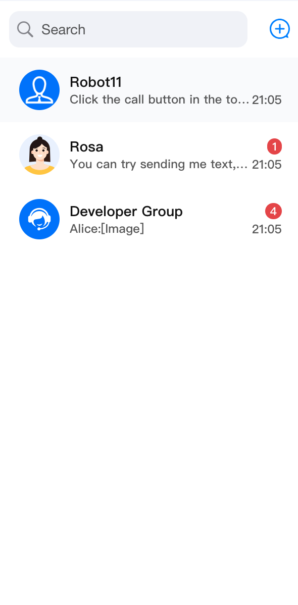 | 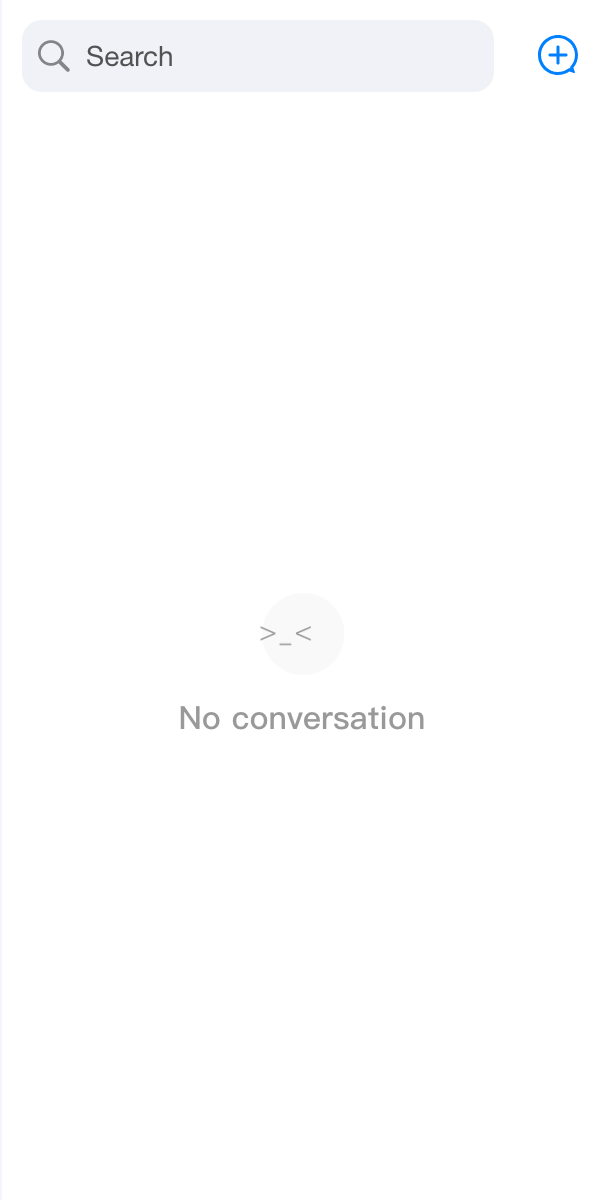 | 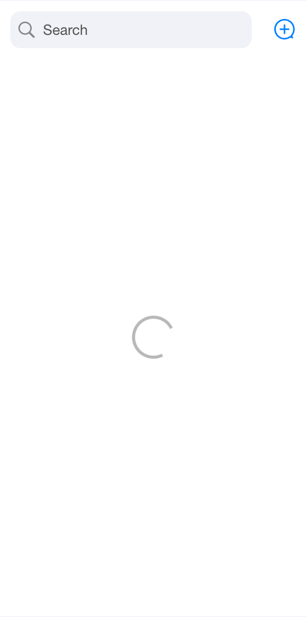 | 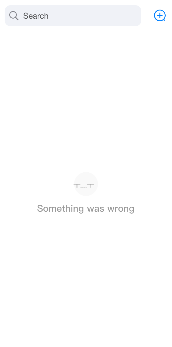 |
Custom Conversation Preview
<ConversationList ConversationPreview={CustomConversationPreview} />
Custom Conversation Actions
<ConversationList ConversationActions={CustomConversationActions} />
Customizing ConversationSearch
<ConversationList ConversationSearch={CustomConversationSearch} />
Customizing ConversationCreate
<ConversationList ConversationCreate={CustomConversationCreate} />
Custom Avatar
<ConversationList Avatar={CustomAvatar} />
Props
Parameter Name | Type | Default Value | Description |
enableSearch | Boolean | true | Control whether to display the Conversation Search feature. |
enableCreate | Boolean | true | Control whether to display the session creation feature. |
enableActions | Boolean | true | Control whether to display the conversation action feature. |
actionsConfig | ConversationActionsConfig | - | Used for custom session operation configuration. |
Header | ReactElement | Header | Custom Header component. |
List | ReactElement | List | Custom session list component. |
Preview | ReactElement | Custom session preview component. | |
ConversationCreate | ReactElement | ConversationCreate | Custom conversation component. |
ConversationSearch | ReactElement | Custom session search component. | |
ConversationActions | ReactElement | Custom Conversation Operation Component. | |
Avatar | ReactElement | Avatar | Custom avatar component. |
PlaceholderEmptyList | ReactNode | <PlaceHolder type={PlaceHolderTypes.NO_CONVERSATIONS} /> | Placeholder element when the custom session list is empty. |
PlaceholderLoading | ReactNode | <PlaceHolder type={PlaceHolderTypes.LOADING} /> | Placeholder element for loading custom session list. |
PlaceholderLoadError | ReactNode | <PlaceHolder type={PlaceHolderTypes.WRONG} /> | Placeholder element for custom session list load error. |
filter | (conversationList: ConversationModel[]) => ConversationModel[] | - | Functions for filtering session list. |
sort | (conversationList: ConversationModel[]) => ConversationModel[] | - | Functions for sorting session list. |
onConversationSelect | (conversation: ConversationModel) => void; | - | Click the callback function after the session, with the parameter being the clicked session object. |
onBeforeCreateConversation | (params: CreateParams) => CreateParams; | - | Custom action executed before session creation, with the parameter being the required parameters for creating a session. |
onConversationCreate | (conversation: ConversationModel) => void; | - | Callback function after session creation, with the parameter being the created session object. |
className | String | - | Specify the custom name for the root element's CSS class. |
style | React.CSSProperties | - | Specify the custom style for the root element. |

