
컬러 테마
Overview
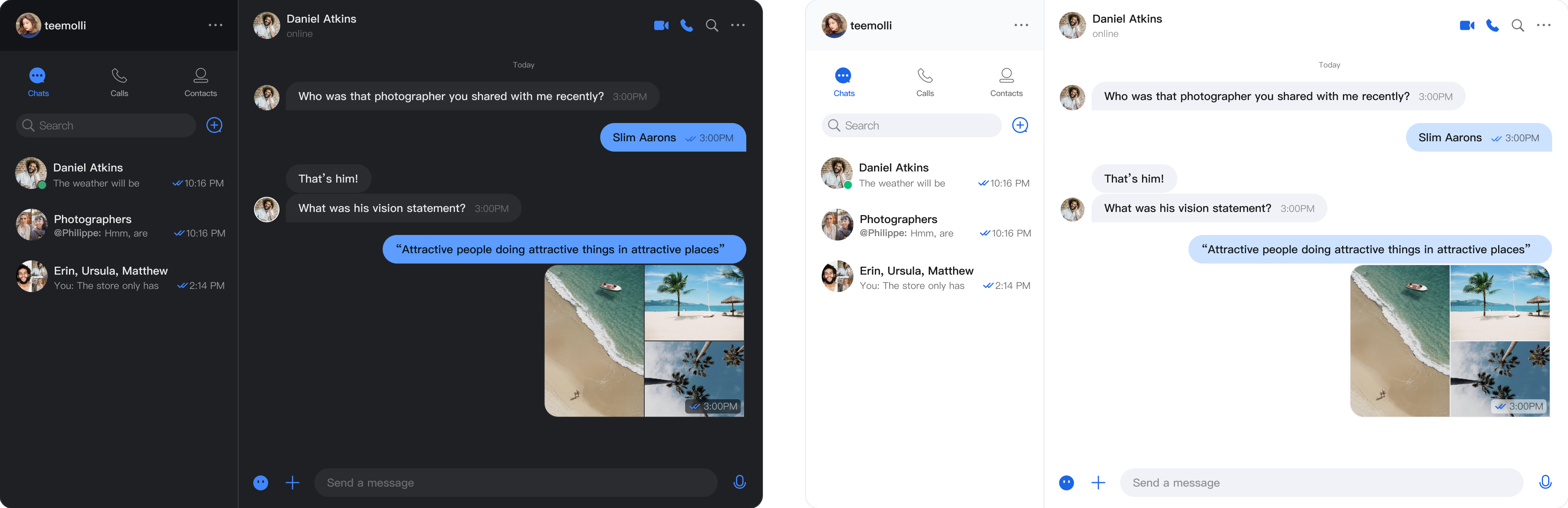
UIKit React component library provides a complete theme system, supporting light and dark theme switching. With simple configuration, it can provide consistent visual experience for your application.
Feature
Light and dark theme seamless switching
⚡ Real-time theme update
🔧 Simple and easy-to-use configuration
Quick Start
Basic Configuration
Use
UIKitProvider to wrap your application and set the theme option to theme="light". Besides, it also supports the dark theme theme="dark".import React from 'react';import { UIKitProvider, ConversationList, MessageList, ChatHeader, MessageInput, Chat } from '@tencentcloud/chat-uikit-react';function App() {return (<UIKitProvidertheme="dark"language="en-US"><div style={{ display: 'flex', height: '100vh' }}><ConversationList style={{ minWidth: '30%' }} /><Chat><ChatHeader /><MessageList /><MessageInput /></Chat></div></UIKitProvider>);}export default App;
Viewing and Switching Theme in Components
Use the
useUIKit Hook to access theme and language features.Note:
Note: Since the theme feature is implemented using React Context,
useUIKit() is unable to be called in the root component.import React from 'react';import { useUIKit } from '@tencentcloud/chat-uikit-react';function SubComponent() {const { theme, setTheme } = useUIKit();return (<div><p>Current theme: {theme}</p><button onClick={() => setTheme('dark')}>switch to dark theme</button><button onClick={() => setTheme('light')}>switch to light theme</button></div>);}function App() {return (<UIKitProvidertheme="dark"language="zh-CN"><div style={{ display: 'flex', height: '100vh' }}><ConversationList style={{ minWidth: '30%' }} /><Chat><SubComponent /><ChatHeader /><MessageList /><MessageInput /></Chat></div></UIKitProvider>);}export default App;

