
Android(Compose)
Component Overview
MessageList is a Jetpack Compose component designed to display and manage chat messages. It provides robust support for various message types and operations:
Supported message types: text, image, video, audio, file, system notification, emoji, and more.
Message actions: supports long-press menus for actions such as copy, delete, recall, and custom options.
Highly customizable: configure styles (bubble color, corner radius, font, etc.) and custom action items.
Chat Message List | Message Long-Press Menu |
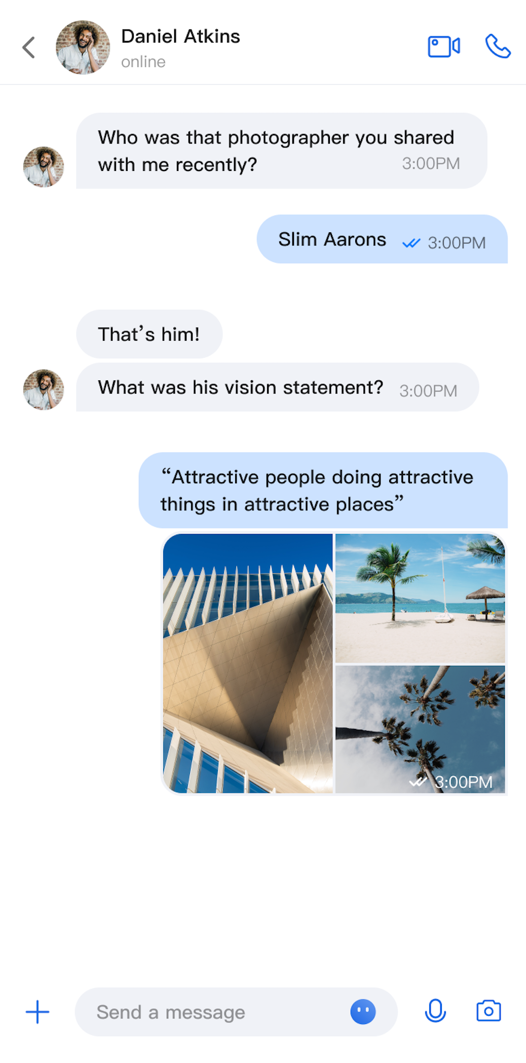 | 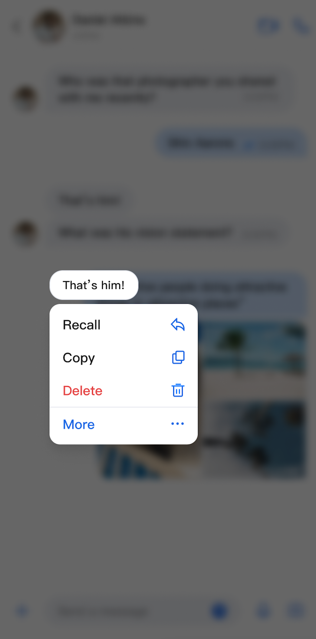 |
Component Integration
MessageList is part of TUIKit Compose. To use MessageList, integrate TUIKit Compose into your project. For integration instructions, see the TUIKit Compose documentation.
Component Structure
MessageList exposes only its initialization method; all other logic is handled internally.
Public Methods
Method | Parameter | Description |
MessageList | conversationID: String | Initializes the component and sets the conversation ID. For C2C Chat, use the format c2c_userID. For group chat, use group_groupID. |
| modifier: Modifier | Jetpack Compose modifier for setting style, layout, behavior, and appearance. |
| config: MessageListConfigProtocol | Initializes the component and applies message list styles. |
| customActions: List | Initializes the component and adds custom message menu actions. |
| locateMessage: MessageInfo? | Initializes the component and sets the message to locate. Typically used to jump from message search results to the target message. |
| messageListViewModelFactory: MessageListViewModelFactory | Factory for creating the internal MessageListViewModel. Usually, you do not need to provide this, as a default implementation is included. |
| onUserClick: (String) -> Unit | Initializes the component and sets the handler for user avatar clicks. |
Basic Usage
You can initialize the MessageList component directly by providing a conversation ID. It is also recommended to implement the onUserClick handler during initialization.
Box(modifier = Modifier.systemBarsPadding()) {MessageList(conversationID = conversationID) {// Handle user avatar click event}}
Customization
You can customize both the style and action items of the message list as needed.
Custom Styles
Implement
MessageListConfigProtocol to define a fully customized style:class MyCustomConfig(override val alignment: MessageAlignment = MessageAlignment.TWO_SIDED,override val isShowTimeMessage: Boolean = true,override val isShowLeftAvatar: Boolean = true,override val isShowLeftNickname: Boolean = true,override val isShowRightAvatar: Boolean = true,override val isShowRightNickname: Boolean = true,// ... other required properties) : MessageListConfigProtocolMessageList(conversationID = conversationID, config = MyCustomConfig()) {// Handle user avatar click event}
MessageListConfigProtocol Property Descriptions:Property | Type | Description | Remarks |
alignment | MessageAlignment | Message alignment | - MessageAlignment.LEFT: left aligned. - MessageAlignment.RIGHT: right aligned. - MessageAlignment.TWO_SIDED: both sides aligned. |
isShowTimeMessage | Boolean | Show message timestamps | Controls whether message timestamps are displayed. |
isShowLeftAvatar | Boolean | Show left avatar | Controls whether the sender's avatar is shown for received messages. |
isShowLeftNickname | Boolean | Show left nickname | Controls whether the sender's nickname is shown for received messages. |
isShowRightAvatar | Boolean | Show right avatar | Controls whether your avatar is shown for sent messages. |
isShowRightNickname | Boolean | Show right nickname | Controls whether your nickname is shown for sent messages. |
isShowTimeInBubble | Boolean | Show time inside bubble | Controls whether the timestamp appears inside the message bubble. |
cellSpacing | Dp | Message spacing | Controls the spacing between adjacent messages. |
isShowSystemMessage | Boolean | Show system notifications | Controls whether system notification messages are displayed. |
isShowUnsupportMessage | Boolean | Show unsupported messages | Controls whether unsupported message types are displayed. |
horizontalPadding | Dp | Horizontal padding | Controls the left and right padding of the message list. |
avatarSpacing | Dp | Avatar spacing | Controls the spacing between the avatar and message content. |
isSupportCopy | Boolean | Enable copy in message menu | true: Display the copy action.false: Do not display the copy action. |
isSupportDelete | Boolean | Enable delete in message menu | true: Display the delete action.false: Do not display the delete action. |
isSupportRecall | Boolean | Enable recall in message menu | true: Display the recall action.false: Do not display the recall action. |
Custom Action Items
You can customize the long-press message menu in several ways.
Method 1. Show or Hide Action Items Locally
Set
isSupportCopy, isSupportDelete, and isSupportRecall in the config parameter when initializing MessageList to control which actions are available:MessageList(conversationID = conversationID,config = ChatMessageListConfig(isSupportCopy = false)) {// Handle user avatar click event}
Method 2. Add Custom Action Items Locally
Pass a list of custom actions to the
customActions parameter when initializing MessageList. Your custom actions will appear below the default actions:MessageList(conversationID = conversationID,customActions = listOf(MessageCustomAction(title = "Share", iconResID = R.drawable.message_list_menu_forward_icon) {println("Share Message")}))
Method 3. Configure Action Items Globally
Set global action items using
AppBuilderConfig:// Configure at app startupAppBuilderConfig.messageActionList = listOf(MessageAction.COPY, // Enable copyMessageAction.DELETE, // Enable deleteMessageAction.RECALL // Enable recall)// Then initialize MessageList; all instances will use the above configurationMessageList(conversationID = conversationID,)
Note:
Local configuration takes precedence over global configuration.
Customization examples:
Message List Actions (Default Options) | Message List Actions (Copy Option Hidden) | Message List Actions (Share Option Added) |
 | 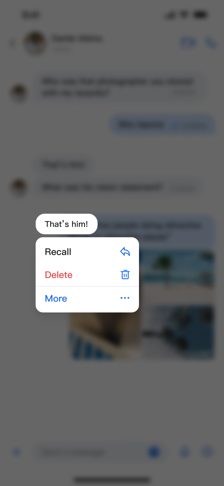 | 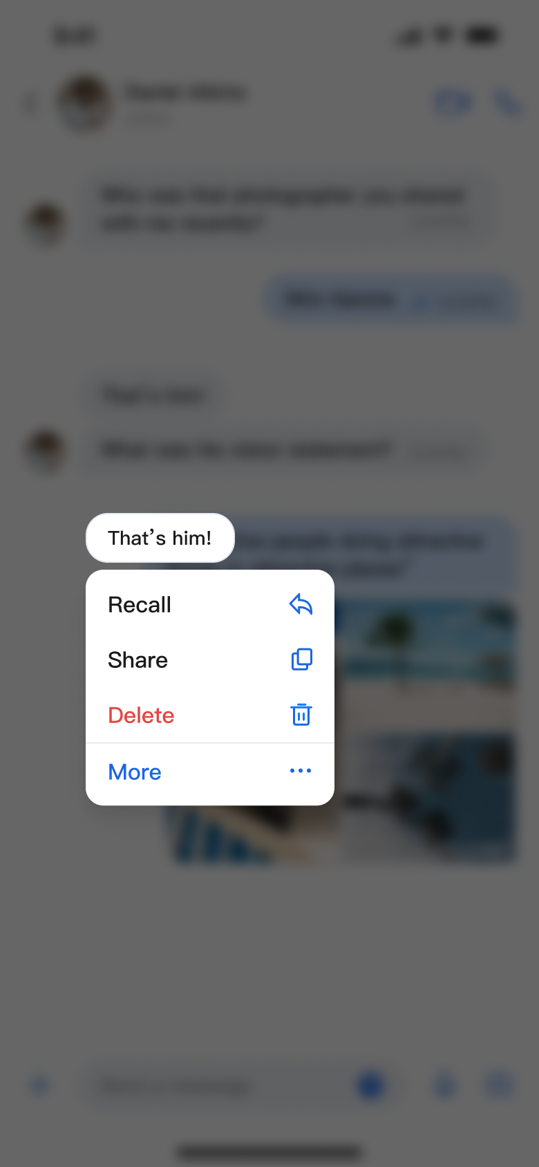 |

