
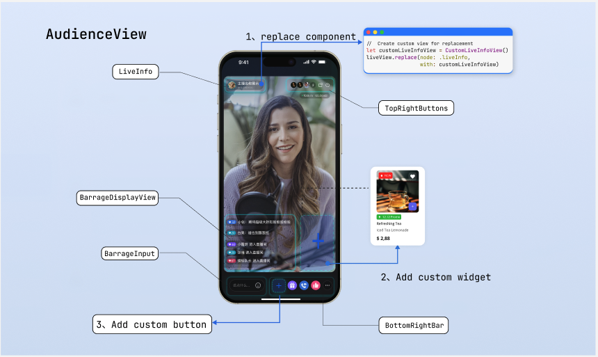
Audience Core View (Android)
AudienceView: Core UI Component for Audience Side
AudienceView enables you to quickly build a basic audience live streaming interface.
This guide walks you through step-by-step customization of the audience interface, from simple button adjustments to advanced view replacements.
Prerequisites
Before customizing the audience interface, complete the main audience Enter Room flow as described in Audience Watch.
Feature Overview
Unlike the host side, where views are created and managed directly, the audience side must support seamless vertical swiping between live rooms.
AudienceView acts as a swipeable container.On the audience side, you do not customize
AudienceView directly. Instead, you work with its internal single-room view, AudienceLiveView. The swipe container dynamically creates and displays these single-room views as needed. Use the AudienceViewListener protocol to access the corresponding room’s view instance (the liveView parameter in callbacks) during the following core lifecycle events. Customize or manage resources at the appropriate time:Method | Description |
onCreateLiveView(audienceView: AudienceLiveView, liveInfo: LiveInfo) | View Creation Callback. This callback provides the newly instantiated AudienceLiveView. Use for static style customization set in advance. Since the container preloads the next room, this callback may be triggered before the view appears on screen. Typically, use liveView here to replace built-in components, configure fixed buttons, and perform one-time layout operations. |
onLiveViewDidAppear(audienceView: AudienceLiveView, liveInfo: LiveInfo) | View Display Callback. This callback provides the AudienceLiveView currently visible on screen. Use for dynamic adjustments based on real-time status or signaling. Usually, record the currently active liveView instance here, so you can update the UI in response to business signals (such as product launch notifications), or start room-specific timers and animations at this point. |
onLiveViewDidDisappear(audienceView: AudienceLiveView, liveInfo: LiveInfo) | View Hide Callback. Triggered when the audience swipes out of the room or closes the interface. Use for state reset and resource cleanup. Typically, clear the active liveView record here, destroy custom business panels shown in the room, stop animations, or clean up timers. |
The single-room view
AudienceLiveView exposes the following core customization interfaces and properties:Method/Property | Description |
topRightItems | Configure the set of buttons in the top-right corner of the live room. Freely add custom buttons or adjust the layout of built-in buttons. |
bottomItems | Configure the set of buttons at the bottom of the live room. Freely add custom buttons or adjust the layout of built-in buttons. |
replace(node: AudienceNode, view: View?) | Replace the default component at a specified position (such as the top info area or bottom action bar) with a fully custom view. |
overlayView | Overlay layer for easily adding global business UI elements that float above the video. |
perform(action:AudienceAction) | Trigger built-in default logic directly from custom views, such as showing the default audience list or the default co-host management panel. |
Quick Start
The example below demonstrates how to quickly build a product-selling live room viewing page. The main flow includes:
Hiding unnecessary co-hosting buttons and adding a shopping cart button.
Simulating receipt of a product launch message and displaying a product card.
Routing click events to the product list page.
import android.os.Bundleimport android.view.Gravityimport android.widget.FrameLayoutimport android.widget.ImageViewimport androidx.appcompat.app.AppCompatActivityimport com.trtc.uikit.livekit.features.audienceview.AudienceLiveViewimport com.trtc.uikit.livekit.features.audienceview.AudienceViewimport com.trtc.uikit.livekit.features.audienceview.AudienceViewDefineimport com.trtc.uikit.livekit.features.audienceview.AudienceViewDefine.AudienceBottomItemimport io.trtc.tuikit.atomicx.common.util.ScreenUtil.dip2pximport io.trtc.tuikit.atomicxcore.api.live.LiveInfoclass AudienceActivity : AppCompatActivity(), AudienceViewDefine.AudienceViewListener {private var currentLiveView: AudienceLiveView? = nulloverride fun onCreate(savedInstanceState: Bundle?) {super.onCreate(savedInstanceState)// Initialize AudienceView containerval audienceView = AudienceView(this)setContentView(audienceView)// Register listener and initializeaudienceView.addListener(this)audienceView.init(this, "your_room_id")}// Show product list pageprivate fun showProductListPanel() {println("Show product list page...")}// Simulate receiving a product push messagefun onReceiveProductPushMessage() {// Must operate on the currently active viewval liveView = currentLiveView ?: returnval productCard = AudienceProductCardView(this)productCard.setOnClickListener { showProductListPanel() }val params = FrameLayout.LayoutParams(dip2px(150f), FrameLayout.LayoutParams.WRAP_CONTENT).apply {gravity = Gravity.BOTTOM or Gravity.ENDrightMargin = dip2px(12f)bottomMargin = dip2px(100f)}liveView.overlayView.addView(productCard, params)}// --- AudienceViewListener callback implementation ---override fun onCreateLiveView(liveView: AudienceLiveView, liveInfo: LiveInfo) {// Configure bottom action bar: Hide co-hosting feature and add custom "shopping cart" buttonval shopCartBtn = ImageView(this).apply {setOnClickListener { showProductListPanel() }}liveView.bottomItems = listOf(AudienceBottomItem.Gift,AudienceBottomItem.Like,AudienceBottomItem.Custom(shopCartBtn))}override fun onLiveViewDidAppear(liveView: AudienceLiveView, liveInfo: LiveInfo) {currentLiveView = liveView}override fun onLiveViewDidDisappear(liveView: AudienceLiveView, liveInfo: LiveInfo) {if (currentLiveView === liveView) {currentLiveView = null}}override fun onLiveEnded(roomId: String, ownerName: String, ownerAvatarUrl: String) {}override fun onClickFloatWindow() {}}class AudienceProductCardView(context: android.content.Context) : android.view.View(context) {// Custom product card}
Adjust Bottom Action Buttons
The bottom toolbar is the main area for audience interaction. By default, it includes buttons for gifts, co-hosting, likes, more, and so on. You can add or remove built-in features using the
bottomItems property, or insert custom buttons with AudienceBottomItem.Custom(View).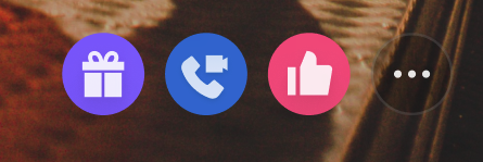
Implementation
Step 1: Prepare the custom button view. Create custom button view objects as needed.
Step 2: Update the bottom button array. In the
AudienceViewListener callback, assign the assembled array of AudienceBottomItem enums to the view property.override fun onCreateLiveView(audienceView: AudienceLiveView, liveInfo: LiveInfo) {// Step 1: Prepare custom button viewval shopButton = ImageView(audienceView.context).apply {setImageResource(R.drawable.shop_cart)}// Step 2: Update bottom button array, keep gift, hide co-hosting, add product buttonaudienceView.bottomItems = listOf(AudienceBottomItem.Gift,AudienceBottomItem.Custom(shopButton))}
Adjust Top Action Buttons
The top area displays room information and key actions. By default, it provides three buttons: audience count, floating window, and exit. You can customize or add control buttons using the
topRightItems property.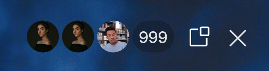
Implementation
Step 1: Prepare the custom button view. Create custom button view objects as needed.
Step 2: Update the top button array. In the
AudienceViewListener callback, assign enum items or custom views to the topRightItems property.override fun onCreateLiveView(audienceView: AudienceLiveView, liveInfo: LiveInfo) {// Step 1: Prepare custom button viewval reportButton = ImageView(audienceView.context).apply {setImageResource(R.drawable.report_btn)}// Step 2: Update top button array (keep audience count and close, add report)audienceView.topRightItems = listOf(AudienceViewDefine.AudienceTopRightItem.AudienceCount,AudienceViewDefine.AudienceTopRightItem.Custom(reportButton),AudienceViewDefine.AudienceTopRightItem.Close)}
Replace Interface Areas
If button adjustments are not enough for your layout needs, use the
replace interface to fully replace specific areas of the view. The AudienceNode enum defines five replaceable areas. Refer to the "Page Structure Diagram" above for context:AudienceNode | Description |
LIVE_INFO | Top-left area displaying host and room information. |
TOP_RIGHT_BUTTONS | Top-right area for system control buttons. |
NETWORK_INFO | Network status indicator area. |
BOTTOM_RIGHT_BAR | Bottom-right area for business action bar. |
BARRAGE_INPUT | Bottom-left area for live comments input trigger. |
Layout Rules
The
replace interface places your custom view in the specified area. The framework controls the position, so you do not need to set it. The view’s size is determined by itself. Use one of the following methods to declare the size:Method 1: Use Internal Constraint Chain (Recommended)
Make sure the child view’s constraints form a complete chain so the parent view expands automatically.
class MyInfoView(context: Context) : FrameLayout(context) {init {val label = TextView(context).apply {text = "Live now"setPadding(dip2px(12f), dip2px(12f), dip2px(12f), dip2px(12f))}val params = LayoutParams(LayoutParams.WRAP_CONTENT, LayoutParams.WRAP_CONTENT)addView(label, params)}}
Method 2: Override onMeasure or Set Fixed LayoutParams
Override the custom
View’s onMeasure method, or assign explicit width and height via LayoutParams during initialization.class MyInfoView(context: Context) : FrameLayout(context) {init {// Assign fixed width and heightlayoutParams = LayoutParams(dip2px(200f), dip2px(44f))setBackgroundColor(Color.DKGRAY)}}
Implementation
Step 1: Create a custom view object, following the layout rules above.
Step 2: In the
AudienceViewListener callback, call the replace method on the AudienceLiveView component, passing in the node enum and your custom view.override fun onCreateLiveView(liveView: AudienceLiveView, liveInfo: LiveInfo) {// Step 1: Initialize custom view that follows layout rulesval customInfoView = MyInfoView(liveView.context)// Step 2: Replace the specific node with the custom viewliveView.replace(AudienceViewDefine.AudienceNode.LIVE_INFO, customInfoView)}
Bind Events and Trigger Logic
After replacing a node, you are responsible for handling its interaction events. You can execute your own business logic in event callbacks, or use the
perform method to trigger built-in logic. Supported AudienceAction values include: show Gift Panel (SHOW_GIFT_PANEL), show audience list (SHOW_AUDIENCE_LIST), and more.Implementation
Step 1: Bind events to your custom view using
setOnClickListener or gesture recognizers.Step 2: In the event callback, call the
perform method with the appropriate AudienceAction enum, or run your business logic.override fun onCreateLiveView(audienceView: AudienceLiveView, liveInfo: LiveInfo) {val btn = MyGiftButton(audienceView.context, audienceView)audienceView.bottomItems = listOf(AudienceBottomItem.Custom(btn))}class MyGiftButton(context: Context, private val liveView: AudienceLiveView) : androidx.appcompat.widget.AppCompatImageView(context) {init {setImageResource(R.drawable.custom_gift)setOnClickListener {// Show the default Gift PanelliveView.perform(AudienceViewDefine.AudienceAction.SHOW_GIFT_PANEL)// Or trigger custom logic// presentCustomPanel()}}}
Deep Customization of Business Popups
If the built-in panels triggered by
perform do not meet your requirements, you can fully take over the logic and build custom business panels using the underlying AtomicXCore data interface.Core Concept
Use
AtomicXCore to access room, user, and status data, and build your own custom views and interactions. After building your controller, use the provided AtomicPopover component to display your panel. This ensures your custom panel benefits from the same gesture handling and animations as the SDK’s built-in panels.Implementation
Step 1: Build a custom business view. Create a standalone
View and use the core data interface to fetch or listen to business data for UI updates.Step 2: Instantiate the popup container. Create an
AtomicPopover and specify its popup position (BOTTOM or CENTER).Step 3: Configure and display the custom view. Set the popup’s height mode (such as a screen ratio), assign your custom view with
setContent, and call show().import android.content.Contextimport android.graphics.Colorimport android.widget.FrameLayoutimport io.trtc.tuikit.atomicx.widget.basicwidget.popover.AtomicPopover// Step 1: Build custom business view (e.g., audience list)class CustomAudienceListView(context: Context) : FrameLayout(context) {init {setBackgroundColor(Color.WHITE)setupUI()bindLiveData()}private fun setupUI() {// Add your custom UI controls here, such as displaying audience avatars, user levels, etc.}private fun bindLiveData() {// Use AtomicXCore's core interface to get current room status or user data// For example: LiveAudienceStore.create(liveID)...// After obtaining core data, refresh the custom UI built above}}// Example: Slide up a custom panel from the bottom, occupying 50% of the screen heightfun presentBusinessPanel(context: Context) {// Step 2: Instantiate popup container, specify popup from bottomval popover = AtomicPopover(context, AtomicPopover.PanelGravity.BOTTOM)// Step 3: Configure and display custom view// Set panel height to 50% of screen height (can also use WrapContent for adaptive height)popover.setPanelHeight(AtomicPopover.PanelHeight.Ratio(0.5f))// Instantiate custom business viewval audienceListView = CustomAudienceListView(context)// Set content and showpopover.setContent(audienceListView)popover.show()}
Refer to the following documentation for using the
AtomicXCore interface to implement custom feature panels:Feature Description | Reference Documentation |
Implement audience co-host management panel: co-host application/invite/accept/reject, co-host member permission control (microphone/camera), status synchronization. | |
Implement host cross-room co-host panel: co-host host interaction management, initiate/accept/reject co-hosting. | |
Implement audience list: count audience numbers, listen to audience entry/exit events. | |
Implement audio effects panel: voice changer (child/male voice), reverb (KTV, etc.), monitoring adjustment, real-time effect switching. |
Add Custom Floating Widgets
In complex live streaming scenarios, you may need to display floating activity icons or interactive stickers above the video. These views, which should be positioned above the video layer and independent of the main layout, must be added to the
overlayView layer.In most cases, floating widgets serve as entry points for activity panels. We recommend combining them with the
AtomicPopover component: bind click events to the widget, and display a custom business popup when triggered.Widget Lifecycle Management
Manage floating widgets in sync with the view lifecycle, based on your business needs:
Persistent widgets (such as a fixed activity entry in the live room): add directly to
overlayView in the onCreateLiveView callback.Dynamic widgets (such as flash red envelopes or temporary product cards): add dynamically to the
overlayView of the currently active view instance, recorded in onLiveViewDidAppear, after receiving business signals.Widget and popup destruction: For dynamically displayed business panels or widgets, remove them in the
liveViewDidDisappear callback. This prevents UI state issues caused by view reuse when users swipe between rooms.Implementation
Step 1: Create the widget view and enable interaction. Instantiate the floating control, set its size and position.
Step 2: Bind click events. Use
setOnClickListener to handle audience clicks.Step 3: Add to the overlay layer and link the popup. Add the widget to
overlayView, and in the click callback, invoke your custom popup logic.class LiveRoomActivity : AppCompatActivity() {// Get the current liveView in AudienceViewListenerprivate var currentLiveView: AudienceLiveView? = null// Example: Floating red packet widget in the top-left corner, click to pop up business panelfun addRedPacketWidget() {val activeView = currentLiveView ?: return// Step 1 & 2: Create widget view and enable interactionval redPacketWidget = ImageView(this).apply {setImageResource(R.drawable.red_packet_icon)setOnClickListener { handleRedPacketClick() }}val params = FrameLayout.LayoutParams(dip2px(60f), dip2px(60f)).apply {gravity = Gravity.TOP or Gravity.STARTtopMargin = dip2px(120f)leftMargin = dip2px(15f)}// Step 3: Add to overlay layeractiveView.overlayView.addView(redPacketWidget, params)}private fun handleRedPacketClick() {// Call presentBusinessPanel(this) here to pop up your custom business view// presentBusinessPanel(this)}}
FAQs
Why does the custom button not respond to clicks?
If a custom view passed via
AudienceBottomItem.Custom() does not respond to click events:Troubleshooting:
Check click event binding (most common cause): In Android, a default
View is not clickable by default. Make sure you call setOnClickListener or set isClickable to true in XML or code.Check view size and boundaries: If your container does not specify width and height (or is not expanded by child views with
WRAP_CONTENT), the parent layout size may be 0. Even if child buttons are drawn outside the boundary, click events will be ignored by the system’s touch mechanism if they exceed the parent view’s Rect area.Check parent interception: Ensure that no external wrapper layer intercepts events in
onInterceptTouchEvent.How do I dynamically hide or show action buttons?
You may need to adjust the bottom or top toolbar dynamically based on room status (for example, hiding co-hosting buttons during product selling).
Solution: The
bottomItems and topRightItems properties of AudienceLiveView support reactive updates. Simply assemble a new button array and reassign it—the SDK will automatically refresh the view. No manual redraw is needed. When updating views dynamically, always update the currently displayed view instance. Use the active instance recorded in the onLiveViewDidAppear callback; do not modify adjacent room views in the preload state.Why does a view replaced via the replace interface not display when swiping?
If you use
replace(node, customView) to replace a node and encounter illegalStateException: The specified child already has a parent... or the custom view disappears when swiping, it’s usually because the same custom View instance was reused across different live room views.Analysis:
Since
AudienceView is a swipe container, the system preloads adjacent rooms for smooth swiping. This means onCreateLiveView may be called in advance. In Android, a View instance can only have one parent at a time. If you pass a shared global View instance, adding it to a new room without removing it from the previous parent will cause a crash. Even if the framework forcibly removes it, the View will be detached from the currently visible room, causing display issues.Incorrect Example (avoid this usage):
// ❌ Incorrect: Holding a shared view instance externallyval sharedBrandView = MyBrandView(context)override fun onCreateLiveView(audienceView: AudienceLiveView, liveInfo: LiveInfo) {// ⚠️ Warning: Reusing the same View instance when preloading the next liveView causes Parent conflict!audienceView.replace(AudienceNode.LIVE_INFO, sharedBrandView)}
Correct Approach:
Always create a new custom view instance for each new
AudienceLiveView in the onCreateLiveView callback.override fun onCreateLiveView(audienceView: AudienceLiveView, liveInfo: LiveInfo) {// ✅ Correct: Instantiate a new custom view every time the callback is triggeredval newBrandView = MyBrandView(audienceView.context)audienceView.replace(AudienceNode.LIVE_INFO, newBrandView)}

