
Anchor Core View (iOS)
AnchorView is the primary UI component for the host side. Use this component to quickly build a basic live streaming interface with extensive APIs and high flexibility. This guide walks you through customizing interface elements from simple button tweaks to full view replacements.
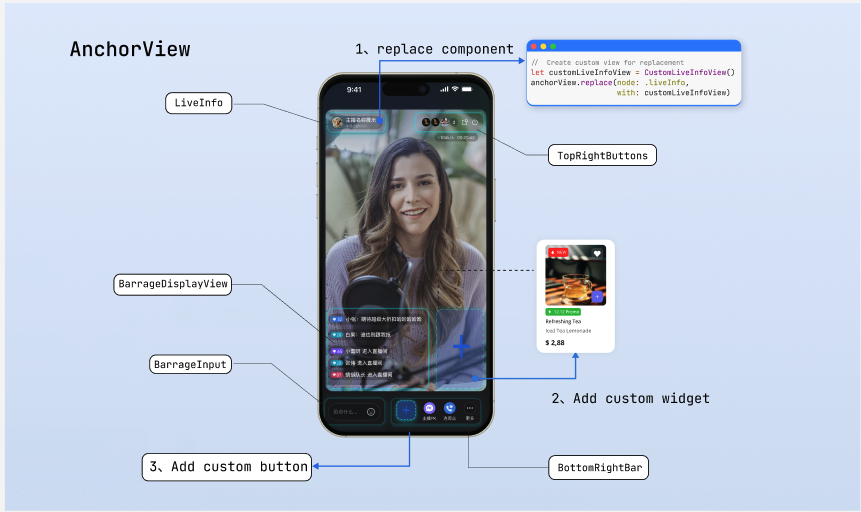
Page Structure Diagram
Prerequisites
Before customizing the live streaming page, complete the main workflow setup as described in Host Live Streaming.
Feature Overview
AnchorView provides the following core customization interfaces and properties:
Method/Property | Description |
topRightItems | Configure the set of buttons in the top-right corner of the live room. Freely add custom buttons or adjust the layout of built-in buttons. |
bottomItems | Configure the set of buttons at the bottom of the live room. Freely add custom buttons or adjust the layout of built-in buttons. |
replace(node:with:) | Replace the default component at a specified position (such as the top info area or bottom operation bar) with a fully custom view. |
overlayView | Widget layer for adding global business UI that floats above the video screen. |
perform(action:) | Trigger built-in logic directly from custom views, such as displaying the default audience list or co-host management panel. |
Quick Start
The following example builds a show-style host dashboard:
Add a beauty filter button to the bottom bar.
Replace the live info node with a business-specific style.
Add a "Popularity Ranking" floating widget.
import UIKitimport AtomicXlet anchorView: AnchorViewfunc setupUI() {// Step 1: Create the beauty filter button and set button orderlet beautyButton = UIButton(type: .system)beautyButton.setTitle("beauty", for: .normal)// Order: co-host, PK, custom beauty button, moreanchorView.bottomItems = [.coHost, .battle, .custom(beautyButton), .more]// Step 2: Replace the LiveInfo view stylelet customLiveInfoView = CustomLiveInfoView()anchorView.replace(node: .liveInfo, with: customLiveInfoView)// Step 3: Add the "Popularity Ranking" floating widgetlet rankWidget = RankWidgetView()// Add widget to the overlay layeranchorView.overlayView.addSubview(rankWidget)// Position below the top-left cornerrankWidget.snp.makeConstraints { make inmake.top.equalToSuperview().offset(120)make.leading.equalToSuperview().offset(12)make.width.equalTo(70)make.height.equalTo(30)}}
Adjusting Bottom Operation Buttons
The bottom toolbar is the main area for host interactions. By default, it displays "Host PK", "Co-host with Audience", and "More" buttons from left to right. You can add custom buttons with
.custom(UIView), or flexibly add/remove built-in features and adjust button order using the bottomItems property.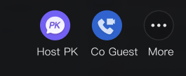
Implementation Steps
Step 1: Prepare custom button views. Create custom button view objects as needed.
Step 2: Update the bottom button array. Assemble an array of
AnchorBottomItem enums and assign it to the component property.import UIKitimport AtomicXlet anchorView: AnchorView// Example: Keep only the co-host feature in the bottom toolbar and add a product list trigger buttonfunc adjustBottomBar() {// Step 1: Prepare custom button viewlet goodsButton = UIButton(type: .custom)goodsButton.setImage(UIImage(named: "shop_cart"), for: .normal)// Step 2: Update the bottom button arrayanchorView.bottomItems = [.coHost,.custom(goodsButton)]}
Adjusting Top Operation Buttons
The top area typically displays key room information and controls. By default, it shows "Audience Count", "Floating Window", and "Close" buttons from left to right. Use the
topRightItems property to add or simplify control buttons in the top-right corner.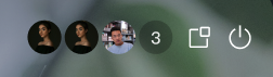
Implementation Steps
Step 1: Prepare custom button views. Create custom button view objects as needed.
Step 2: Update the top button array. Assign selected enum items or custom views to the
topRightItems property.import UIKitimport AtomicXlet anchorView: AnchorView// Example: Keep audience count and close room buttons in the top-right corner, and add a "Report" buttonfunc adjustTopRightBar() {// Step 1: Prepare custom button viewlet reportButton = UIButton(type: .custom)reportButton.setImage(UIImage(named: "report_btn"), for: .normal)// Step 2: Update the top button array in display orderanchorView.topRightItems = [.audienceCount, .custom(reportButton), .close]}
Replacing Specific Interface Area Views
If button adjustments can't meet your layout requirements (for example, replacing the live comments input box in the bottom-left corner with another button), use the
replace interface to fully swap out the view in a specified area.Internally, the component defines five UI areas that support custom replacement via the
AnchorNode enum. See the "Page Structure Diagram" above for reference:AnchorNode | Description |
liveInfo | Top-left area displaying host and room information. |
topRightButtons | Top-right area for system control buttons. |
networkInfo | Network status indicator area. |
bottomRightBar | Bottom-right area for business operation bar. |
barrageInput | Bottom-left area for triggering the live comments input box. |
Note:
The
replace method fully replaces the specified node. If you replace both topRightButtons and bottomRightBar, their corresponding Items properties become invalid. For simple button adjustments, use the Items properties described earlier. Use replace only when you need to redesign the layout of an area.Layout Rules
The
replace interface inserts your custom view into the specified slot. The framework controls the position; you don't need to set it. The view's size is determined by itself. Declare the size using one of the following methods:Method 1: Use internal constraint chain (Recommended)
Ensure child view constraints form a complete chain so the parent view expands automatically.
class MyInfoView: UIView {init() {super.init(frame: .zero)let label = UILabel()label.text = "Live now"addSubview(label)label.snp.makeConstraints { make inmake.edges.equalToSuperview().inset(12) // Child view expands parent view}}required init?(coder: NSCoder) {fatalError("init(coder:) has not been implemented")}}
Method 2: Override intrinsicContentSize
Override this property to specify a fixed size for the view.
class MyInfoView: UIView {override var intrinsicContentSize: CGSize {CGSize(width: 200, height: 44)}}
Implementation Steps
Step 1: Create a custom view object.
Step 2: Call the
replace interface on the AnchorView component, passing the node enum to replace and the custom view.let anchorView: AnchorView// Example: Replace the default area with a custom live info viewfunc replaceLiveInfoNode() {// Step 1: Initialize a custom view with proper layout ruleslet customInfoView = MyInfoView()customInfoView.backgroundColor = .darkGray// Step 2: Call replace to update the specific nodeanchorView.replace(node: .liveInfo, with: customInfoView)}
Binding Events and Triggering Logic
When you use custom views to replace default buttons or nodes, you need to handle their interaction events. In the event handler, you can run your own business logic or use the
perform method to trigger TUILiveKit's built-in logic.Implementation Steps
Step 1: Bind events to the custom view. Use
addTarget or gesture recognizers to add tap events.Step 2: Trigger built-in logic or run business code. In the event callback, call
perform with the AnchorAction enum, or execute other business logic.import UIKitimport AtomicXclass YourAnchorViewController {var anchorView: AnchorView?// Example: Bind a tap event to a custom live info view and reuse the SDK's built-in host info panelfunc setupCustomLiveInfoNode() {// Step 1: Initialize custom view and bind gesture eventlet customLiveInfoView = MyInfoView() // Custom live info viewcustomLiveInfoView.backgroundColor = .darkGray// Enable user interaction and add tap gesturecustomLiveInfoView.isUserInteractionEnabled = truelet tapGesture = UITapGestureRecognizer(target: self, action: #selector(handleLiveInfoClick))customLiveInfoView.addGestureRecognizer(tapGesture)// Replace the live info node with the custom viewanchorView?.replace(node: .liveInfo, with: customLiveInfoView)}// Step 2: Trigger built-in logic or business code@objc func handleLiveInfoClick() {// UI node view is custom, but tap logic reuses the built-in host info popupanchorView?.perform(.showLiveInfo)// Or pop up your own host info dialog}}
Deep Customization of Business Popups
If the built-in panels triggered by
perform don't meet your business needs, you can fully take over this logic and build custom panels using data from the Core SDK.Core Approach
Use the
AtomicXCore data interface to access room, user, and status data. Build custom views and bind interactions as needed. After creating your custom controller, use the AtomicPopover component to present it, so your panel benefits from the same gesture handling and animations as the SDK's built-in panels.Implementation Steps
Step 1: Build a custom business view. Create a standalone
UIView and use the AtomicXCore interface inside it to fetch or listen to business data for UI updates.Step 2: Configure popup container parameters. Instantiate the popup configuration object and specify position, height, and animation type.
Step 3: Present the custom view. Pass your custom view as the
contentView to the AtomicPopover container and present it.import UIKitimport AtomicXimport AtomicXCore // Use core data interface for business development// Step 1: Build custom audience list viewclass CustomAudienceListView: UIView {override init(frame: CGRect) {super.init(frame: frame)self.backgroundColor = .whitesetupUI()bindLiveData()}required init?(coder: NSCoder) {fatalError("init(coder:) has not been implemented")}private func setupUI() {// Add custom UI controls, such as audience avatars, user levels, etc.}private func bindLiveData() {// Use AtomicXCore to get current room status or user data// Refresh custom UI after obtaining core data}}// Example: Slide up a custom panel from the bottom, occupying half the screen heightfunc presentBusinessPanel(from parentViewController: UIViewController) {// Step 2: Configure popup container parameterslet config = AtomicPopover.AtomicPopoverConfig(position: .bottom,height: .ratio(0.5),animation: .slideFromBottom)// Step 3: Present custom viewlet audienceListView = CustomAudienceListView()let popover = AtomicPopover(contentView: audienceListView, configuration: config)parentViewController.present(popover, animated: true)}
Refer to the following documentation for implementing custom feature panels using the
AtomicXCore interface:Feature Description | Reference Documentation |
Audience co-host management panel: co-host application/invite/accept/reject, co-host member permission control (microphone/camera), status synchronization. | |
Host cross-room co-host panel: manage host co-hosting interactions, initiate/accept/reject co-hosting. | |
Audience list: count audience number, listen for audience join/leave events. | |
Audio effects panel: voice changer (child voice/male voice), reverb (KTV, etc.), monitor adjustment, real-time effect switching. |
Adding Custom Floating Widgets
Live streaming often requires floating activity icons or interactive stickers above the video screen. These views should be added to the
overlayView layer, as they sit above the video and are independent of the base layout.In practice, floating widgets are usually entry points for activity panels. Combine them with
AtomicPopover: bind a tap event to the widget, and pop up a custom business dialog when clicked.Implementation Steps
Step 1: Create the widget view and enable interaction. Instantiate the floating control and set its size and position.
Step 2: Bind tap event. Add a gesture recognizer to the widget to respond to host tap actions.
Step 3: Add to overlay layer and link popup. Add the widget to
overlayView, and in the tap callback, call your custom popup logic.import UIKitimport TUILiveKitclass LiveRoomController: UIViewController {var anchorView: AnchorView?// Example: Display a red packet widget floating at the top-left corner, and pop up the custom business panel when clickedfunc addRedPacketWidget() {// Step 1: Create widget view and enable interactionlet redPacketWidget = UIImageView(image: UIImage(named: "red_packet_icon"))redPacketWidget.frame = CGRect(x: 15, y: 120, width: 60, height: 60)redPacketWidget.isUserInteractionEnabled = true// Step 2: Bind tap eventlet tapGesture = UITapGestureRecognizer(target: self, action: #selector(handleRedPacketClick))redPacketWidget.addGestureRecognizer(tapGesture)// Step 3: Add to overlay layeranchorView?.overlayView.addSubview(redPacketWidget)}@objc func handleRedPacketClick() {// Call the presentBusinessPanel method to pop up your custom business view// presentBusinessPanel(from: self)}}
FAQs
Why is the custom button I added not responding to clicks?
If a custom view added via
.custom() or replace doesn't respond to clicks, check the following:Troubleshooting Suggestions:
View size and internal constraints (most common issue): If you pass in a custom container view (such as replacing
bottomRightBar), ensure that child controls form a complete constraint chain to expand the parent view, or override the main view's intrinsicContentSize. If the parent view's actual size is 0, even visible buttons won't receive click events—they fall outside the parent view's bounds.Interaction properties: Check the
isUserInteractionEnabled property. For UIImageView or generic UIView containers, this defaults to false. Set it to true manually.Event binding and target: Confirm you've correctly added a
UITapGestureRecognizer or used addTarget.How to dynamically hide or show buttons?
You may need to adjust the bottom or top toolbars dynamically based on the host's level or room status (for example, hiding the co-host button during PK phase).
Implementation: The
bottomItems and topRightItems properties of AnchorView support reactive updates. Assemble a new button array and assign it to the property—the SDK automatically refreshes the view. No need to manually call reloadData or similar methods.Size issues after replacing views?
Child controls inside the main view must form a complete constraint chain or override
intrinsicContentSize. See "Custom View Layout Rules" above for details.
