This document describes how to set the UI styles for iOS.
Setting profile photo styles
Setting the default profile photo
When displaying a user, TUIKit reads the URL of the user's profile photo from the user's profile and displays the profile photo. If the user does not set a profile photo, the default profile photo is displayed.
You can customize the default profile photo before TUIKit initialization. The following is a code sample:
config.defaultGroupAvatarImage =[UIImage imageNamed:@"your group image"];
// Display the 3x3 grid display of group profile photos
config.enableGroupGridAvatar = NO;
Note:
The default profile photo of a group is a 3 x 3 grid consisting of group members' profile photos. If the 3 x 3 grid fails to be generated or the group contains only one member, TUIKit displays defaultGroupAvatarImage as the group profile photo.
You can disable the display of the 3 x 3 grid consisting of group members' profile photos as needed.
Setting the profile photo shape
TUIKit provides three types of profile photo shapes: rectangle with right-angle corners, round, and rectangle with rounded corners.
typedefNS_ENUM(NSInteger, TUIKitAvatarType){
TAvatarTypeNone,/*Rectangle with right-angle corners*/
TAvatarTypeRounded,/*Round*/
TAvatarTypeRadiusCorner,/*Rectangle with rounded corners*/
};
You can customize the profile photo shape before TUIKit initialization. The following is a code sample:
TUIConfig *config =[TUIConfig defaultConfig];
// Change the profile photo type to a rectangle with rounded corners of 5 degrees
config.avatarType = TAvatarTypeRadiusCorner;
config.avatarCornerRadius =5.f;
Setting the Chat UI Styles
Setting the chat UI background color
You can customize chat UI background color before TUIKit initialization. The following is a code sample:
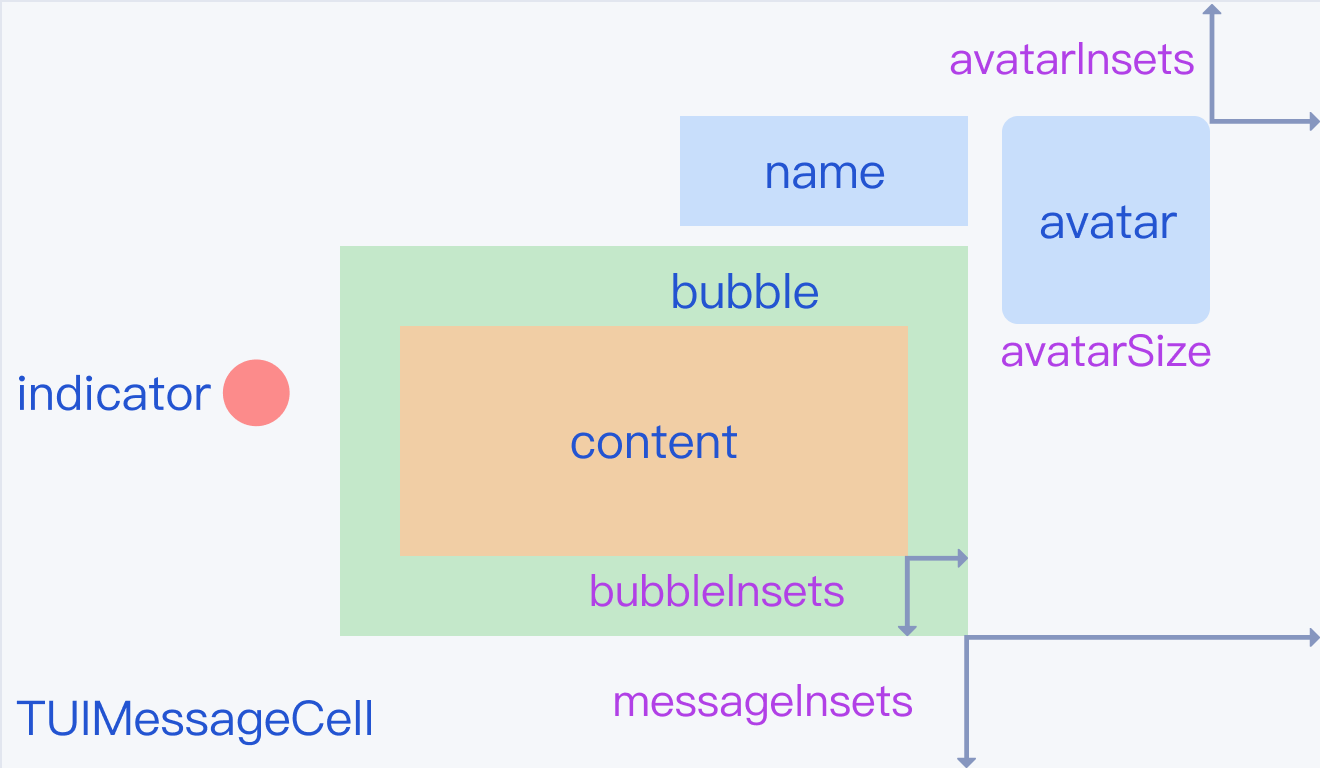
The following figure shows how message views are combined in the chat UI:
Setting message fonts and colors
Text message data comes from the TUITextMessageCellData class, whose API allows you to modify the fonts and colors of text messages.
You can customize message fonts and colors before TUIKit initialization. The following is a code sample:
The image displayed in the bubble cell is obtained from TUIBubbleMessageCellData. The object provides a class method to set bubble background images.
You can customize bubble background images before chat UI initialization. The following is a code sample:
// Set sent-message bubbles, including the common and selected states
In TUIKit, text and voice messages are displayed in bubbles. TUIMessageCellLayout provides a class method bubbleInsets to set bubble margins.
You can customize bubble margins before chat UI initialization. The following is a code sample:
To set the sender's profile photo style, you can modify related properties of TUIMessageCellLayout.
You can customize the profile photo style before chat UI initialization. The following is a code sample:
// Set the sender's profile photo size and position
For other message types, obtain the corresponding layout instances to set the profile photo sizes and positions.
Setting the Message Nickname Style
To set the sender's nickname font and color, you can modify related properties of TUIMessageCellLayout.
You can customize the message nickname style before chat UI initialization. The following is a code sample:
// Set the sender's nickname font and color for received messages