
iOS(SwiftUI)
Component Overview
MessageList is a SwiftUI-based component designed for displaying and managing chat messages. It supports a wide range of message types and offers flexible customization options:
Supported message types: text, image, video, audio, file, system notification, emoji, and more.
Message actions: Includes long-press menu actions such as copy, delete, recall, and custom actions.
Highly customizable: Configure styles like bubble color, corner radius, font, and add custom action items.
Chat Message List | Message Long-Press Menu |
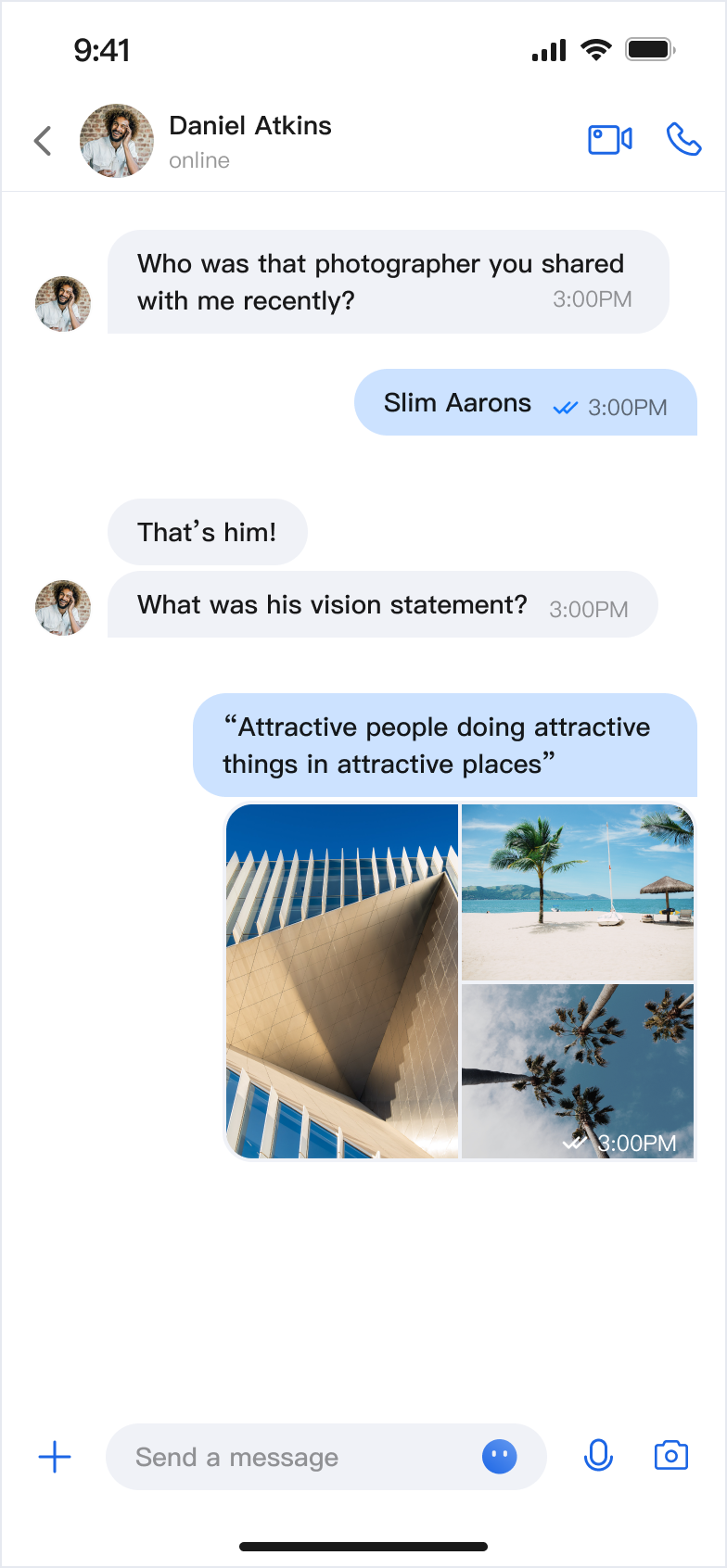 |  |
Component Integration
MessageList is part of TUIKit SwiftUI. To use MessageList, first integrate TUIKit SwiftUI. For detailed integration steps, see the TUIKit SwiftUI documentation.
Component Structure
MessageList exposes only its initialization method; all other logic is encapsulated within the component.
Public Methods
Method | Parameters | Description |
init | conversationID: String | Initializes the component and sets the conversation ID. |
| config: MessageListConfigProtocol & MessageActionConfigProtocol = ChatMessageListConfig() | Initializes the component and sets the message list style. |
| locateMessage: MessageInfo? = nil | Initializes the component and sets the located message. Typically used when navigating from the message search results page to the message page and locating the target message. |
| onUserClick: ((String) -> Void)? = nil | Initializes the component and sets the event handler for clicking on the user avatar. |
| customActions: [MessageCustomAction] = [] | Initializes the component and sets custom message menu options. |
Basic Usage
Initialize the MessageList component directly with a conversation ID. For best results, implement the onUserClick handler during initialization.
import AtomicXimport SwiftUIstruct ContentView: View {var body: some View {MessageList(conversationID: "conversation_123",onUserClick: { userID in// Handle user avatar click event})}}
Customization
You can customize both the style and actions of the message list using the following methods.
Custom Styles
Implement the
MessageListConfigProtocol protocol to define a custom style:struct MyCustomConfig: MessageListConfigProtocol & MessageActionConfigProtocol {let alignment: Int = 0let isShowTimeMessage: Bool = truelet isShowLeftAvatar: Bool = truelet isShowLeftNickname: Bool = truelet isShowRightAvatar: Bool = truelet isShowRightNickname: Bool = truelet isSupportCopy: Bool = false// ... other properties}// Apply custom styleMessageList(conversationID: "conversation_123",config: MyCustomConfig())
MessageListConfigProtocol Property Descriptions:Property | Type | Description | Remarks |
alignment | Int | Message alignment | 1: Left align. 2: Right align. 3: Both sides align. |
isShowTimeMessage | Bool | Show time message | Controls whether to display message timestamps. |
isShowLeftAvatar | Bool | Show left avatar | Controls whether to display sender avatar for received messages. |
isShowLeftNickname | Bool | Show left nickname | Controls whether to display sender nickname for received messages. |
isShowRightAvatar | Bool | Show right avatar | Controls whether to display your own avatar for sent messages. |
isShowRightNickname | Bool | Show right nickname | Controls whether to display your own nickname for sent messages. |
isShowTimeInBubble | Bool | Show time inside bubble | Controls whether the timestamp is displayed inside the message bubble. |
cellSpacing | CGFloat | Message spacing | Controls the spacing between adjacent messages. |
isShowSystemMessage | Bool | Show system notification | Controls whether to display system notification messages. |
isShowUnsupportMessage | Bool | Show unsupported messages | Controls whether to display unsupported message types. |
horizontalPadding | CGFloat | Horizontal padding | Controls the left and right padding of the message list. |
avatarSpacing | CGFloat | Avatar spacing | Controls the spacing between the avatar and message content. |
MessageActionConfigProtocol Property Descriptions:Property Name | Type | Description |
isSupportCopy | Bool | Whether to enable copy function in the message action menu: true: Display the copy action.false: Do not display the copy action. |
isSupportDelete | Bool | Whether to enable the delete function in the message action menu: true: Display the delete action.false: Do not display the delete action. |
isSupportRecall | Bool | Whether to enable the recall function in the message action menu: true: Display the recall action.false: Do not display the recall action. |
Custom Actions
You can customize the long-press message menu items using several approaches.
Method 1. Show Action Items Locally
Set
isSupportCopy, isSupportDelete, and isSupportRecall in the config when initializing MessageList to control which actions are shown:struct CustomMessageView: View {var body: some View {MessageList(conversationID: "conversation_123",config: ChatMessageListConfig(isSupportCopy: false))}}
Method 2. Add Custom Action Items Locally
Pass
customActions when initializing MessageList. Your custom actions will be appended to the default action list:struct CustomMessageView: View {var body: some View {MessageList(conversationID: "conversation_123",// Add custom actioncustomActions: [MessageCustomAction(title: "Share", iconName: "forward_icon_figma", systemIconFallback: "square.and.arrow.up") { _ inprint("share Message")}])}}
Method 3. Configure Action Items Globally
Set global configuration using
AppBuilderConfig:// Configure at app launchAppBuilderConfig.shared.messageActionList = [.copy, // Enable copy.delete, // Enable delete.recall // Enable recall]// Then initialize MessageList; all MessageList instances will use this configurationMessageList(conversationID: "conversation_123")
Note:
Local configuration overrides global configuration.
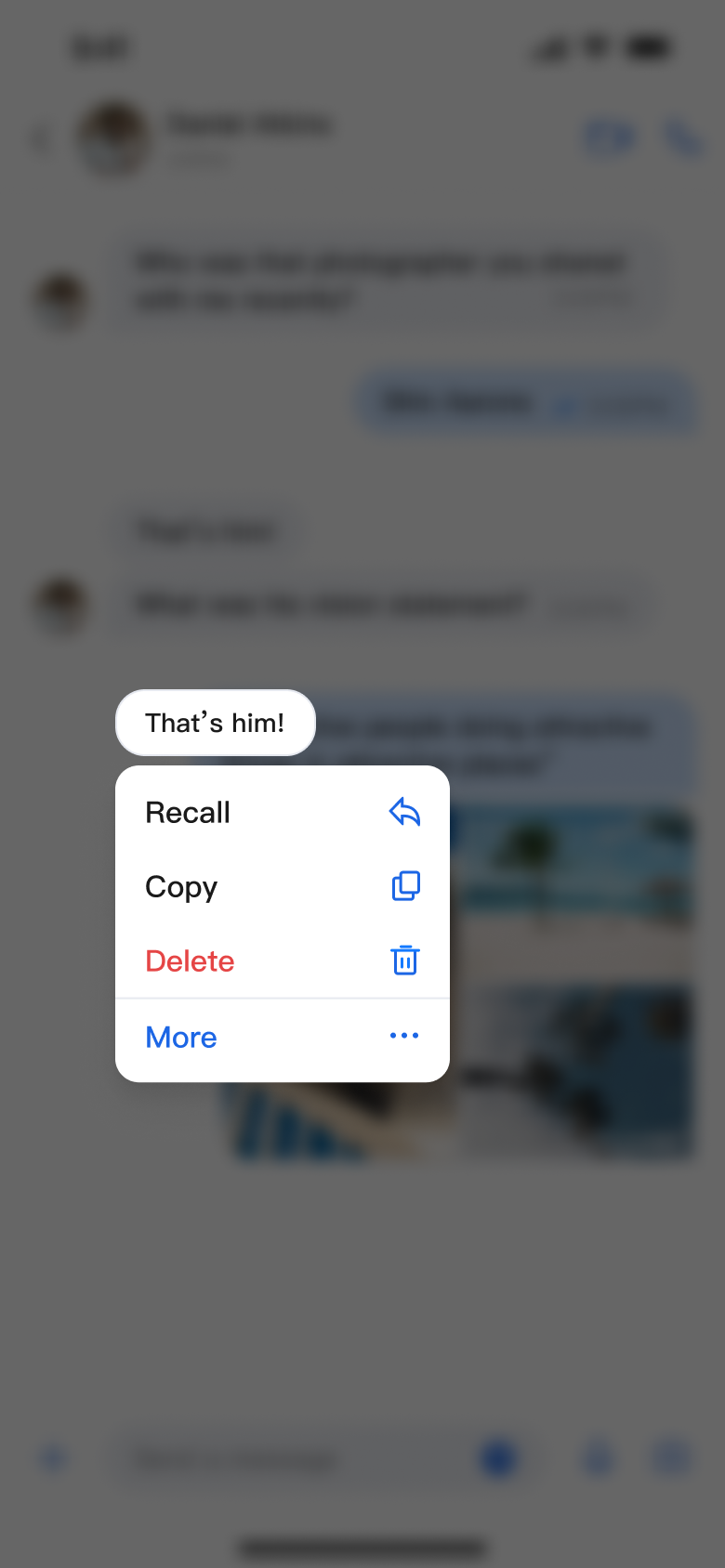
The following images show the customization effects:
Message List Actions (Default Options) | Message List Actions (Hide Copy Option) | Message List Actions (Add Share Option) |
 | 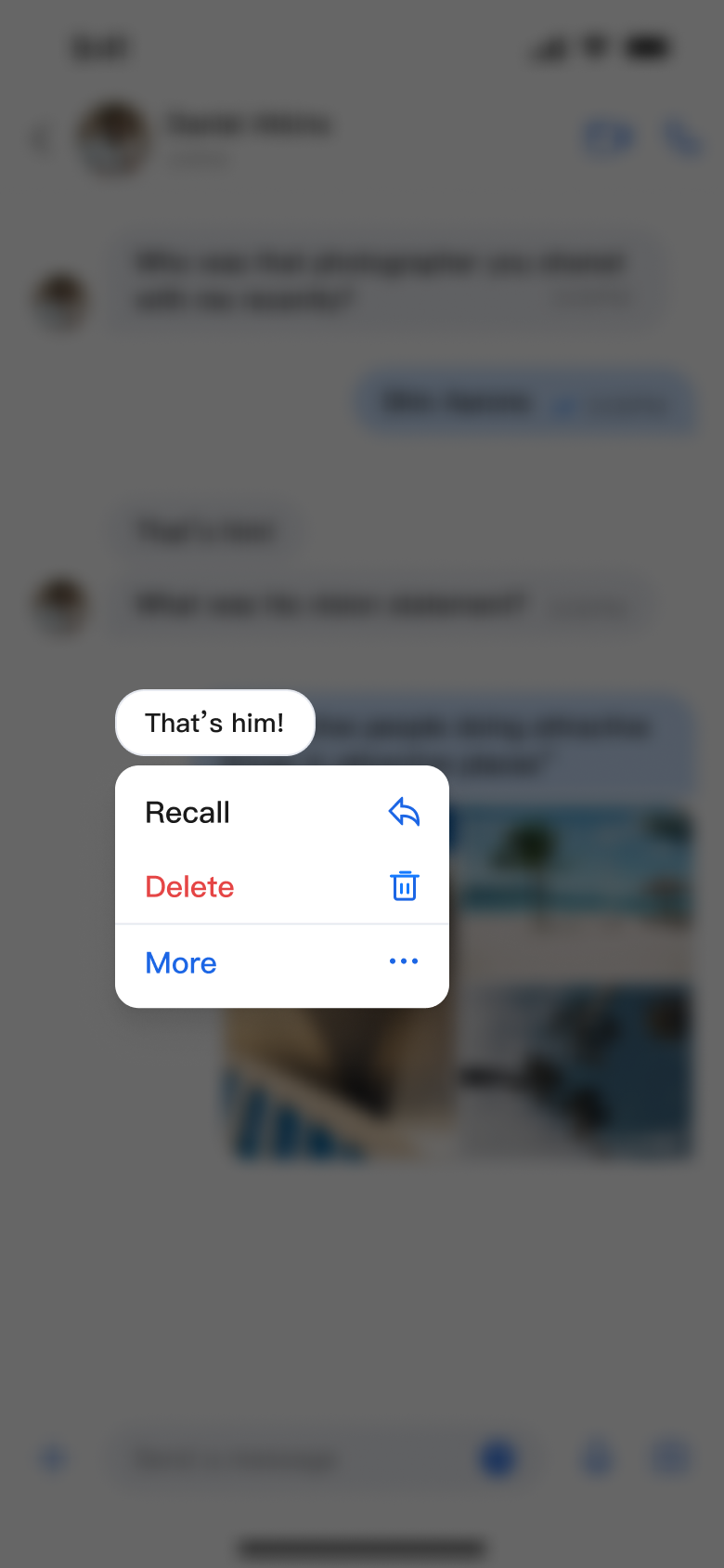 |  |

