UI components are the building blocks in user interface design that shape the experience of every digital interaction. They can not only enhance functionality but also dictate the aesthetics and usability of apps, influencing how users perceive and interact with apps.
This guide demystifies UI components, from the basics of what they are to their application in various design projects. If you're keen on mastering UI design, you've come to the right place, as we will cover everything possible on UI components. Dive in!
What Are UI Components?
UI components are integral building blocks of modern user interface design. Essentially, UI components are reusable design elements like buttons, cards, and dialogues that can be standardized across different parts of an application to maintain consistency and functionality. These components serve as the functional and aesthetic elements that users interact with directly, such as form fields, navigation bars, and informational widgets.
In the broader landscape of UI design, these components can help maintain uniformity and reduce the effort needed in design and code maintenance. By using UI component libraries, designers and developers can create a library of visual elements with predefined properties, ensuring that the interface is consistent throughout an application. This approach not only streamlines the development process but also enhances the user experience by providing a familiar and predictable interaction model.

Types of UI Components
Here are some main types of UI components:
Navigational Components
Navigational components guide users through an application's interface and improve the overall accessibility of content. Common types include menus, sidebars, and tabs. These components help organize information hierarchically, allowing users to easily navigate between different sections or pages of the app or website, thus enhancing the user experience by making navigation intuitive and efficient.
Input Components
Input components are used extensively in tasks ranging from user registration to advanced configurations, enabling users to enter and adjust settings, make selections, and provide necessary information to the system. They include text fields for single or multi-line text input, dropdown menus for selecting from a list of options, checkboxes for multiple selections, radio buttons for exclusive choices, and date pickers for selecting dates.
Informational Components
Informational components provide users with additional context or feedback without requiring direct interaction. This category includes tooltips, modals, and progress bars. Tooltips offer brief descriptions or supplementary information when hovering over an element; modals focus user attention on content or choices critical to workflow; progress bars visually depict the completion status of a task.
Container Components
Container components are used to structure and organize content in a user interface. Cards and accordions are common examples. Cards serve as containers for various pieces of information like text, images, and actions, ideal for dashboards and news feeds. Accordions are collapsible, allowing users to expand or collapse sections of content, which is particularly useful for condensing extensive information into a manageable format.
Common UI Components
Here are some widely used components:
- Navigation Bars: Help users navigate through the application by grouping important links in a visible area, typically at the top or side of the screen.
- Forms: Collect information from users via input fields, checkboxes, dropdowns, and buttons.
- Cards: Display content in a contained visual structure, often used for presenting a mixture of text, images, and actions related to a single subject.
- Modals: Overlay windows that require users to interact before returning to the main application flow, commonly used for confirmations and dialogues.
- Tabs: Allow for the organization of content in a high-density layout, enabling easy navigation between views within the same context.
- Accordions: Display collapsible content panels for presenting information in a limited space, useful for FAQs and nested menus.
- Breadcrumbs: Show the path taken by a user to reach their current location within an application, aiding in navigation and understanding of site structure.
- Progress Bars: Give visual feedback on the completion status of a process or task, guiding users through multi-step processes.
What Are UI Elements?
UI elements are the basic components of a user interface that enable interaction and information display in an application. Common UI elements include:
- Buttons: Allow users to perform actions like submitting forms or opening new windows.
- Text Fields: Enable users to input text data.
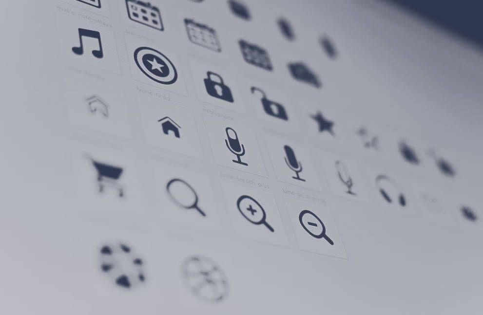
- Icons: Provide visual symbols for actions or content, often enhancing user navigation or interface aesthetics.
- Checkboxes: Let users select multiple options from a set.
- Radio Buttons: Allow users to select one option from several available choices.
- Dropdown Menus: Offer a list of options from which users can select one.
- Sliders: Enable users to adjust settings along a range, such as volume or brightness.
- Labels: Display text that identifies other UI elements or provides brief instructions.
- Tooltips: Offer additional information and guidance when users hover over an element.
How Do UI Components Differ from UI Elements?
In essence, UI elements are like the individual words in a language, while UI components are more akin to sentences that convey clear actions or functions within the application. Components use these elements to create interactive and reusable parts of the design that provide a specific utility, enhancing the overall user experience by combining aesthetics with functionality.
UI Elements are the basic building blocks of a user interface. These are the smallest, foundational parts of a UI, such as buttons, icons, checkboxes, and text fields. Essentially, UI elements are individual visual elements that users interact with directly. They do not usually have functionality by themselves outside the context of a component or larger UI system.
UI Components, on the other hand, are more complex constructs that may consist of multiple elements grouped together to perform a specific function. For example, a search component might include a text field (element), a search button (element), and possibly a dropdown for filtering options (element).
How to Use Elements and Components in Your UI Design?
Integrating elements and components effectively in your UI design can transform user experiences. This section will guide you through practical strategies and tips to seamlessly blend these elements, enhancing functionality and aesthetic appeal in your digital projects:
Step 1: Define Your Objectives
Begin by clearly defining the goals of your application. Understand the user needs and what actions you expect users to perform on your platform. This will guide your choices for which UI components are necessary and how they should be implemented.
Step 2: Choose Your UI Components and Elements
Select the appropriate UI components and elements that match your objectives. Common choices include buttons, forms, icons, and sliders for interactivity, and containers like cards and accordions for organizing content. Ensure each component aligns with a specific user need.
Step 3: Create a Consistent Design Language
Develop a consistent design language that includes a color scheme, typography, and layout patterns. This consistency should extend to the components themselves, ensuring that similar elements have uniform styling and behavior across all application areas.
Step 4: Prioritize Usability
Design each component with usability in mind. This means making elements large enough to interact with easily, ensuring that the interface is navigable and logical, and using labels or icons that clearly communicate their function to the user.
Step 5: Implement Accessibility Features
Make sure your design is accessible to all users, including those with disabilities. Use semantic HTML for web applications, provide adequate contrast for readability, and ensure interactive elements are accessible through keyboard and assistive technologies.
Step 6: Test Your Design
Test your interface with real users to gather feedback on its usability and aesthetic appeal. Use this feedback to identify areas that need improvement. Consider using A/B testing to test different versions of a component to see which performs better.
Conclusion
This guide has traversed the comprehensive world of UI components, detailing their crucial roles in enhancing both the functionality and aesthetic appeal of user interfaces. By understanding and implementing various UI components and elements, from input fields to navigational aids, you can create more intuitive and engaging interfaces, ultimately elevating your UI design capabilities and crafting seamless user experiences.
If you have any questions or need assistance, our support team is always ready to help. Please feel free to Contact Us or join us in Telegram.
FAQs
What Considerations Should Be Made When Designing UI Components for Mobile Applications Versus Web Applications?
When designing UI components for mobile applications, consider the limited screen size and touch interface, prioritizing large touch targets and minimalistic design to enhance usability. For web applications, more screen real estate allows for more detailed components and hover effects, which are unavailable on mobile.
What Is the Difference Between UI Pattern and Component?
UI components are reusable design elements like buttons and menus used to build interfaces, while Patterns are how these components are used within a UI. Patterns provide a framework, while components are the building blocks within that framework.
What Is UI Kit Used For?
The UI kit is an essential tool in the design and development process, primarily used to promote consistency and streamline the creation of visually appealing and user-friendly interfaces. They consist of a collection of pre-designed elements—such as buttons, input fields, dropdown menus, and more—that can be reused and customized to build coherent interfaces across different parts of an application.


